


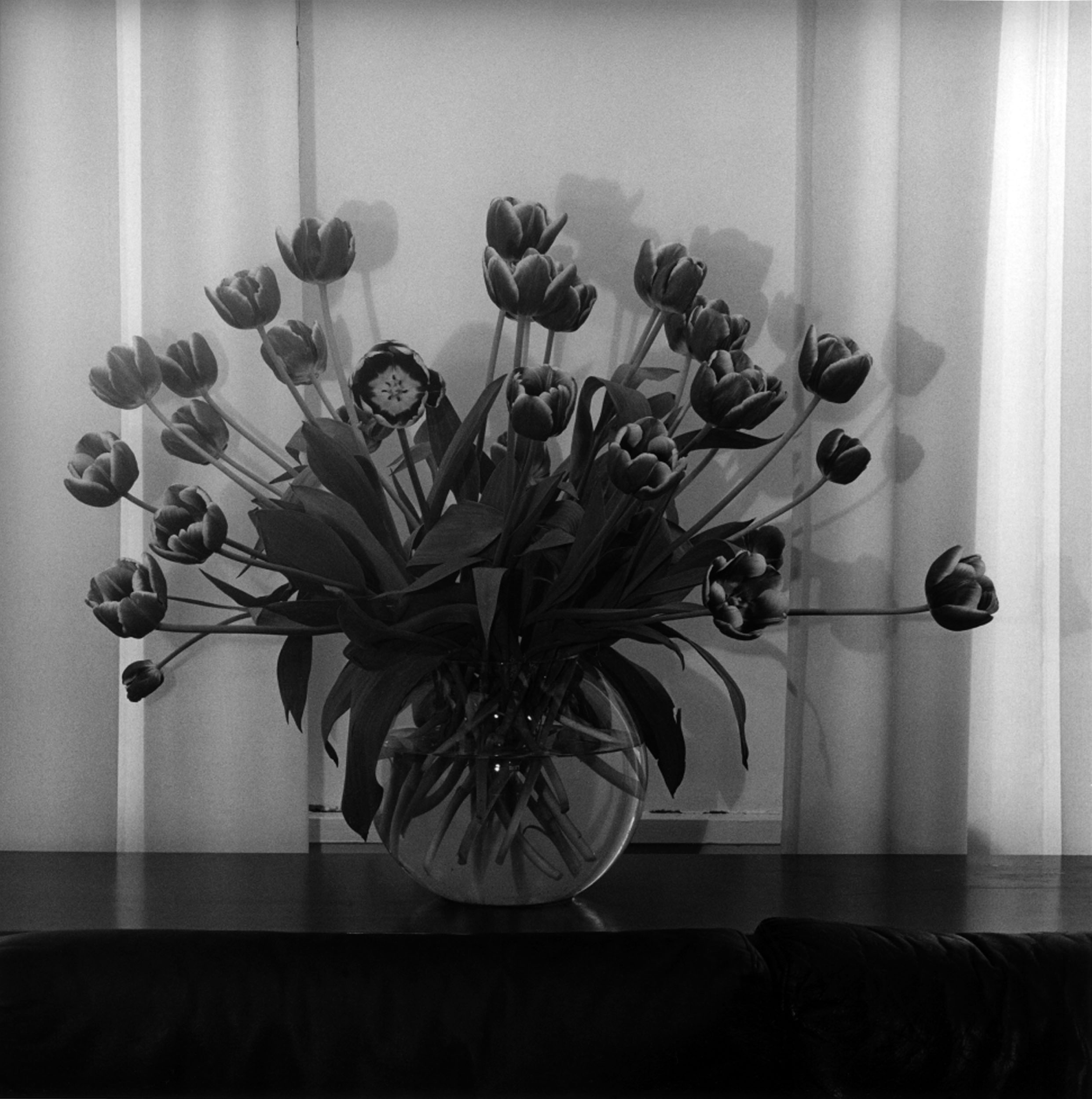
Robert Mapplethorpe
Tulips, 1979
Silver gelatin print
50.8 x 40.6 cm
Courtesy and © Robert Mapplethorpe Foundation

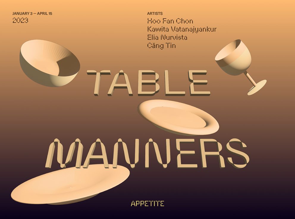
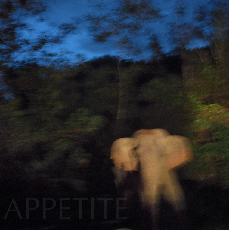
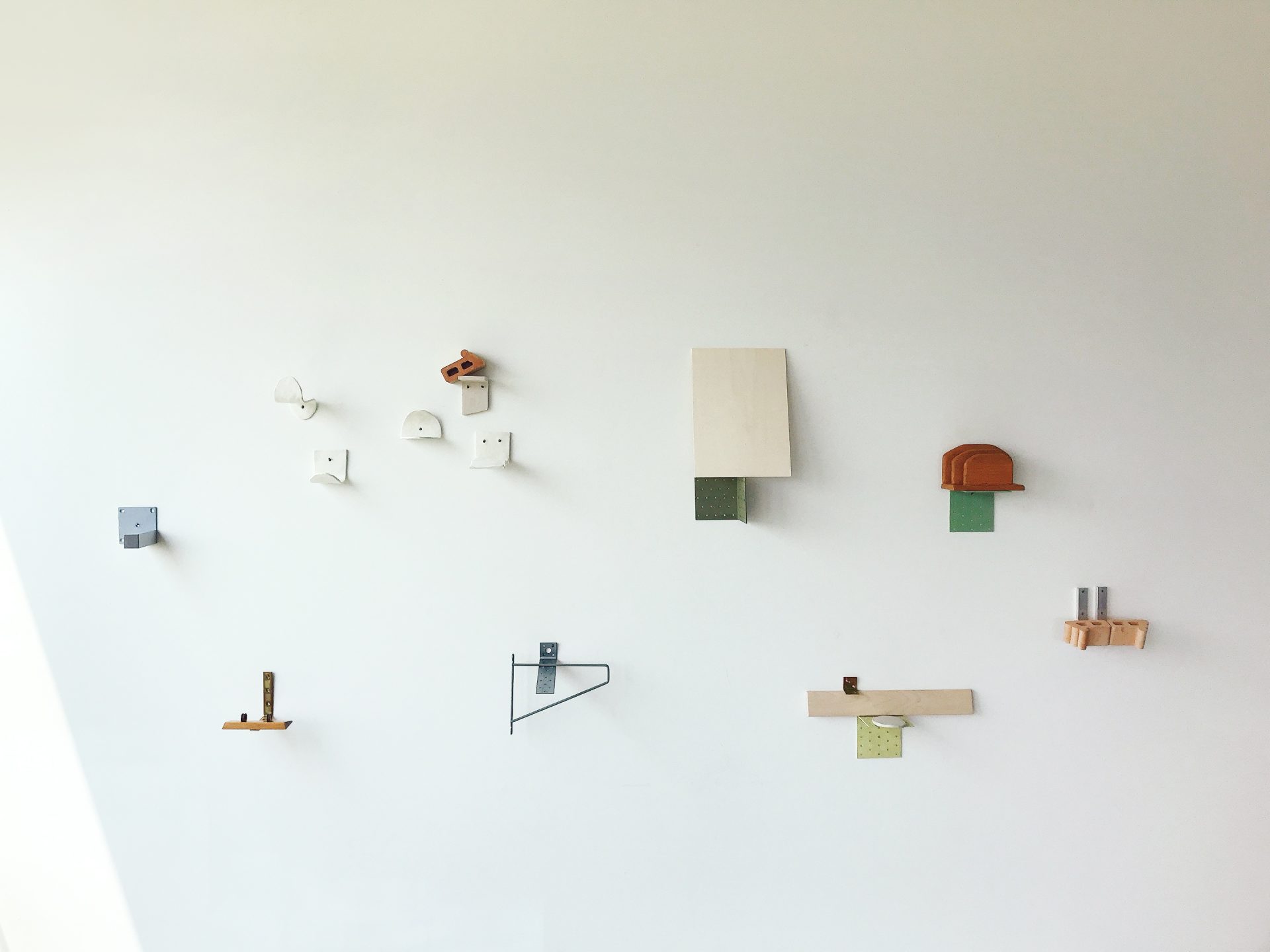
Appetite’s art programme, helmed by Siuli Tan, brings the experience of an art gallery to a more informal and relational space. Every three months the team curates new exhibitions that feature established and emerging artists alike, many of whose works have never been shown in Singapore before.
Appetite’s art programme, helmed by Siuli Tan, brings the experience of an art gallery to a more informal and relational space. Every three months the team curates new exhibitions that feature established and emerging artists alike, many of whose works have never been shown in Singapore before.
We host daily events across a wide range of formats like public talks, masterclasses, book launches, networking sessions, and tiny desk concerts. For private bookings, please contact us at info@appetitesg.com
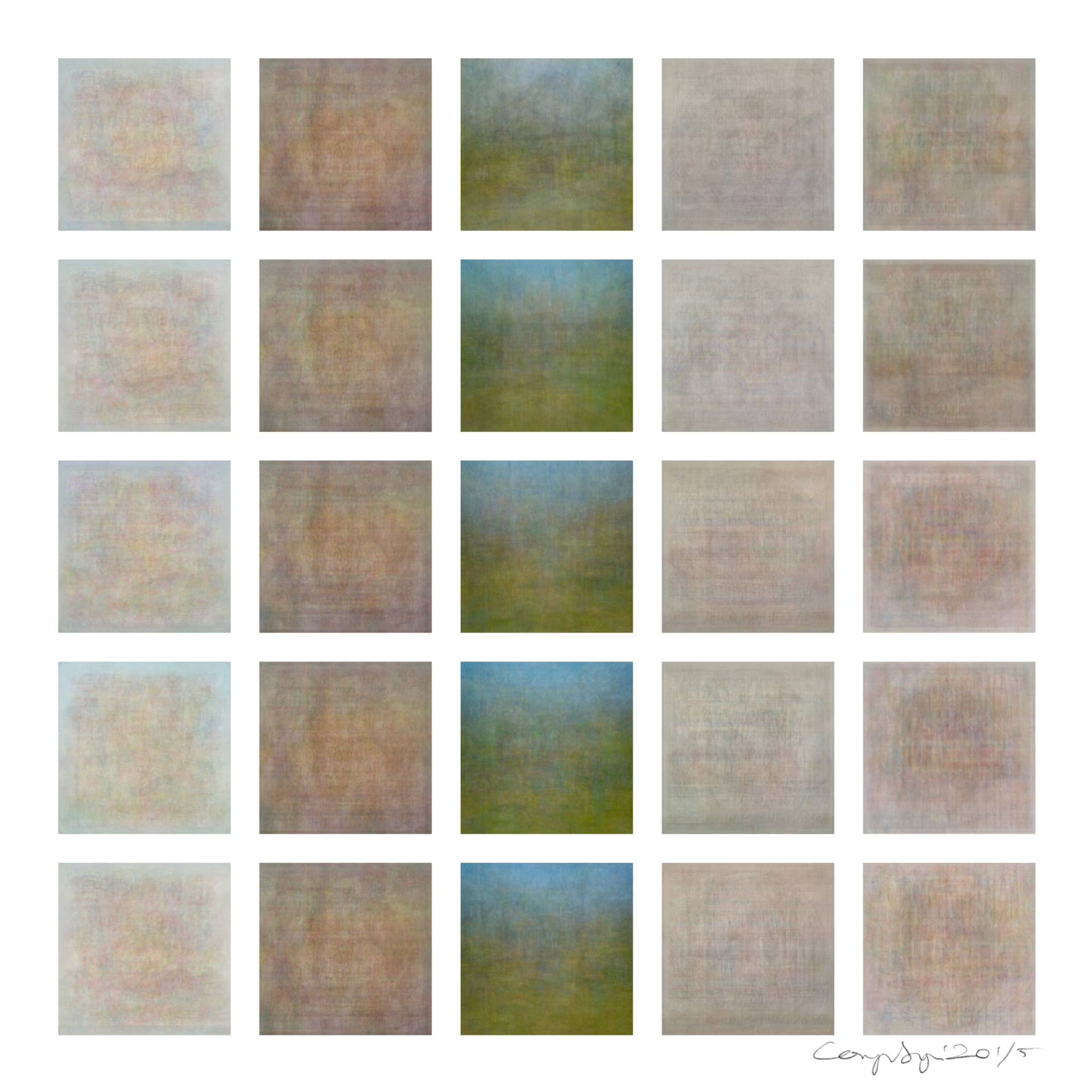
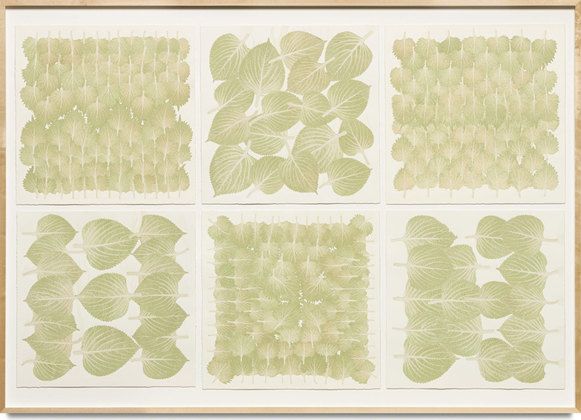
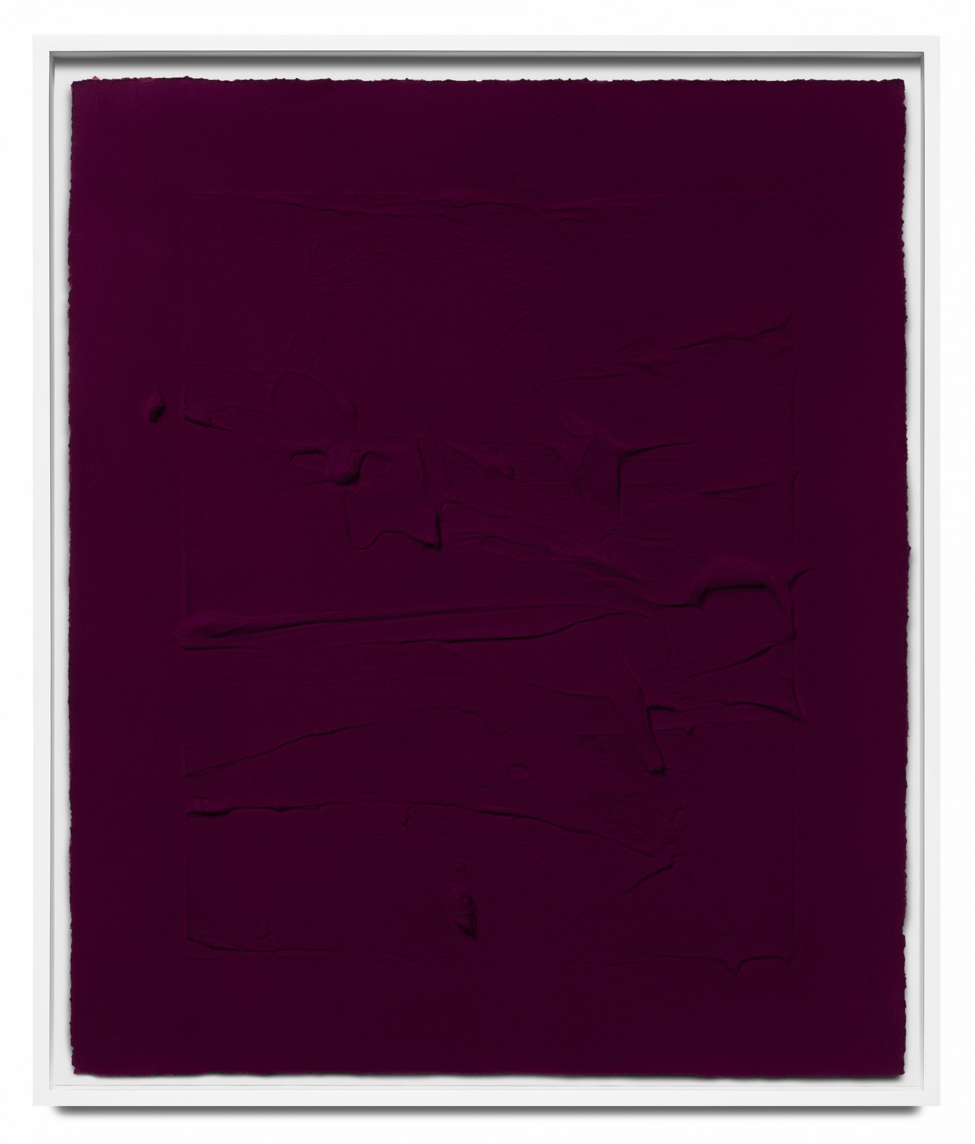
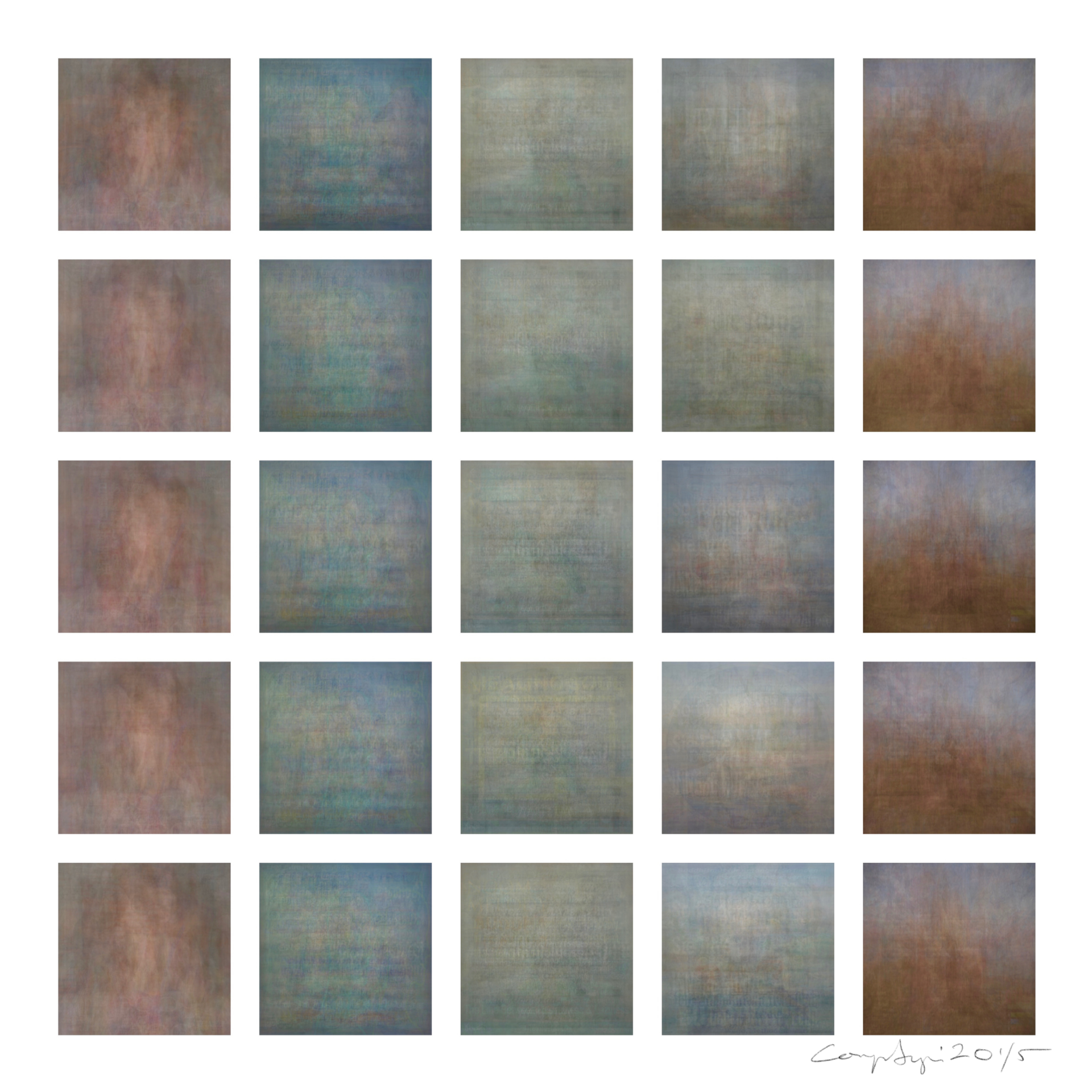
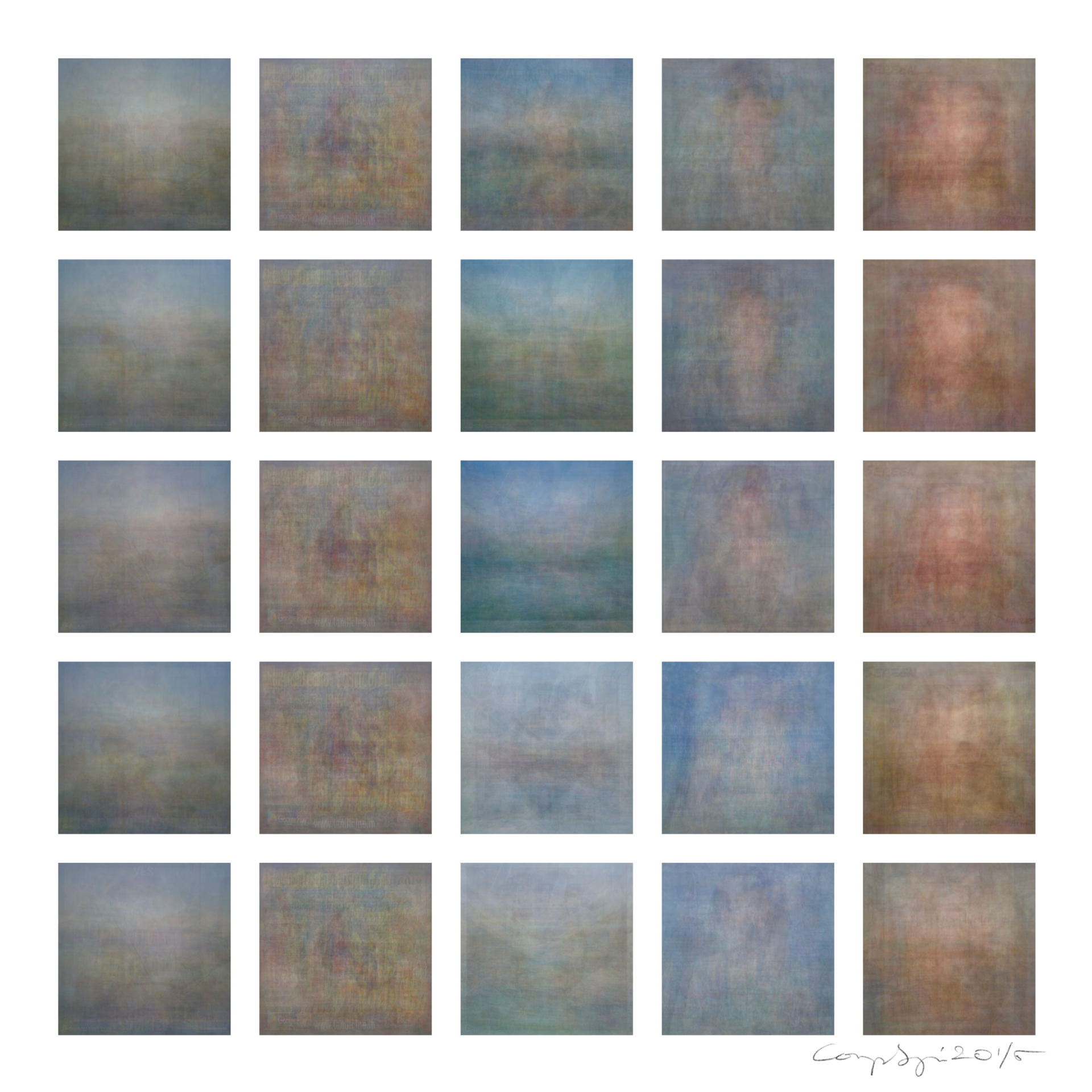
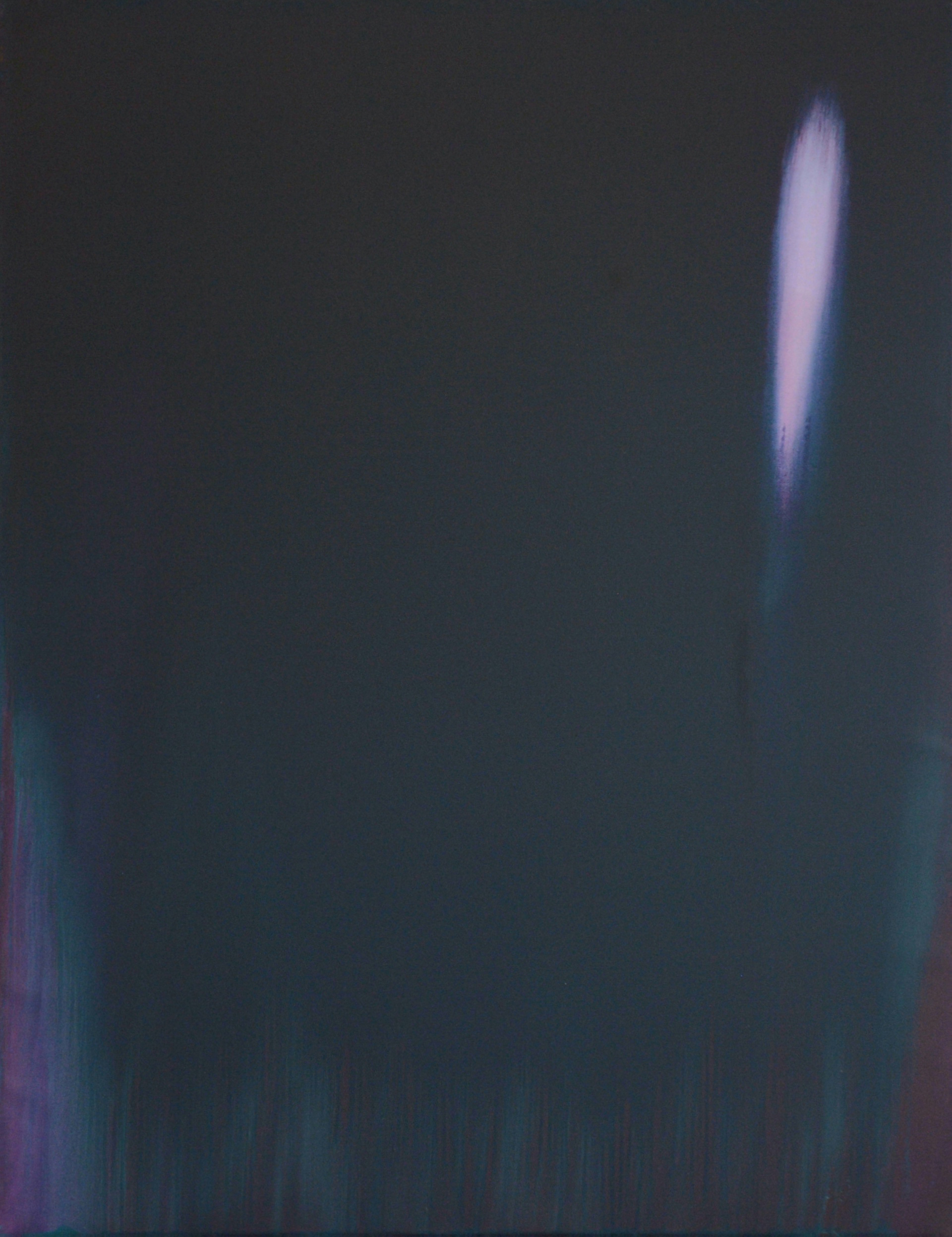
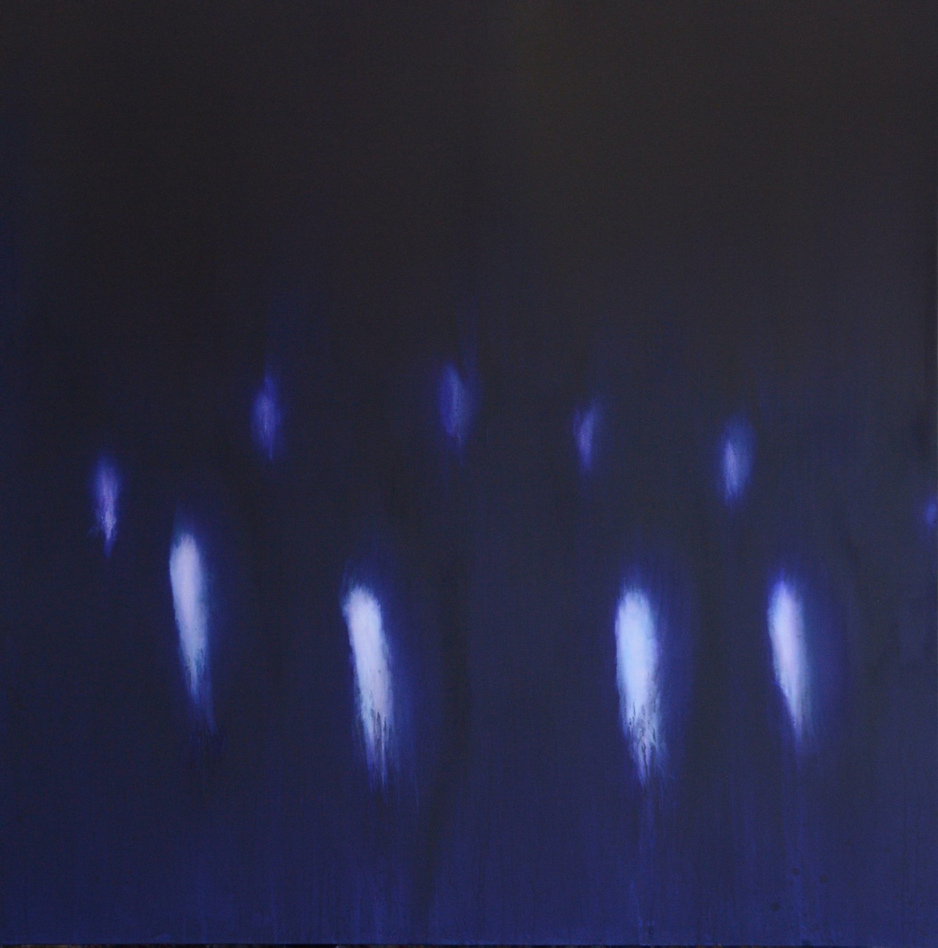
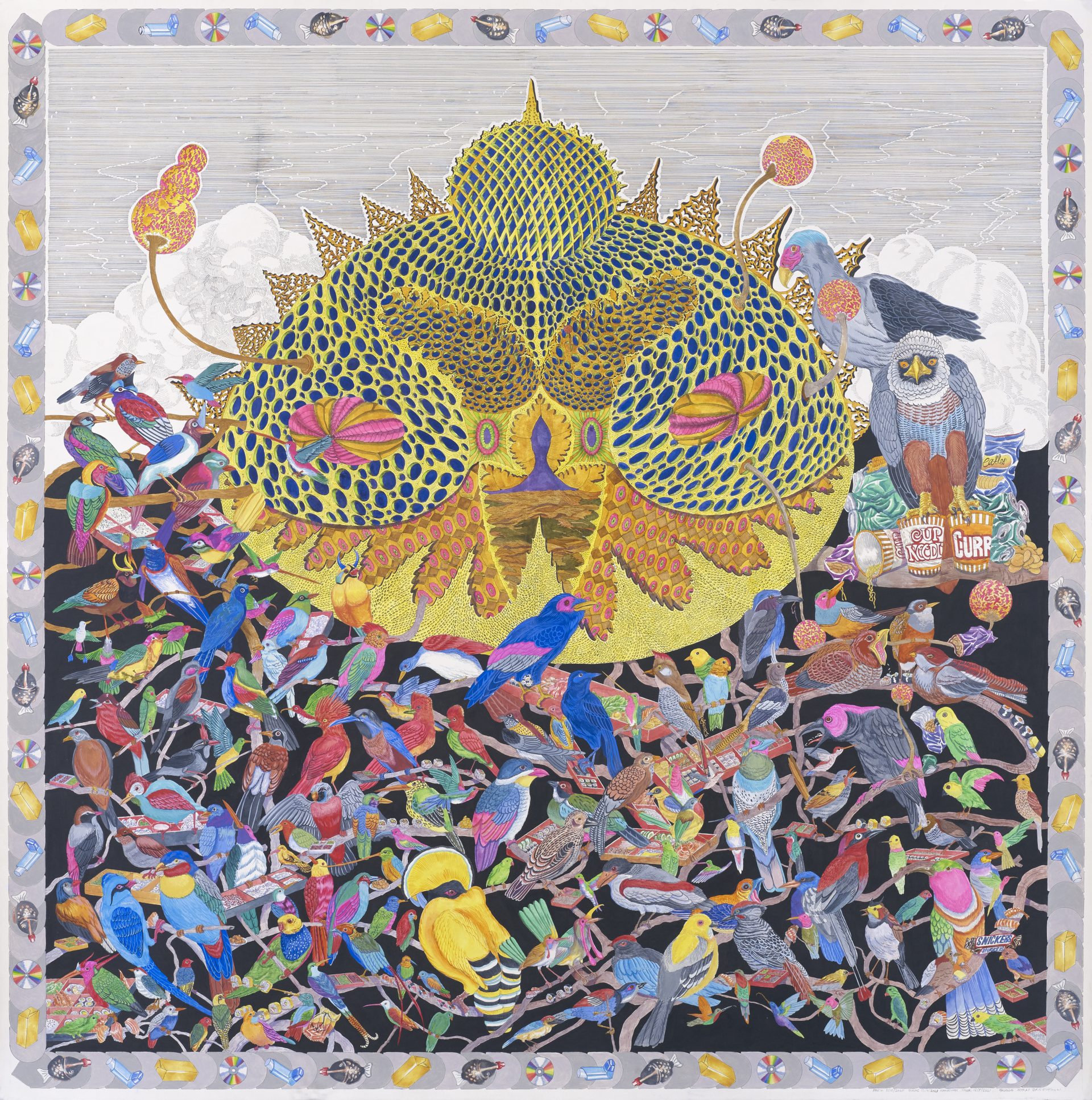
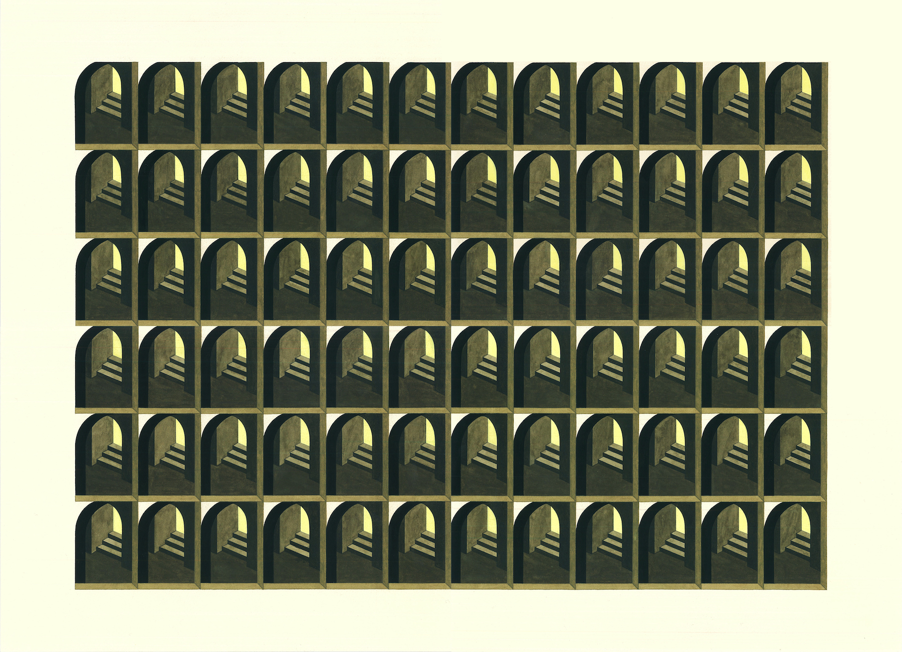
Artist: Comp Syn, Mark Chu
Title: Colourgrams – Pleasant
Columns (search term): 愉快, இனிமையானது, pleasant, angenehm, aangenaam
Rows (search location): Singapore, Bangalore, New York City, Frankfurt, Amsterdam
Year: 2020
Medium: Inkjet print
Artwork Size: 100 x 100 cm
Edition of 5

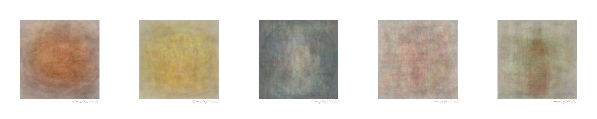
Artist: Dawn Ng
Title: A Pretty Girl in her Underwear if There’s Anything Better in this World Who Cares
Year: 2020
Medium: Digital Print
Artwork Size: 100 x 100cm (unframed)
Edition of 3 + 2 AP
Sullivan+Strumpf Gallery
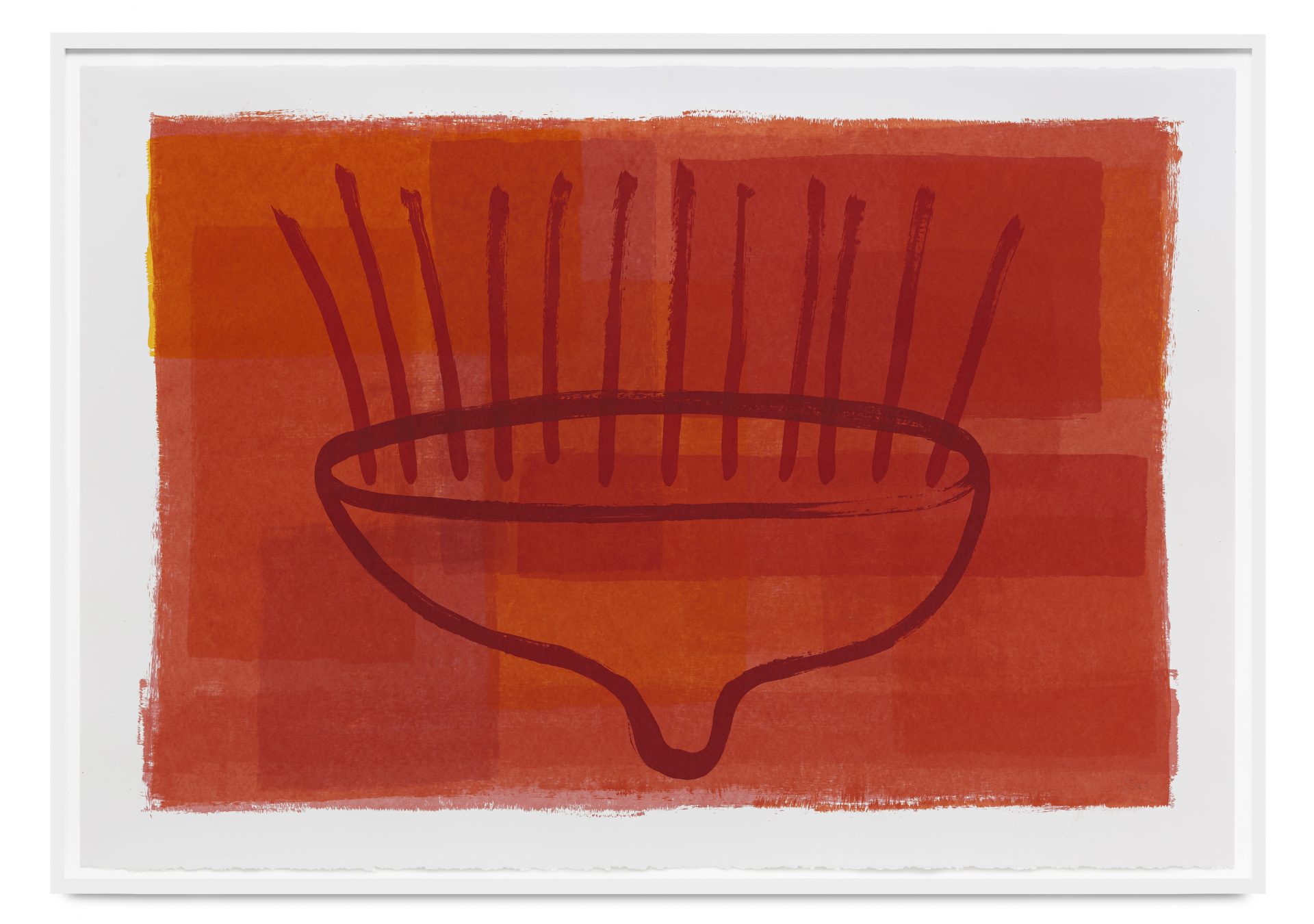
Thai contemporary artist Pinaree Sanpitak (b. 1961, Bangkok) is one of the most highly acclaimed artists of her generation, best known for her practice centred on the female body and its forms. Since her photographic collages of the early 1990s, Sanpitak has consistently reworked and reshaped the breast-stupa— a commonly recurring motif in her work— with a diverse range of materials. Examples include Noon-nom (2001-2002), an interactive installation featuring breast-shaped pillows, and Breast Stupa Cookery (2005-present), an ongoing collaborative project where Sanpitak invites chefs to create meals using breast-stupa-shaped cooking molds.
Sanpitak regards the breast-stupa as autobiographical, drawing upon her identities as a woman and a mother. Notably, however, Sanpitak also directs our attention toward the universality of the shape.
At first glance, it might seem difficult to detach the breast-stupa from its associations to Thai Buddhist culture and the female body. How might we find other ways to relate to Sanpitak’s artworks? What else can we find that would resonate with our own experiences?
The domical form, both in Sanpitak’s works and as an architectural structure, has housed a wide range of meanings: from overturned alms-bowls to vessels, to memorial mounds and heavenly dwellings. Sanpitak’s works, in their simple yet distinct forms, take on some of these connotations to create atmospheres that invite contemplation and reflection.
Throughout her career, Sanpitak has pushed the boundaries of form, material, and participation. At Appetite, we expand the ways in which her works can be experienced and received— not in a white cube gallery, but a relational and multi-disciplinary space.
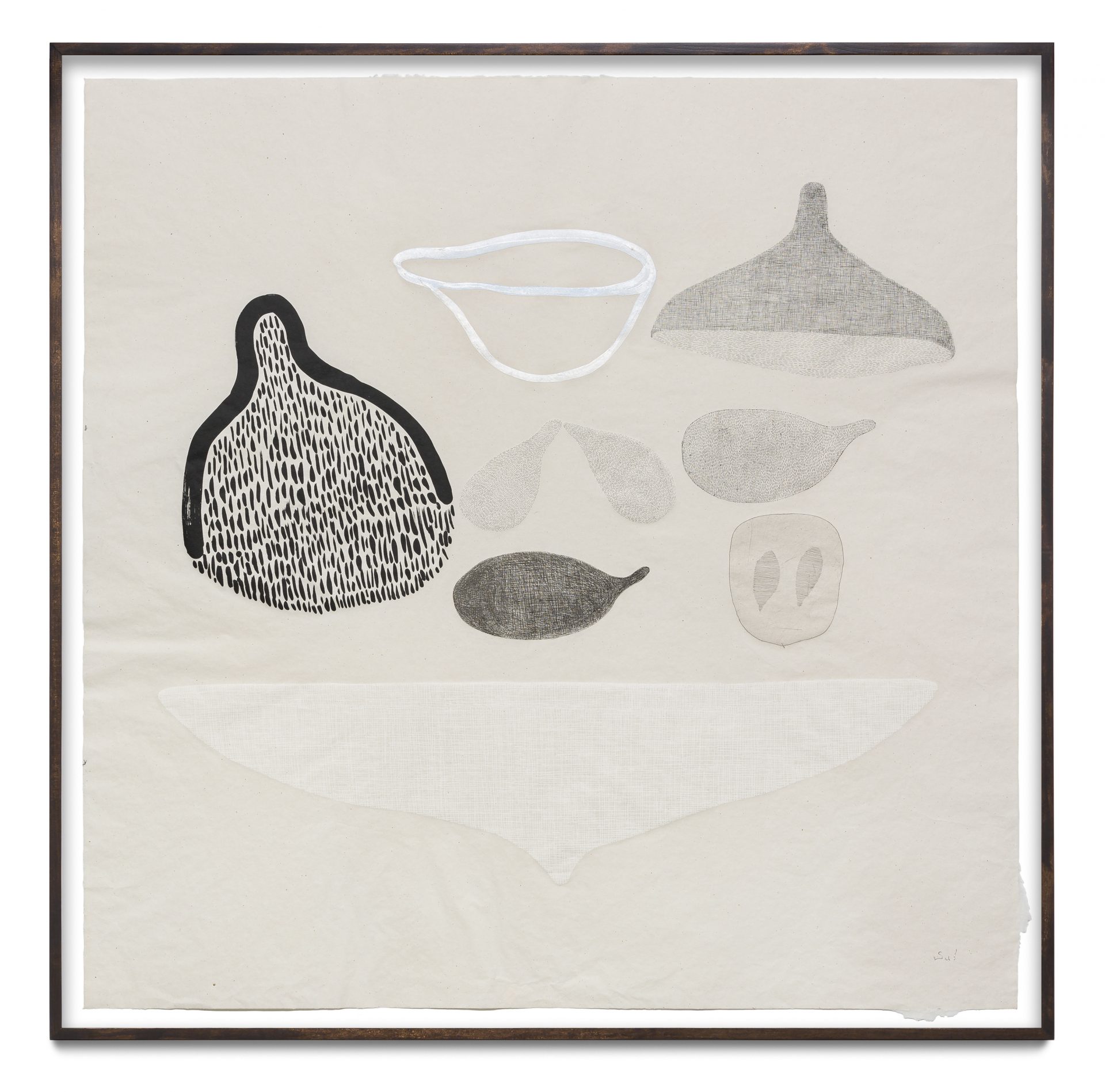
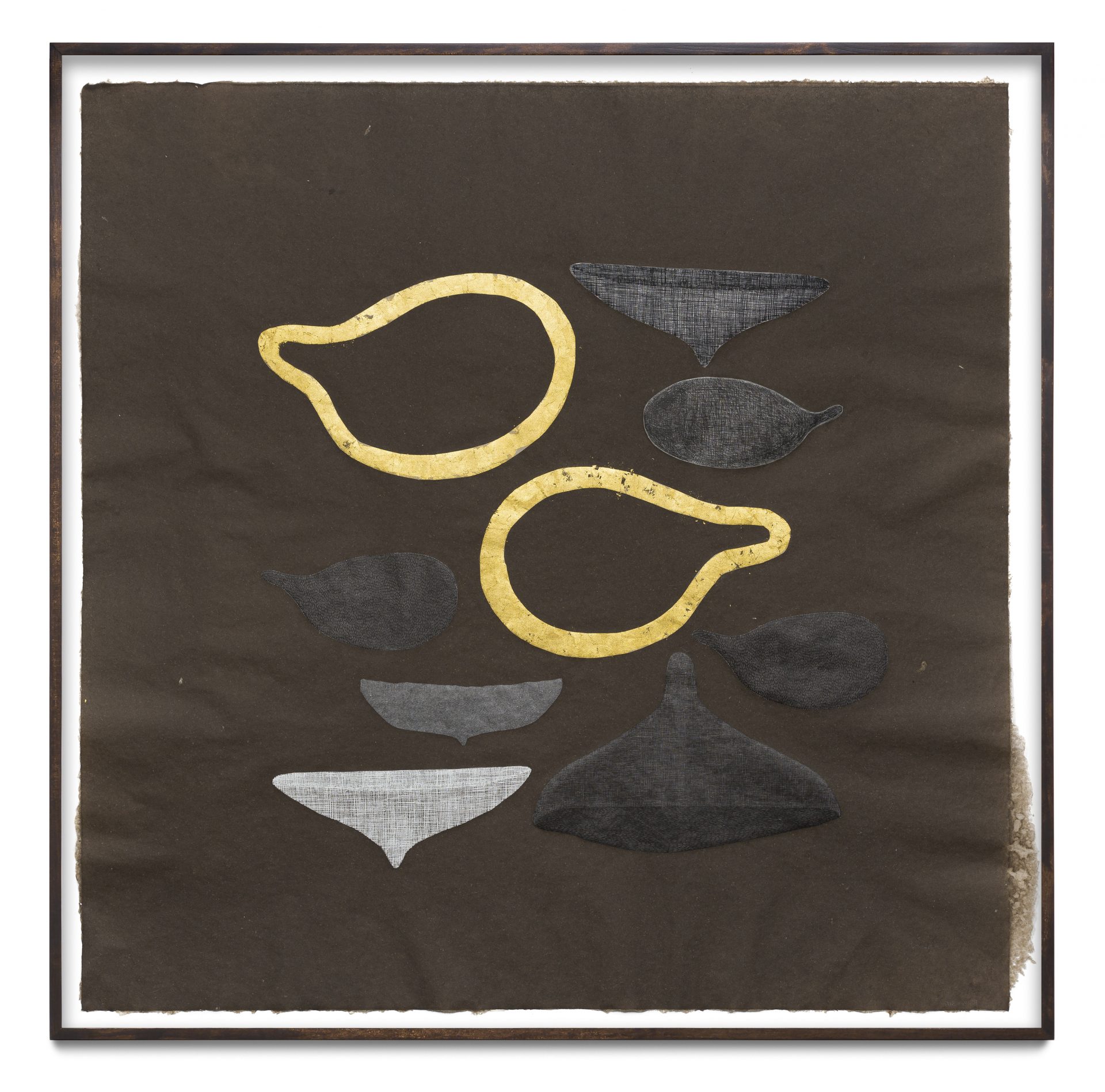
Yanyun Chen (b. 1986) is an emerging visual artist based in Singapore who runs a diverse practice. While her foundations are grounded in classical drawing and animation, Chen has also produced a number of notable installation projects, such as The scars that write us, which was awarded the People’s Choice Award at the 2018 Singapore Art Museum President’s Young Talents Exhibition. This project, as well as her subsequent solo exhibition Stories of a woman and her dowry (2019), takes on an auto-fictional lens to examine the female body and its inheritances, in particular the ties that bind a woman to her family.
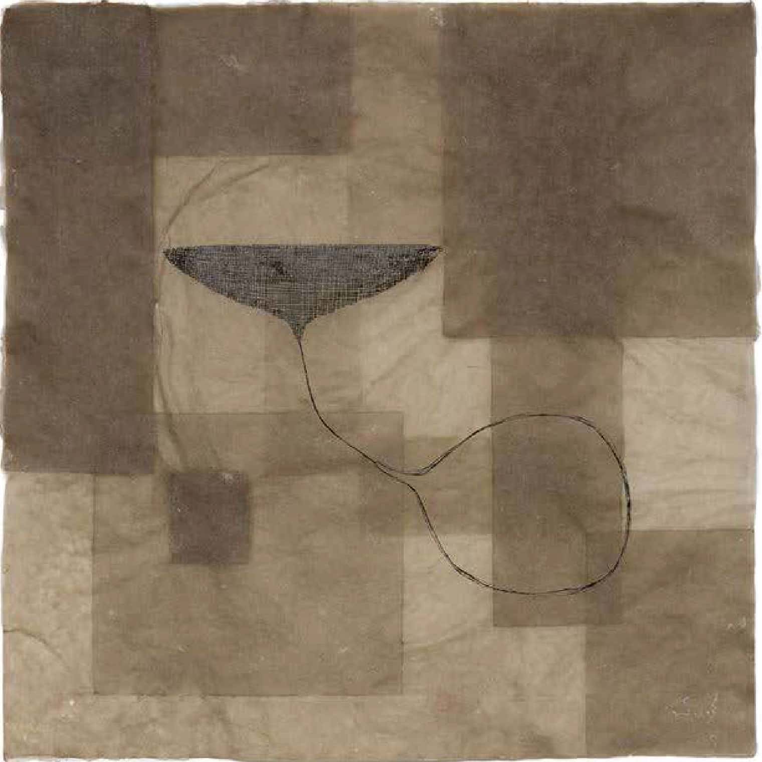
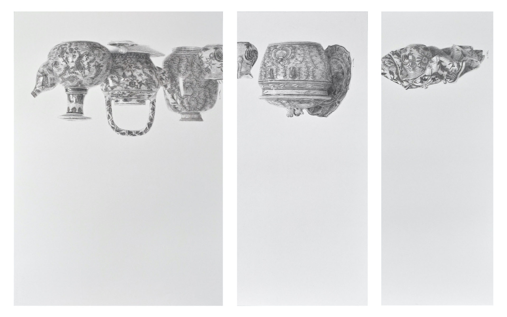
Hills Like White Elephants anticipates Chen’s artistic shift towards the female body and its experiences. At the same time, this triptych is also an excellent representation of her charcoal-based drawing practice, which inquires and subverts techniques and traditions of academic art forms. Charcoal has been historically considered by Western artists as the medium of unfinished work. By using charcoal to create intricate compositions reminiscent of the 17th-century Dutch still-life tradition, Chen challenges conventional perceptions of charcoal while simultaneously showcasing her mastery of the delicate medium.
Chen embraces these complexities with precision and provocation, offering personal answers and universal questions. What do we do with the cultures, stories, and expectations that we learn and inherit? How do we negotiate our place between the past and the future?
In Conversation with Yanyun Chen
Kathy: I’d like to begin by sharing a bit about why we wanted to present Hills Like White Elephants as part of the She/Her exhibition. We were drawn to your interest in the female body, its forms and experiences. This has been a recurring subject for you, especially within the past two years with projects such as your solo exhibition Stories of a Woman and her Dowry, and the short film Women in Rage, which very recently won Best Animation at the Q3 Prague International Indie Film Festival. Hills Like White Elephants predates both of these projects. We were particularly interested in this series, because apart from its subject – which you’ve explained as a reflection on feminine personhood – there is also an element of how this work is, in a way, cross-cultural. Visually, we have the metaphor of the flower vase, whose Mandarin term 花瓶 also has connotations of a “woman-on-display” (essentially suggesting that this woman only serves to provide visual pleasure). On a literary level, the title of this work refers to a short story by Ernest Hemingway, which centres on a conversation that is implicitly about abortion. I’m wondering if we could talk about the significance of the Hills Like White Elephants triptych to you. What drew you towards creating a visual response to Hemingway’s short story?
Yanyun: So the work wasn’t actually done in response to the Hemingway story. I was thinking a lot about the notion of the 花瓶 – the flower vase, and I’ve always wanted to do a work with that very classic blue and white china, or porcelain, either from the Netherlands or from China, because I just always liked that visual. It just so happened that there was a porcelain factory in Singapore that was closing down. I made a trip to go and see all these pots and bowls and it was just the kind of visual that I was looking for. And since they were selling it for cheap I just bought a whole bunch.
When the opportunity came for me to do a sort of still-life set-up, I arranged it, and I knew in my head I wanted to do a triptych. I have this habit when I draw, which is, when I’m close to say about seventy percent done, I actually turn the entire drawing upside down to check the work’s visual balance. With this work, when I did that, I paused, and couldn’t see it any other way. And I thought I was doomed! Because I did not plan for this, you know.
One of my friends- Jeremy Fernando- saw the work upside down and asked if I had read Hills Like White Elephants. I think the lines clicked together right after that. It’s been a while since I read the short story, but I always remember its textures. In the middle of the conversation at some strange moment, the female protagonist turns away and says “those hills look like white elephants.” And that’s all she says, but the pregnancy of that phrase sort of glued itself to the visuals— the suspended conversation; the suspended possibilities. Things that are very fragile and very important, are still. The world is there. And so all these sensations made this work.
Kathy: I think our approach to reading your work was very different from the process that you just described, because we saw the title and assumed that the story preceded the drawing.
Yanyun: It was a connection that happened by accident, that came while I was doing the work and trying to figure out what I was doing. I think there is something very beautiful in those moments when you thought you were going one way, something just veers you off course, but actually gets you closer to what you’re trying to do.
Kaushik: I’m interested in the associations in your work— porcelain and the fragile woman on display, voluptuous figures, but at the same time there is an undeniable strength and empowerment to the work. How do you see this tension between being read as both feminist and anti-feminist?
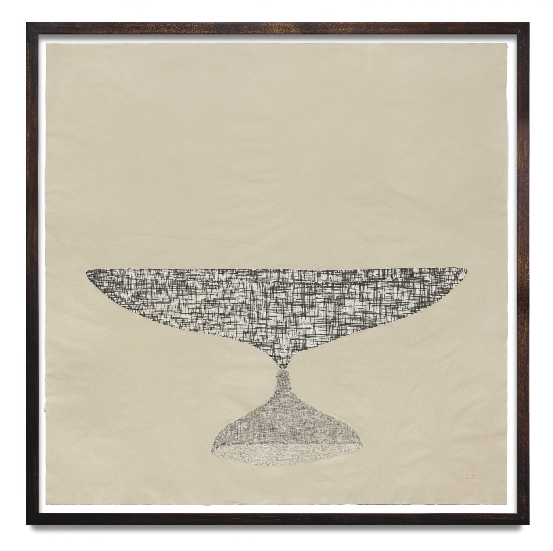
Yanyun: You could definitely say that I am perpetuating certain tropes. I’m borrowing from the notion of the vase, the female vase, and I am perpetuating it. But I cannot run away from something that is just right there, especially since I am responding to, drawing from, and speaking about it. But at the same time I think of that moment of suspense, visually how these porcelain objects are hung in the air, suspended, which changes our associations with the trope of the female vase.
And the fact that, yeah I cannot control who sees the work and how they see, and the kinds of baggage that comes with their visual experience, right? Because when I displayed the work previously in a show, we got all kinds of comments and I always enjoy listening to what people think. You have the ones who appreciate it a lot because it’s so classical – they love the fact that it is so classical, and then it makes them extremely uncomfortable with the fact that the porcelain is upside down. And then there are the ones who get the contemporary links but really don’t like classical drawings. Because they feel that it is perpetuating some kind of tradition, or approach. But it opens up people’s assumptions. A lot of people were like, “Why did you make it into a triptych? Why did you divide it into three, but not evenly and it’s kind of a reductive scale, at the same height but it gets narrower and narrower as you go?” And the biggest part has the most white spaces. To be honest I have no answer for that, it just naturally evolved and it had to come this way. There is also discussions on the significance of porcelain objects, this particular kind, the Dutch blue and white porcelain, and the conflicts in history with Chinese porcelain. Who came first in this aesthetic? Who did/does it better? It’s kind of a perpetual kind of debate if you read up on porcelain. These objects that I have, they’re not the refined stuff. They were made from a Singapore porcelain factory, you know. They’re not special, actually, they’re uneven and very wonky. So there are all these connections that come to an object like this that are very fascinating to play with.
Kathy: This next question came out of thinking about your visual metaphor of the woman on display, because I thought that it was interesting how by using charcoal to depict porcelain, it’s like rendering it as a two-dimensional object, and in this way the porcelain themselves also lose any practical purpose, and yet they’re also on display. I know that charcoal is a medium that you’ve worked a lot with, but I also noticed that in a number of other works you’ve also worked with different mediums, or had still-life drawings of flowers and an actual installation piece in front of it. So I was curious about how you decided on the medium for this work. Why did you decide to use charcoal?
Yanyun: Well, charcoal is a medium I’ve always been using that I’m very familiar with and like it a lot. I do remember when I first started the flower series the thought that I had was, “Ok, these Flemish paintings of flowers: it’s just one of these iconic images that when someone mentions the term, you can recall an impression of it. But, it’s always in colour.” So when I was trying to figure out what to draw I thought about it and went, “I’ve never seen it in black and white.” So I just tried, and the flower series grew from this familiar trope, just in an unnatural medium.
Same with the porcelain blue: we’re very familiar with the blue that comes with this kind of porcelain. And I just mentioned in there, everyone has their own concept of blue. It doesn’t have to be the exact blue, but it’s that blue on white. When you reduce the saturation, people still cannot see it as black and white. They recognize it as that kind of blue, on that kind of white, and that kind of vase. There’s a bit of fun for me to find something that’s very familiar, familiar to the point that you take it for granted that you actually know really well, and then use a medium that I enjoy very much to see what happens to the assumptions that we have in our head. Because, what if I told you that the patterns were not blue? What if I told you it was that red kind of, Chinese porcelain red that was patterned? It throws people off. Because they’ll ask, what do you mean it’s red? So it is a certain kind of assumption.
And I like these kinds of moments in making works which are just a bit off. It was an active choice to use charcoal. I knew quite early on that I wanted to do a piece that involved these kinds of porcelain pieces in charcoal, with a very white background. I wanted to see how far I can push an object that’s arriving, but also kind of disappearing. It’s a technique that I have been exploring for a very long time. I don’t explicitly talk about it because it’s so technical that, you know, unless you’re the one making the work it doesn’t really matter to anybody else. I like those moments where you can’t actually tell if something is disappearing, and it’s one of the things that I do in my classes – lost and found lines, when you look at an object like a transparent glass on the marble table, you see that there are moments in time when the edges disappear. That’s actually how we see things. But the nature of seeing evolved from our understanding of security and safety: the main reason that we can see stuff is so that we can stay safe, right? Safety means that you know where the edges of things are. You don’t want to fall down, you don’t want to bump into things. We assume that we are connecting all the edges, but we actually don’t see them. So it’s a trick of the eye – your mind’s telling you to be careful. Your eyes lie in that sense. It’s a bizarre technicality that your mind and your eye are in conflict.
Kaushik: Within the charcoal tradition, is porcelain a common subject?
Yanyun: Well, in the classical western charcoal tradition, charcoal has never been considered a finished medium. It’s always just a sketch, and it’s always meant to be thrown. Charcoal has always been considered a medium to get you into painting, but never as a finish point. In the academic tradition, no one finishes a charcoal drawing because it’s not necessary. There’s something about the tactility of the medium and the precision of it which is often not what you associate with charcoal, because charcoal is considered rough. It’s just ash, deoxygenated ash. But if you can push the precision of that to the point that you finish the work, it’s counterintuitive to the nature of the medium. I still haven’t reached a point where I want to work with colour as a medium. I mean, I do have works in colour, or lit to a certain colour, but they’re always as light and not as work.
Jean: We were just talking about charcoal before you came because Kathy was sharing about taking your class. The thing that I love about your work is understanding the technicality and how complex it is to grasp charcoal, and the eraser in respect to that tool in particular and how that technicality is highlighted in still-life. Because it’s always that tension, and exactly what we were saying about seeing, with your eye and your mind, and knowing what it means to render a specific porcelain vase in relation to the other bits and pieces of the entire arrangement. I think there’s so much magic in it because it comes from a place of a classical grasp, but we are moving into a contemporary take on the female, and what it means to talk about these ideals. Even when we were talking about ekphrastic writing, and reading off literary pieces, or responding to literary pieces, and pulling parallels between bodies of works, I think it’s such a complex piece of work to have in relation to the other questions that we will move into later on.
Kaushik: You have this super cool complication to the idea of ekphrastic writing, not exactly ekphrastic writing but ekphrastic painting and drawing, which is that we arrived at another work of art, in this case literature, through the process of creation. It’s not we see – we read the work then we draw, or we see the painting and we write, but it just so happens that your impulse or profession is to draw, and life is giving you literature. Life is giving you painting, life is giving you references. And that’s the next level of ekphrastic writing, that it depends on suspending these different elements. We’re actually saying like this exists all the time, the influence presents itself to you, and your work evolves from that, and I love that.
Yanyun: I kind of think that’s what we actually do. Like naturally, without paying much attention to it. I mean, we get influenced by things we do not plan for, and then your life suddenly takes a different course and you have no idea what’s going on but you’re just riding it as it goes. I think it’s more natural. And I guess, if you link back to my training, it’s always quite an interesting tension, because classical training is very fixed: it’s a way of doing things and you really go through the process of getting precision and polish. You know that there’s no other way to get there, but at the same time it’s the extreme limitations, in contrast with the extreme expansion that’s contemporary art. Because contemporary art is pretty much free association. Trying to find a space where my work can exist, that’s a constant question. Because you know, same work, you bring it to a certain kind of gallery they’ll be like, “This is too classical.” Bring it to another kind of gallery and they will say, “It’s too contemporary.” Bring it to another gallery, they’ll say, “Is this Asian or not?” It’s pulling too many threads and too many tensions at the same time that it doesn’t sit well in any particular mode or category. And I think that that’s how I like my works to be. I don’t see it as an isolated category… I mean it’s still a drawing. Fundamentally, it’s still an object that’s hung on a wall, right? But there’s more to it, I think. And life is way more complex than we give it credit for.
Kathy: Actually I want to go back to a different point – as you were speaking about charcoal, I was thinking about how using charcoal, it’s such a fragile medium because once you breathe too heavily onto it… it’s gone. Your work is also kind of between that stage of almost disappearing and still being there. I think another thing that got my attention was also your use of white space. You’ve talked about this before in your classes: the use of active and passive white spaces. The white spaces in this work are difficult to ignore, and as you said just now, it has a very suspenseful presence. You’ve also had other works that made use of compositional elements in Chinese painting, and I’m wondering if any of that came into this work as well.
Yanyun: I think I would then have to tell you one of the early works that I did in 2013 called Lady of the Seine. It’s a drawing, not very big, of a death mask of a woman. It was a death mask that is very common in academies. I was just drawing that as a school assignment, and then I thought, who is this person I’m drawing? So I did this long Google search and found out that this woman really existed. She drowned in the River Seine in France. She was just fished out from the water, and people were just mesmerized by how peaceful her face was, that they decided to make a death mask of her face. But this face was so sensational that it sort of created a fashion movement: there was a period of time in France’s history where that hair was a thing, and Princess Leia’s hair was supposedly based off that fashion trend. So when I knew this story I thought, okay, maybe I should make her look like she is submerged. She’s in and out of this surface of black, suspended. And the moment that idea hit, suddenly all my lines changed. Previously it was just a study of observation, just trying to get the drawing as precise as possible became, “I want to try and make her look like she’s floating out of black.” And so that, I think, switched my mind. The way I used space changed, and then, you know, when you are forcing yourself to see things a certain way, to create a thing in a certain way, then you realise that everything around it becomes very significant. Like every little blank space, every line, every value, everything becomes significant because you’re trying to create an effect. And that’s kind of very linked to the Chinese classical painting with white, because once you put a mark down you cannot go back. So you plan, or you train yourself to be so familiar with the use of the medium that you know how to create any kind of edge with just one go. So the use of white and charcoal, and black-and-white, they’re not that different. It doesn’t seem as far apart as it looks, like when you look at classical Chinese painting and look at a Renaissance painting they look like worlds apart. They feel like worlds apart. But when you look at the technique, it’s not. It’s weirdly similar, like, there are certain moments where you go, “Oh! So that’s what they were trying to do.” And one of the things that I was trained in when I was at the academy with charcoal and painting, is that you can’t learn how to paint unless you learn how to draw, and you can’t learn how to draw unless you learn how to paint. Because the limitations of one medium is superseded by limitations of the other medium. You have to learn both in order to see both, otherwise you cannot see. So when it comes to traditions for me as well, I needed to be familiar with both. In order to learn each other, it’s always like that. So I guess my understanding of liu bai, which is the Chinese classical approach of leaving white came from studying western academic drawings. And my understanding of how brushworks, and shapes and sections and this approach in Western drawing came from classical Chinese painting. It’s just my way of learning things, that it sort of flipped.
Jean: I particularly love Wu Guanzhong’s transition from ink into ink and abstraction, or ink and white space, like rendering traditional buildings and scenes with so much negative space. And what you just spoke about made me think, that’s precisely where a lot of the magic happens. And he’s such a seminal figure in that time and transition as well.
Yanyun: I love how obvious this is in his work. It’s very useful in class, because then you can, “Nah, you see right!” It’s so easy to use as a visual, and also as a way of learning what the two classical traditions are trying to do. I think the cliche here is “East meets West” but it’s actually not. It’s “technical tradition meets technical tradition”. It’s just different traditions, different philosophies meeting each other.
Jean: When we encountered Hills Like White Elephants, even though it was on a screen, there is an immediate feeling that hits you at your stomach. Because of the white space, it gives depth and distance, that you can imagine the vases, the pieces falling.
Yanyun: Yeah. The work is not balanced. And I guess it does, it will annoy anyone with classical sensibilities. It’s like, “off”. You know the term “pregnant silence” right? That’s how it feels like. It’s not silence. It’s a lot going on, it’s an active kind of white. Pregnant silences.
Kathy: It’s interesting how drawing, or art is able to visualise this kind of like, abstract idea of emotion, pregnant silence, which otherwise we might only feel but not be able to describe in any other way. I think now, the next thing I want to ask is, looking through the works on your website, I got the sense that Hills Like White Elephants is almost this turning point between this other period where you were investigating sixteenth-century still-life traditions, and this later period where your projects started taking on an autobiographical, or autofictional lens? And this is where female identity and the physicality of the female body also become very prominent. I’d love to hear more about that.
Yanyun: Ok, so, Hills Like White Elephants was 2018. And that was the same year I did The scars that write us, which was at the Singapore Art Museum, but it was much earlier on. And I think I showed Hills Like White Elephants sometime in August, and the SAM show was in October, there was that period of time. And I didn’t expect to be asked, I was really surprised when they invited me to do the President’s Young Talent show, I didn’t expect to be selected. I started to massively panic because okay, now I agreed to do a show, in a space fifteen metres long, and I don’t know how to do it. So in the midst of my panic I was going to see other shows, and I bumped into Ang Song Nian, the photographer and installation artist, and Song Nian congratulated me. I told him “I’m stressed out of my mind, I don’t know what to do. The space is so big!” He gave me really good advice: if it’s very big, then go as small as you can. So I sat there thinking, I see what he’s trying to tell me. And so I asked, how small can I go? I asked myself, what’s smaller than a scar? In terms of the works I was interested in doing, let’s go with the smallest but let me not go with the smallest work but the smallest topic. And so the keloid scar, I grew up with it so it has always been there. So I thought let me use that as a starting point, and see how far I can push this. That was how I started to trace a story. I got this keloid scar, I also know my family members have it, so I was like ok lah let me go chit-chat with them about what it was like. What is it like, actually growing up with this? It started to show that actually their experiences and my experiences are not very different. Which is – it hurts like hell, people ask you a lot of questions about it, and when you’re younger people just go ahead and like, “Eh what is this ah?” It’s a very personal experience. And even though it’s so common and so shared, no one actually talks about it in an honest sort of way. It also hurts my feelings when strangers go up to you and poke at your scar. It’s these tiny moments that became the significant part of the story. So I arrived at the shared experiences of scars and all the little tiny details that: if you’re a scar carrier of this type, or actually if you’re a scar carrier in general, with psychological or physical scars, you go through these thought processes. The same kind of annoyances, pressures, and just those tiny moments.
The autobiographical move was very much by accident. The reception of the work was also by accident, because at the end of the day I was very happy with what I had done. But there was this feeling like, I don’t know if anyone is going to care about scars. Fundamentally, who cares about somebody else’s scars? Though I guess there was a certain moment of confrontation when you walk into someone’s personal story, so close and so, you know it’s a fixed experience, that it connects with your own experience.
And so it’s this connection, that is like Hills Like White Elephants where dots start to connect, and then this experience, this kind of like things that link up to the next thing that link up to the next thing. So that was how that move happened. I had all these strangers coming up to me to flash me their scars. The institution was also worried that people would touch the works. They were worried that people would get upset about the fact that there’s boobs and there’s like, you know, pregnancy scars, and all these kinds of things in their face, and my final room is a bunch of text, like words on a wall. So these were like three taboos. You never go to a show and see a wall of text. No one reads the text. You know, and if you put an object there without a barrier people will want to touch it. If there’s nudity, someone is going to complain. And none of the three happened. I learnt that if you present the work well, and there’s a certain kind of sacredness to the way you present, people tend to be very respectful.
So it was fascinating, and a very very important learning journey for me, when a visual object changes from an object on a wall to an experience. Without changing the form, because they are still hung objects. I didn’t have any physical sculptural things. The experience changed. If you present images at a particular distance and it either becomes a very fast sequence or a very slow sequence, depending on pace of viewing. If you walk in a room looking at works at a certain pace, that’s the timing of the story. So if you space the works far, and you light it so it’s obvious that this is the way you’re supposed to go, you pace the viewers’ feelings out. So it was a test, and it worked.
Of course there was the whole social debate about whether you can speak for someone else. Right now the conversations about prejudice, discrimination, race, privilege, it’s all, to me, a fundamental question: can you actually speak for someone else? And the notion of authority as well. There was that moment where I had to contend with the fact that I was a woman, a Chinese woman in Singapore you know, of a certain tradition with a certain background and a certain kind of privilege with a certain kind of flaw… these things became very obvious. But it also meant that it became my arsenal. I came with this toolbox, whether I like it or not. I gotta use it. And so the show, Stories of a woman and her dowry, came from that reckoning. It was a reckoning that, yeah I have a bad relationship with my grandma. It’s really, that’s it. But also understanding that her generation and my generation are fundamentally extremely different. And as much as I don’t agree with it, it is also a revelation of the times. So it is that tension between the positions of the woman in two generations. My tensions and disagreements with my grandma on a personal level, and the anger that I have comes from her source, and so they clicked. So this is the sentiment that I have now, I would say, that when I became aware of, how do I carry someone else’s story?
Kaushik: It seems though, that, to the question, “can you speak for someone else,” you actually did, get close to an answer with the show itself, at the point of creation, you felt like all the works were deeply autobiographical, you weren’t even sure if the subject of scars would be relevant. But suddenly, you realised, through the process of exhibiting, that the autobiographical is actually universal.
Yanyun: There are moments, yes.
Kathy: One last question – you’ve explained before how the etymology of ‘yan’ describes the patterned surfaces of cliff facades. When I was approaching this work, I thought it was fascinating how the Mandarin title 悬念(xuan nian) – with xuan referring to a cliff, and nian referring to thoughts, it also brought to my mind an association with yearning, or desire, because nian the way I use it most commonly as xiang nian, which is thinking of something, like oh I want this, I’m thinking of this. For me, these associations added another layer of emotion to the drawings. Listening to you talk about all this, and from reading that short piece on your website, names, words and language, they all seem so central to an understanding of this series, because they are what give meaning to it. Could you share more about the role of language in your practice?
Yanyun: I went to a school called the European Graduate School, in Switzerland, for my Masters and PhD. One of the fundamental things that I appreciate from my many years there was their sensitivity to words. I learnt the significance of forming a question, and what a good question is. Because every word you choose has a different etymology, which is the historical baggage that comes with each word being used. The word etymology means one thing, but the gesture of etymologizing means a completely different thing. It’s conflicted. The word itself is conflicted, the whole study is conflicted. They are trying to do different things: one is searching for the essence of a word, and one is searching for the origin of the word. It doesn’t work. And there’s a beauty and an irony in that. And knowing that, breaking apart the word etymology and understanding what’s being done, how it’s done, that realization has forever stuck with me. That the meaning of things and how they are used can be so significantly different that it opens up endless possibilities of trying to understand a word. It’s never static, and etymology does not have a linear storyline. This word was being used, then this word was being used again, then suddenly in a different time it means something else. Someone else hijacks the word, or colonizes the word, turns it into some other being altogether. It’s a very disjointed history. Knowing that meaning is non-linear was very significant. Meaning is highly dysfunctional, and so if you embrace it, you can create any kind of thread between things. So long as it logically makes sense on some level, on some level if it clicks, it will click, and click very well. My experience as a postgrad was all about trying to understand what it means to ask a question and what a question is. Language becomes very significant because I’ve become way more sensitive and way more careful, and way more articulate. I was very not as articulate before my postgrad, because I saw the world visually. I work visually, I never had to use words. And that was one of the flaws that I had. I needed to skill-up and try to understand what the hell I was trying to do and say. So that changed my own journey, this was even before I practiced art the way I do now. For me storytelling began from drawing and animation, that became training, became language, and then came back to storytelling. Right now I’m at this stage where story is very significant and there’s only that many autobiographical stories you can tell! And I think what I’m reckoning with is what kind of stories do I want to tell now, that is not about me, that moves out of the autobiographical for the moment to let experience happen, then I collect more things that I can actually talk about. That’s all language.
In 2015, Lim’s works were presented alongside those of six other photographers in Rediscovering Forgotten Thai Masters of Photography, an exhibition led by Thai artist-curator Manit Sriwanichpoom. An instinctive reaction to this project title might be to ask: What made these photographers’ works distinctively Thai, and what made them especially masterful?
Lim’s images resemble the aesthetics of 1960s Hollywood far more than Thai iconography of the same era. His 1967 femme fatale portrait of Phusadee Anukkha-montri, for instance, features a Mauser C96 pistol, popularised in the James Bond film From Russia With Love (1963).
While femme fatale archetypes are often pejorative in American cinema, the women in Lim’s photographs are proudly celebrated. And for good reason. The 1960s was a golden age for Thai cinema, and in 1965 Apasra Hongsakula became the first Southeast Asian winner of Miss Universe. Actresses and models were not only the faces of beauty pageants and local billboards, they also became representations of a modern Thailand on the world stage.
How do individual and collective identities collide, and how does visual culture mediate this relationship? Archive and mirror alike, Lim’s photographs open up new ways for us to understand our own time.
After graduating from the prestigious Royal Academy of Fine Arts, Puipia launched his own label SHONE PUIPIA in 2017. He works from his central Bangkok studio and multidisciplinary space, soi sa:m.
The son of two established Thai artists— Pinaree Sanpitak and Chatchai Puipia— Shone grew up drawing cartoons and imagining fantasy worlds. Today, his collections draw inspiration from the likes of Grete Stern’s surrealist photomontages, Sarah Sze’s installations, and David Hockney’s graphic compositions.
In Conversation with Shone Puipia
Kathryn:
Thank you, Shone, for taking the time to talk with us. It’s been a pleasure to dive into your work the past few weeks. We have a few works from both your Wild Bunch and Brighter World collection for Appetite’s inaugural show, She/Her. That show features artists that explore and work with the female form. What is so unique about your work is that your designs tell stories and your collections have really strong narrative qualities. How exactly do you go about telling a narrative through textile? Are there certain looks in the collection that you see as points in the narrative arc?
Shone:
For the Wild Bunch collection, it is really about the narrative. From the first to the twelfth look, the textile, the material, and the techniques really tell the story. I really wanted to start with references to actual Victorian garments – pieces in white fabric. The collection is an alternate story to the movie, Picnic at Hanging Rock, so I wanted to investigate her travel through the woods– what could happen there. So the pieces have this raw quality. Raw and frayed edges. The collection starts off white and pure, then I inject colors and more wild elements like the fur I made by felting yarn and feathers together. In the beginning, there is the second look where the fur is just on the back of the white dress — hidden red and oranges. By the end, it’s really an explosion of materials and colors.
Kathryn:
I had read about your warp painting technique and was wondering if the fabric for that look’s blouse was made using that technique?
Shone:
For that kimono, I worked with Jim Thompson, the company that makes Thai silk. I was really interested in this technique where they print the pattern onto the yarn before it’s woven into the fabric. You get this blurred out effect from the shifting of the yarns. Their examples were more abstract motifs, but I wanted to see what it would look like using photographic artworks. So, I made a garden collage with flowers, plants, mixed with shells. That was the source of the fabric.
Kathryn:
In that collection you explore the dichotomy between the innocent Victorian girl and this wild, sexually liberated woman. What are your current and past conceptions of femininity? How has your understanding of womanhood changed over time?
Shone:
When I was in school, I created characters based on icons, figures in movies, or people I was inspired by. I would make this “ideal” woman for the collection. Increasingly now, since the collections are not purely womenswear anymore, it has become something very personal–what I want to wear, what I’m feeling at the moment, what the people around me want–my mom, my clients, people I meet at the show.
Jean:
I am very curious as to how you choose these icons. What stands out to you in these women?
Shone:
I like strong female characters. These girls from Picnic at Hanging Rock– they are wild, they broke away from formality and went on this adventure. A collection I did in my second year of school was based on the Royal Tenenbaums; I was drawn to Margot Tenenbaum. She is very feisty, and that’s what I really liked in her character. They have… somewhat masculine qualities to them–they aren’t traditionally feminine. That’s what I try to evoke in my work as well.
Kaushik:
While we’re on the subject of both Peter Weir and Wes Anderson, could you tell us a little bit more about your love for film? How long has it been a part of your life, and when did you realize it would be core to your practice?
Shone:
We’ve always been a movie-watching family, even pre-COVID. We would always go to the cinema every week to catch all the movies. You can get a lot out of a movie–storytelling, moving narratives, a certain aesthetic quality. Films take you somewhere else, and I feel like that can also be applied to fashion.
Kathryn:
Soundtrack is also another element to films. I noticed for the Wild Bunch show, you chose a Creedence Clearwater song, which I loved.
Shone:
Yeah, for that show, I really wanted to create a fun moment. It was the ending collection for that night.
Kathryn:
Could you discuss the increasing role that androgyny plays in your practice?
Shone:
I started out in womenswear, but I felt like I was missing out on all these fun clothes. I like to dress up, and I often cannot find what I want to wear in the market. So, it was really a decision to put myself into the collections–really making clothes that I would want to wear. Now, I don’t see clothes as having gender. If you want to wear this or that, it doesn’t really matter. If it looks good and you like it, it’s something you should go for. That’s what I have wanted my recent collections to be about.
Kathryn:
Your mother’s work is also featured in the show, and I was hoping you could speak about your working relationship with her. She’s joked before that part of her job is to be your assistant. How do you work together, and how do you influence each other?
Shone:
We always see what the other person is working on. It’s nice to have the opinion of a woman when you’re designing things for women. She doesn’t have a model-type body, so it helps to think of ways to design clothes for different body types. In terms of design, we give and take from each other in form and material. One of the main materials used in the collection–mawata silk (raw silk fibers)–I discovered through her installation work (called “The Room”). I was also there to help her with the installation. I wanted to use it in garments, but it’s quite a fragile material. I ended up encasing it in silk organza, so you still get the texture of the raw silk while still being a functional garment.
Now, for this new collection, other than the clothes, I asked mom and dad to make artworks interpreting the collection. Mom made calicot patterns for the collection. Dad made an installation. Grandma did cross stitching embroideries for the shoes in the collection.
Kaushik:
You’ve told us how your mother has influenced you. Could you tell us how you’ve influenced your mother?
Shone:
She started working with the breast motif after I was born. So motherhood was my influence! She started doing these “Bare Silhouette” works where she would place garments on the canvas; she got more involved in that type of work when I started working in fashion.
Shone:
There’s also that series she made of breast-stupa hats, and I was the model for that when I was really young.
Kathryn:
Your collages for the Wild Bunch collection really demonstrate your personal interest in celebrity culture and this type of fashion photography.
Shone:
I like these photographs from the past. I’m very attracted to this sense of nostalgia…this lost glamour. I don’t see those sort of characters nowadays. That’s why I go back to these kinds of photos.
Kathryn:
What is it like to have been born and raised in Southeast Asia, then going on to study in Antwerp and receive that globalized influence, and ultimately return to Bangkok to continue your design work? Do you incorporate those global influences into your fashion design, and if so, how?
Shone:
What I do now is very much informed by studying and living in Europe. Since I started doing the brand here in Bangkok and hearing feedback from people, they all feel that I’ve introduced something really different to the Thai fashion scene. I think I work very differently because of my experiences and the people I hung out with. My Antwerp years really inform a lot of what I do.
Jean:
Between Europe and Thailand, do you see any differences in the perception or ideals of what it means to be a woman? What does it mean to dress women of different geographies?
Shone:
When I was in Europe, we were all with other fashion students and they were all really fearless dressers. Coming back here, it’s much more toned-down. In the young generation in Thailand, I see more individualistic dressers. The culture has changed.
Jean:
Within this youthful, more daring group in Thailand, would you say ideas of femininity are also changing?
Shone:
Regarding gender, I think we see much more fluidity now. Everywhere but also here.
Kaushik:
I’m wondering if you think of your practice as political. How important is it to think about contemporary politics when designing your collections?
Shone:
I don’t think of myself as a political person or someone who is trying to make a statement. I do this to present a vision–a vision of what the world could look like, what people could look like if we disregard differences like race and gender. I don’t actively try to make a stand.
Kaushik:
We are very attracted to that idea you just described: to look past race, gender, and all of these other arbitrary differences. That’s exactly what we’ve tried to do as a restaurant for the past 3 years now.Have you thought about where this desire comes from? Why are you interested in this idea of an ideal world?
Shone:
For me fashion is about creating pure beauty–I’m trying to put this out in the world because I don’t see it around me. I think that’s my personal impulse to do this.
Kaushik:
Do you have a specific moment when you knew you wanted to be a designer?
Shone:
I fell in love with it through the craftsmanship of it. It was during my high school years when I was figuring out what I wanted to study. I was taking these French classes and these pattern-making classes. Once I started to take those, I really loved the craft and the skill side of fashion. Just like with my parents, to do this kind of work you need the skills, not just the ideas. So it’s very important for my collections that the making, the patterns, the finishing, and the construction of clothes are well thought out and well executed.
We’re still a small studio, so I work on the patterns myself. To be able to oversee every step of the process is very important to me. I am very hands-on. I guess I think of myself more as a coutourian, not like these big houses where the designer doesn’t even design anymore. I still really like this tactile part of the work, to be hands-on with the pieces.
Kathryn:
Has your dedication to craft and tactile engagement with your works been the main reason you’ve resisted venturing into the ready-to-wear genre?
Shone:
Yeah, I don’t want to become big and then have to compromise. I would very much prefer that we work as a small team, making everything in house so that I can ensure the quality for my clients. It’s a practice I want to promote nowadays because I feel that it’s getting lost, especially in the wake of fast-fashion brands. I want to bring back this sense of craftsmanship and quality to clothes–something that will last a long time.
Kaushik:
We’ve just lived through a very strange three months. What’s on your mind about collections that are to come?
Shone:
It’s difficult now… I don’t have the perfect solution to it, but the dilemma we have now as a studio is what to create when people are not buying for quality anymore and instead turning to fast-fashion. When People are not going out and there are no events, it’s difficult to continue making these extravagant clothes.
So for the collection we just launched, it was suitable to the times. We decided to go with more solid colors–less of a focus on prints and extravagant details. It was more about separate pieces and showing the garment side of our work. At the end of the day, I would much prefer to go back to presenting something fun. We need that in the world.
A frequent traveler, she maintains a focus on the socioeconomic, political, and cultural histories of her worksites as a central source of inspiration. Her site-specific wallpaper installation Coordinates of Speculative Solidarity (2019) for Miami’s The Bass, for example, contends with the city’s precarious position in the face of climate change-induced severe weather, and the location-mediated unity that results from such events.
After graduating from Goldsmiths College in London in 1993, Martin began honing a very particular painting practice. Using a fine comb, the artist would sweep oil or acrylic paint across aluminium, stainless steel or Plexiglass to create swirling, monochromatic compositions, as in Detox (1999) and Lover (1997). 1997 marked Martin’s breakthrough exhibition: “Sensation: Young British Artists from the Saatchi Collection” at the Royal Academy of Art in London, where he stood out for the lack of figuration in his work. The Young British Artists (YBA’s) began exhibiting as a group in 1988 and became known for their shock factor, experimentation with materials and processes, and entrepreneurial savvy. The members dominated the 1990s art scene, and to this day are some of the world’s most successful contemporary artists.
In the 2000s, Martin began to blur the boundaries between painting and sculpture through his use of metal casting. For works like Sloe (2013), the artist raked plaster across a flat surface then cast it in nickel to create an unctuous, sculptural fossilization of mark-making.
Although he creates an intentional ambiguity between painting and sculpture, Martin holds color as a central thread across his practice. The artist returned to oil in recent years, exploring harmonic relationships between hues, as included in titles such as Untitled (Titanium white/ Prussian blue/ Scheveningen black) from 2018.
Jason Martin was born in Jersey, in the Channel Islands, in 1970 and lives and works between London and Portugal. Solo exhibitions include Lisson Gallery, London, UK (2019); STPI, Singapore (2018); Lisson Gallery, New York, NY, USA (2018); Thaddaeus Ropac, France (2018); Schauwerk Sindelfingen, Sindelfingen, Germany (2017); Museum gegenstandsfreier Kunst, Otterndorf, Germany (2016); Peggy Guggenheim Collection, Venice, Italy (2009); Es Baluard Museu d’Art Modern i Contemporary de Palma, Majorca, Spain (2008); Kunstverein Kreis Gŭtersloh, Gutersloh, Germany (2007); and Centro de Arte Contemporáneo de Málaga, Spain (2005).
Tiravanija’s work is a part of major public collections such as Guggenheim Museum, MoMA, Museum of Contemporary Art Los Angeles, and TATE London. He has exhibited at renowned institutions such as the Musée d’Art Moderne de la Ville de Paris, Chiang Mai University Art Museum, the Philadelphia Museum of Art, and has participated in the Whitney Biennial (1995 and 2005) and the Venice Biennale (1993, 1999, and 2015). The artist was awarded the prestigious Hugo Boss Prize in 2004.
The artist also engages with the natural environment to rethink different modes of life through collective experimentation. Co-founded by Tiravanija in 1998, The Land Foundation is a rural site outside Chiang Mai, cultivated as an open space with the intention to grow community, discuss agricultural philosophies, and implement renewable energy technologies. The foundation stems from Tiravanija’s interest in art as a non-commodity, as a way to imagine other modes of living. By establishing The Land Foundation, the artist challenges the conception of the artist as property, art as capital.
Tiravanija explores similar questions of social and political geographies through language and text. The “Less oil more courage” works from 2003-2015 allude to protests against Bush’s invasion of Iraq in 2003.
In 2016, Rondinone’s public sculpture Seven Magic Mountains opened outside of Las Vegas, Nevada, produced by the Nevada Museum of Art and the Art Production Fund. Other prominent solo exhibitions include shows at the Tate Liverpool, the Arken Museum of Modern Art in Ishøj, and the Rockbund Art Museum in Shanghai. Along with Urs Fischer, Rondinone also represented Switzerland in the 52nd Venice Biennale in 2007.
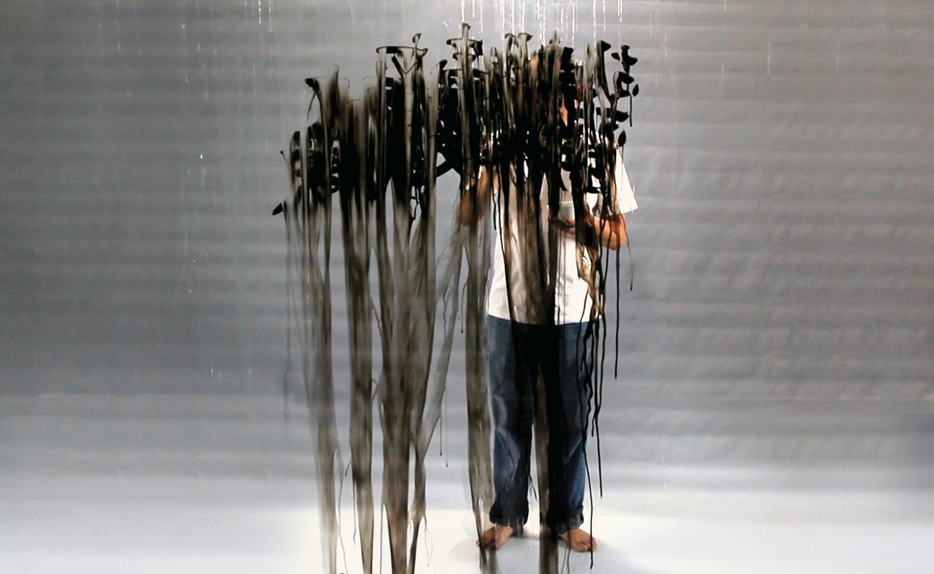
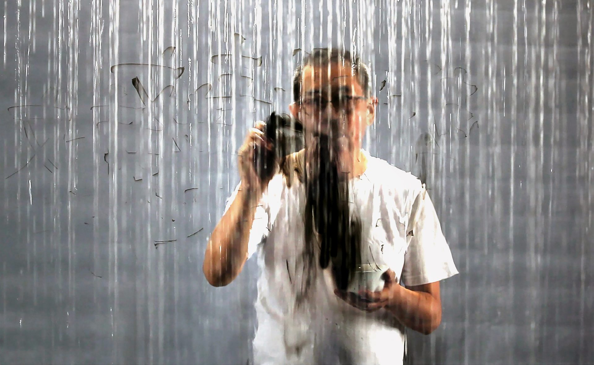
Mark Chu is an Australian painter who has exhibited in New York, Shanghai and Melbourne. He has been photographed for the New York Times, and enjoyed portrait sittings with luminaries such as French DJ Laurent Garnier. Chu is an accidental polymath whose interdisciplinary rigor spans significant breadth. He has recorded two concertos as a piano soloist with the Melbourne Symphony Orchestra. Completing his Criminology BA, Chu reviewed restaurants for Melbourne’s premiere dining publication The Good Food Guide and wrote fiction in The Lifted Brow. During his fiction MFA at Columbia University, Chu worked closely with the Atlantic City Arts Foundation, contributing public murals and editing an art book of intimate interviews which chronicled art’s civic importance during economic downturn. As a founding member of Comp-Syn, Chu has co-authored papers in computer science, and is currently working on quantifying interdisciplinarity.
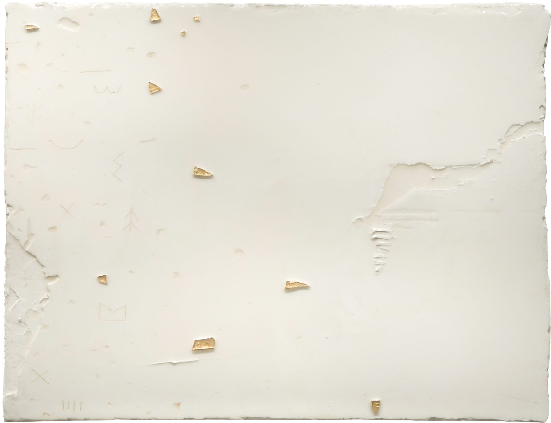
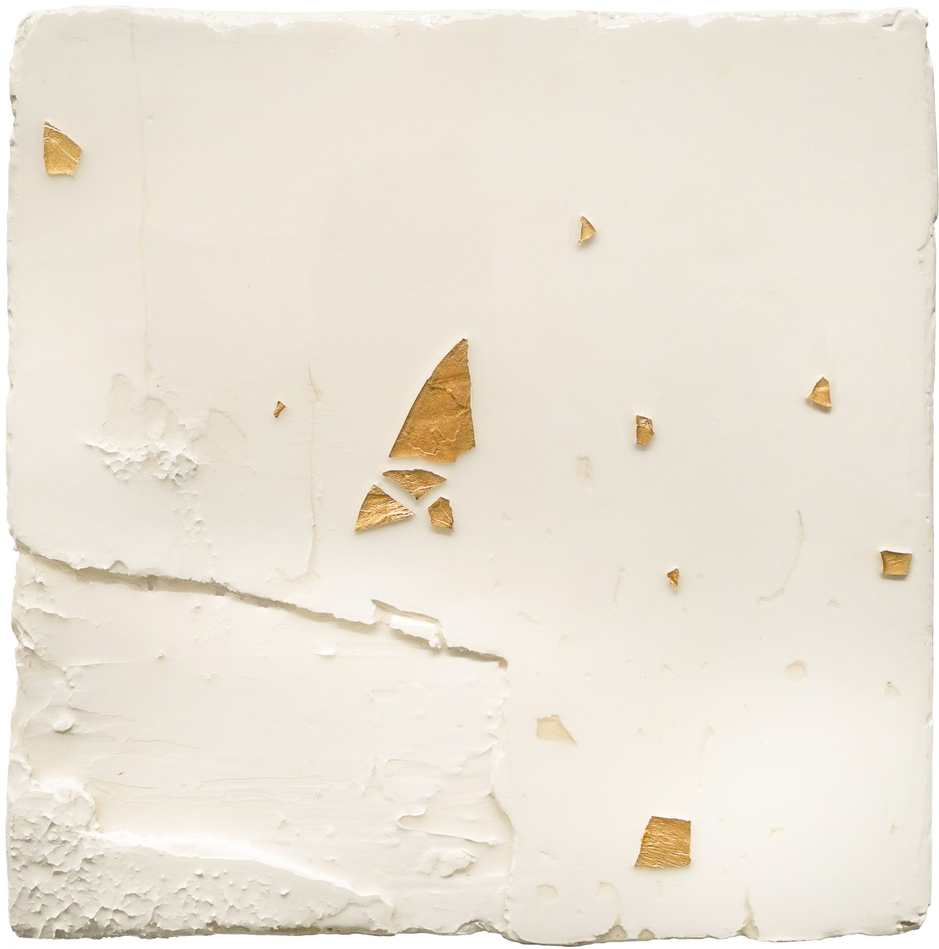
Appetite: While I was researching your work and practice, I learned a lot about the glyphs that feature in some of your pieces. I was fascinated by how they crop up in ancient rock art all over the world. How did you come across this archeological phenomenon, and what about them resonated with you so much that they’ve been incorporated into your art?
Ben: I questioned why I was doing what I was doing, and why artists before me did what they did. This led me to research one of the first works of human art – cave wall paintings. It was proof of a need to express symbolic thought visually, and even more remarkable is how these same marks and symbols were made independently all over the world. I find this very uniquely human ability to represent concepts with abstract signs inspiring.
A: What is the process involved in rendering these symbols into the plaster?
B: Plaster is a very easy and forgiving material. When wet, interesting textures can be made using trowels and scrapers, and when dry, can be sanded down or dug into. To best accentuate these symbols, I sanded the base plaster layer smooth before scoring in the drawings with wood carving tools. A final coat of resin is applied to fix the composition.
A: Additionally, a few of the titles of your pieces are references to mythological/literary archetypes and biblical allusions, and I’d love to learn a little bit about why these themes are significant to you!
B: A lot of the stories I was first exposed to were from the bible, and being brought up in a religious household, my values growing up were very attached to religious teachings and maxims. A lot of my first exposure to visual art was also in churches I would go to every Sunday. The biblical references in my work are a reflection of how stories of religious characters can shape you and how you see the world.
A: Your work touches on themes of human condition on scales that range from the anatomical, to the mystical/mythical, and to the inorganic environment we inhabit. What qualities of industrial drywall plaster renders it so versatile for engaging with these concepts?
B: Plaster as a medium does not have the same weight of tradition and history as say, oil or ceramic, and yet has continued to play an important role in art history – from Renaissance frescoes to the walls of contemporary art galleries. This contradictory detachment and dependency makes plaster a very fluid medium in exploring artistic themes and concepts.
A: Mythology (especially the Greek and Roman-derived canon of Western mythology) has a hefty legacy in visual culture, from Botticelli’s Birth of Venus to Rothko’s concept of art ‘taking over’ the role that myths and ritual used to play in channelling ‘unconscious energies’. What’s your take on the ways myths might still serve us in a (seemingly) demystified world?
B: Acknowledging the commonalities in myths and ritual across cultures and time periods shows us that either everything is made up, or that nothing is made up. I find that hanging on to mysticism allows us to have more avenues for connection, something that is wearing thin these days.
A: Is there anything in particular you’re interested in exploring next that you haven’t yet tapped into?
B: I’m currently developing a series of bone china ceramic works. In the 16th century, Chinese porcelain became a cult item amongst the very wealthy in England. However, the journey the porcelain wares had to take meant that a lot of it would be damaged en route. So the English invented a form of ceramic that mimicked the appearance and characteristics of porcelain, made from a mix of animal bone ash and stone, and called it bone china. A form of porcelain could now be produced locally to feed the demand and being more affordable, flooded the homes of the masses. Today, the largest producer and cheapest supplier of bone china is China.
As a founder of Gerakan Seni Rupa Baru, or the “New Art Movement,” Harsono has been a staple in the Indonesian contemporary art scene for almost half a century. He pioneered a wave of hyper-political art under a regime that forcefully depoliticised art. Physically, Harsono’s early work also distinguished itself from the traditional bounds of Indonesian art; he and the other Gerakan Seni Rupa Baru artists utilized everyday objects in their work, channeling the “ready-made” branch of art, made famous by Marcel Duchamp in the early 20th century. Works like Harsono’s Paling Top ‘75 (1975), which featured a toy gun in a wooden crate, overtly tackled the breaches of freedom that Indonesians faced every day.
Rising political tensions led Harsono to larger and more performative works like Destruction (1997), in which the artist publicly burned and destroyed the masks of the three legal political parties. The work called attention to the fraudulent electoral system and the long-time abuse of political power.
In the late 1950s, martial law was declared in Indonesia. Anti-communist politician Sukarno became president, and was succeeded by army-officer Suharto. The autocratic nature of Suharto’s presidency, called the New Order, came with great economic prosperity, but severe abuses of freedom. His rule was characterized by widespread propaganda, corruption, and human rights violations. Chinese Indonesians, or Tionghoa, were forced to assimilate: they were required to adopt Indonesian names, abandon their traditions, and were banned from speaking Mandarin or practicing their religion.
The fall of the Suharto regime in 1998, while a turn toward a more democratic government, was accompanied by extreme cultural strife. Rioting and violence ensued, especially that which was directed at minority groups. Chinese Indonesians, in particular, were brutally victimized and killed.
With this transition, Harsono — who is himself Chinese Indonesian — has allowed his work to take a turn toward the introspective. For two decades now, his art has been reflecting on the lost lives and traditions of his historically marginalized community.
While Harsono’s work addresses the Chinese Indonesian experience, the issue of diaspora resonates with a global audience — not only in the present, but in the decades and centuries leading up to now. In our research we came across other artists whose work exhibits similar formal qualities, as well as cultural and art historical significance. In considering the integration of language in art, for example, one might come to think of Moroccan contemporary artist Lalla Essaydi. In her photographs, Essaydi engulfs Muslim women with Arabic calligraphy using henna. Like Harsono’s traditional Chinese characters, Essaydi’s all-consuming text carries symbolic and cultural weights. The juxtaposition between the traditionally female art of henna and the male practice of calligraphy reminds us of the pervasive gender norms in Iranian society, yet subverts them in allowing the women to “speak.”
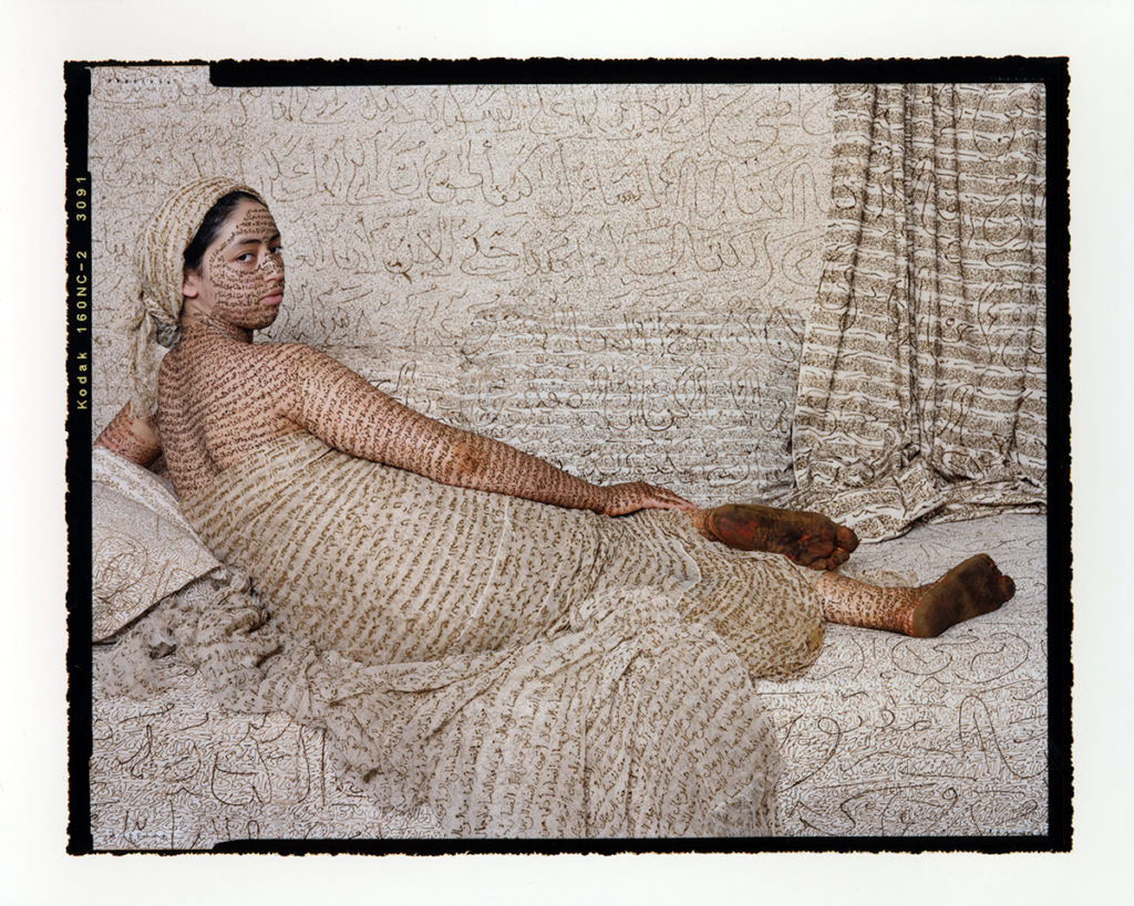
A similar use of language appears in the work of Shirin Neshat, an exiled Iranian artist who works primarily in photography and video. In the series Women of Allah (1994), she wears a chador (the traditional Islamic veil) and covers all of her exposed skin with Iranian poetry. Here, language implies depth: the intricacy and meaning of the poem implies inner dialogue and self-actualization. Neshat presents the Women of Allah as complex individuals, as more than the surface-level assumptions that may be made about them.
Neshat, like Harsono, utilizes video as a medium. Rapture (1999) presents a world in which landscape is separate from architecture, representing the cultural divide between Iranian men and women. The women cross a desert to the sea where they board small boats, while the men are stuck in a fortress, wrestling. Neshat comments on the reality of exile and the fantasy of freedom, particularly for women. Critic Eleanor Heartney describes how Neshat “makes art through her identities as an Iranian and as a woman, but reshapes them to speak to larger issues of freedom, individuality, societal oppression, the pain of exile, and the power of the erotic.”

Essaydi, Neshat, and Harsono all use language as a means of communication, but also as an emblem of cultural identity. Harsono makes us question: what components of culture — like language, an article of clothing, a recipe — connect us to our heritage? In addressing and speaking to political strife, tensions, and persecution, how might we reimagine our pasts and shared identities? Writing in the Rain confronts the realities of diaspora, and raises an issue that exists across time and humanity: how do we honor our pasts and still survive the pressures of the present?
Interview with James Jack
Kathryn Miyawaki, Appetite
April 7, 2021
[Zoom: New Haven & Pandan Studio, Singapore]
Kathryn Miyawaki (Appetite): Thank you so much for taking the time to speak with me today about your practice. We are thrilled to have your Iwaki Window preparatory drawings for our upcoming show. To start off, I’m curious where your interest in soil comes from. Was there a specific experience, artist, book, or otherwise that brought you to this practice?
James Jack: Thank you for this opportunity. I think every child, at some point, puts dirt in their mouth—it’s an instinct. If you don’t remember this, ask your parents. According to my mother, I put dirt in my mouth, and I think it might be an instinct shared by humans and more than humans… a desire to touch but also internalize soil, the histories of the land, and the connections to our bodies. The earth is where we come from, it’s also where our cells and our matter will return to.
In Japanese, daichi 大地 means Mother Earth. The artist who taught me this was Sekine Nobuo (1942-2019). I did oral histories with him and other Mono-ha artists while living in Japan as a Crown Prince Akihito Scholar from 2008. I learned the word daichi as well as animistic views of nature as well as actions or practices of working with the Earth from these artists. Takayama Noboru, whose studio is still in Miyagi Prefecture today, influenced me a lot. Particularly around 3.11… a time of processing trauma while loving the earth but also being very afraid of it. Takayama was a passionate artist, professor and lifelong critic of human-centric consciousness. The work Iwaki Windows in this show at Appetite was made in the years right after 2011 with a hope to re-sensitize ourselves through direct contact with the earth once again, even though it is contaminated with radiation. For example, while making these drawings there were Geiger counters everywhere in Iwaki city and many areas of Tohoku—remember, this was in 2012-2013, not long after the Daiichi explosion. In Takayama’s words, “We play with nature, and nature plays with us,” my artistic consciousness is rooted in this very intimate relationship with earth. .
Kaushik and I talked about this because Appetite is a restaurant—I was working on an organic farm for a year and a half right after finishing my undergraduate degree. Five months after I moved to the farm, 9-11 occurred. I delivered organic veggies to SoHo twice a week in a converted school bus and some friends of mine were visiting from the city when it happened. I will never forget the safety of being on a farm, while the volatile situation was unfolding in lower Manhattan affecting our family, friends and many others. The gasoline, supplies and roads were restricted everywhere surrounding the city including the highway that led to the farm. We couldn’t deliver produce to Soho, so we had an abundance of food, shelter and we had each other. There was a lot of uncertainty, but we had the essentials—nutrients, Earth, love, creativity, health. From that point on I always remember that cities such as Tokyo, Singapore and New York depend upon agriculture, resources and knowledge from rural areas. Now we’re in another pandemic—different from 3.11 and 9-11—but still, too many of the problems in these circumstances are caused by humans. I hope that through repairing our connections with the earth, we as humans might be able to correct some of our bad habits and care better for each other and for the earth. Those are a few brief experiences that have shaped my artistic practice of working with the earth.
K: Yeah, absolutely. For the Iwaki Windows, many of your samples were from Japan—were they sites that were still considered “danger zones” due to radiation? What specific areas of Japan were you taking these samples from?
J: Yes the work started and ended with Iwaki city which is located in Fukushima Prefecture. I carried my sketchbook with me and wherever I went I touched the earth, then rubbed it directly onto one sheet of paper. Other sites in Japan include Yame (Fukuoka Prefecture), Jōsō (Ibaraki), Naha (Okinawa), Beppu (Oita) as well as sites in Hawai‘i, Singapore and other places. felt it directly with my fingers. When the work was first exhibited at Iwaki Alios Center and Moritakaya Art Space (2014), a separate bilingual list was provided to viewers listing the 88 sites included in this work. The series is intentionally composed of 88 sheets in homage to the number of temples along the henromichi, or pathway of pilgrims on Shōdō Island, which I had just completed walking on in late 2011.
K: You made them by rubbing the soil onto the paper with your finger?
J: Yes, no tools… just a trace of dirt in between two fingers gently rubbed into the paper. On the backside each is labeled with the location of the soil sample. These are actually pages of my sketchbooks, which I created as a meditation while trying to work through a difficult situation. For roughly a few years after 3.11, I recorded a trace of the places I was in on paper. I was teaching an open seminar on art management in Iwaki city each month while completing my PhD, which consisted of a series of talks with local community arts organizations. It was an art management seminar, so people of diverse ages and backgrounds from local organizations who wanted to heal, recover and thrive with art and culture gathered each month to talk openly together. There was some support for post-3.11 rebuilding in Tohoku, and I continued to help them achieve their dreams: get grants, start up an artist residency program in a clothing factory, making specific proposals to hold exhibits outdoors and other cultural activities after the triple disaster.
One of the towns was Ōfunato, and others included Futaba, Namie and Onahama as well as some sites along the side of the road, where there were countless big sacks full of topsoil contaminated from radiation. The government didn’t know what to do with these bags of topsoil–some of them are still there, apparently. So, some of the Iwaki Windows samples come from there, some come from Tokyo too. This one is from Majorca, Spain, where I travelled with my partner to visit a friend of ours who was doing a residency at the Utzon home. This one is from Hakozaki in Fukuoka, which is where I ended up living later. Another is from Yame; where I advise a project called the 芸濃, or Art-Farm school. Some are from the US too. This one is from Gillman Barracks in Singapore. It was roughly 2012-2015 when I was making these, then in 2016 we showed at Iwaki.
K: When you were in Japan and speaking with people affected by 3.11, how were people reckoning with the aftermath of the catastrophes? Was it something that was talked about openly? Or were people struggling to speak about it, given that it was only a year or two after it happened?
J: I would say both of those reactions were there, plus much more. Some people were talking a lot about it, other people were struggling inside and quiet on the outside, while others near me were doing a lot of volunteer work. There was a lot of trauma and uncertainty because of the nuclear meltdown… it is like a never-ending disaster that continues today with the scheduled release of the contaminated water into the sea and thyroid cancer rates increasing now.
Earthquakes happen frequently in Japan–people still remember the earthquake in Kobe quite clearly, for example, and there are a lot of smaller ones we experience all the time. So, the earth shaking beneath us is strangely common, but the nuclear aspect was a big question mark. Information was being fudged by the government and they weren’t sending out the real time reports of Geiger counters measurements so this invisible toxicity aroused a lot of concern. A lot of professors and friends of mine got their own counters and we loaned them to each other to test our own neighborhoods for radiation. A professor in Gunma was giving out real time feeds on SNS so you could enter a code in convenience store copy machines and print out a map for that day’s radiation levels in the Kanto region.
There was so much to consider at that time, even simple things like taking a walk became disconcerting when considering we enjoyed walking near waterways, canals, rivers and these were hotspots for radiation. We were also worried about food because we didn’t know if the soil was safe and certain foods were repositories for radiation such as mushrooms. There were all these mixed messages from the government and the news: foreign and domestic sources from scientists to journalists were all saying totally different things. It was impossible to know what to believe. That was all continuing to happen in our lives in Japan while I was making this work.
K: I can’t even imagine the ambiguity and anxiety people felt during this time. How long were you in Japan? When did you end up leaving?
J: I never really left because so much of our lives remain there, but we moved to Singapore in 2018.
K: You made Light of Singapore using soil samples as well. I was wondering if you’ve noticed a difference in peoples’ relationship with the land in Singapore versus Japan. When I was thinking about the timeliness and pertinence of this show at Appetite, I began to think about Singapore’s paradoxical identity as a “Garden City.” What kind of relationship have you noticed people have with the natural environment in Singapore?
J: That’s a great question. I don’t have a clear answer just yet, but I do have some observations. To start with, a couple of the samples in Iwaki Windows are from Singapore because I came here for an exhibit in 2013 and a residency in 2015. At that time and continuing in my practice today, I have been working on repairing fractured relationships between land and sea in Singapore. Many people have been displaced from the Singapore River to right in front of my studio, which is where the Pandan River meets the sea. So, I’ve been listening to their stories and their grievances as one window into the larger trends of displacement. This was in the 1980s, so there are just a few people that remember it vividly… but there are a lot more colonial remnants here that have been swept under the facade.
I make my large scale pieces with just pigments from one location. For my installation works, I only use samples from the place where the exhibit is occuring. Then I return the pigments after the project is over. For example, the works I make here in Singapore are all made with local dirt. For Natura Naturata: Light of Singapore (2017) work, all of the pigments are from Western Singapore—an HDB construction site on Commonwealth Ave, Fort Canning (an archaeological dig site that has revealed a lot of pre-colonial history), the Japanese cemetery (which holds a lot of war memories). The Japanese occupation of Singapore was short, but it was really violent.
Another place I took samples was the MacRitchie Reservoir, which is where much of our water comes from. Now there are a lot of other plants that are being built for potable water from desalination, recycled water and additional catchments during the current pandemic. I gathered samples from these sites and more with students from NTU, who suggested locations that would be interesting—locations with rich social history as well.
I am interested in places that are currently in transition, such that they look like blocks of color when you see them on the window or on the paper, but there’s more to see—unwritten histories or alternative views on the past. Each of the colors come from a place with a story. From a creative perspective, I love color, but these projects are also very much about the past today. Looking is not just looking, it’s also reconsidering, rethinking, and rewriting the past. I hope that the simple act of looking at a color—since you’re looking at traces of the actual earth—reveals these stories, the ghosts, the insects, previous ancestors that inhabited this land too.
K: Right. Being in the presence of these soils triggers sight, taste, memory, and so many other sensory experiences.
J: Yes. The sensation of being around that much dirt illuminated with light is a bodily experience… and not always a positive one. You feel all of these complicated memories, you might think of the stench of rotting soil or organic fertilizer.
K: Yes! Now that you mention it, the smell of soil carries so many memories for me, and must for many others. My mom loves gardening and the smell of fresh mulch reminds me of her. My dad and I golf together a lot, and the chemical smell of fertilized grass or fertilized soil is a very distinct one.
J: Exactly. Have you been to Japan before? If so, what regions?
K: Yes! I went to Tokyo, Kyoto, and Hiroshima with my family when I was about eight years old. Then, after my sophomore year of high school, I studied abroad in Nagoya for the summer. I lived with a host family not knowing a lick of Japanese. I didn’t grow up speaking it all all; my dad is third-generation and all his family is in Hawai‘i. My great grandparents were originally from outside Hiroshima.
J: Yeah, I was going to guess your family was from around Setouchi. My photographer in Takamatsu’s family name is Miyawaki. Near Onomichi, Hiroshima Prefecture, an elderly couple helped us build the artwork Boat to Khayalan (2014-2018), and their family name was also Miyawaki. So I was thinking you might have roots in Setouchi, near Hiroshima.
K: Wow! That’s so incredible. When I was in Japan, I came to realize that Miyawaki is not a very common Japanese name… so it’s really amazing you knew two different people or families with that name. I really want to go back to Japan; it’s such a wonderful place.
J: Absolutely. You mentioned your dad’s family is based in Hawai’i?
K: Yes, that side of my family is from Hawai‘i, and I grew up visiting there every year. I was thrilled to see how much work you’ve done on the islands.
J: Wonderful. Which island is your family from?
K: O’ahu. They’re all in Honolulu—Mānoa and Makiki areas. I was there just this past winter; it was lovely.
J: I was there as well! It was the last trip we took before lockdown—around Chinese New Year last year. We were on O’ahu and Molokai. We have fond memories. That’ll probably be the first trip we make after the pandemic settles down too.
K: I totally understand that. Could you speak about your experience teaching and creating works there?
J: Absolutely. The dirt samples were borrowed, exhibited and returned on from the same places—-following local protocols. I worked with lawyer, professor and community leader Malia Akutagawa. This spiral work is ongoing, and these are all community movements focused on Molokai and how the ‘āina (the land) possesses the power of rejuvenation and protection. Protect Kahoolawe Ohana (PKO) became an outstanding positive example of how to protect the land from damage when they took back Kahoʻolawe Island from the military—they became a positive example of indigenous rights, for example. I am engaged in a community art project in Kona, on Big Island, right now that will open later in May after this show at Appetite. It focuses on water inside of the ‘āina—the wetness inside the land. It is an open system for re-sensitizing humans to the powerful presence of water and our dependence upon it.
K: That’s amazing. So, you were only able to exhibit the samples that you borrowed in Hawai‘i? I imagine there are restrictions on what leaves the island, but also that it was a matter of respecting the ‘āina and the local peoples.
J: Right. There was a biennial really interested in the work I made with samples from Molokai for Honolulu Museum of Art, but the work was intransportable. The idea of taking something and touring it in an exhibition is a very colonial concept… like in a World Expo or national pavilion style of presentation. Instead we have permission to use the Molokai spiral anywhere from my co-creators Uncle Walter Ritte and curator Healoha Johnston and share with anyone who wants to learn how to care for the land today in this ongoing documentation of successful events to protect land. The focus of my artwork is on rejuvenation and community.
The lessons I learned on Molokai were about how to decolonize our practice as artists by working with community voices in the center and making decisions together from start to end. Actually, to tell the truth, Molokai won’t let you do otherwise. If you don’t follow the Molokai process, it is impossible to do anything. That conscience I learned from cultural practitioners including Malie Akutagawa, Walter Ritte and Matt Yamashita is very important for artists to practice today.
K: Wow. I had no idea that it was like that.
J: Yeah, they are very careful who they let in and what they let out. Whenever somebody comes with a business proposal, a development plan, a camera, or something like that, Molokai will check your motives and if they are extractive or bad for the island they will just chew you up and send you back where you came from. This is not about hatred, it is really all about love! They love the ‘āina. They love people, and they will not tolerate otherwise. The community is so clear about what you need to do and how they want to be represented with their values of sharing, abundance, respect and caretaking. I was living on O‘ahu in 2007 when I first went to Molokai, and I remember distinctly the news on O‘ahu often portrays Molokai people as jobless, anti-tourism, anti-this, anti-that. What should be in the spotlight is all that they are actually pro: pro-‘āina, pro-humans, pro-sovereignty, pro-future and much more. They are working hard to protect and promote deeply Hawaiian values. That’s why they’re so strict; they won’t put up with any destructive behavior.
K: Yes. That’s how it should be. They have every right to be that strict.
J: The love in their hearts, which drives their actions, can teach us ways to care for the land in our own neighborhoods now—let this conversation continue to spiral on in colorful shades to come!
K: Yes, absolutely. Thank you so much for sharing your experiences with me. We are thrilled to have your work in our show.
A TOUCH OF A GAZE:
I DON’T KNOW WHAT I AM SEEING; BUT I KNOW THEY ARE SEEING ME
by Yanyun Chen, presented on occasion of STAGING: MAPPLETHORPE on 29 May 2022.
To begin, let us close our eyes and feel our skin.
How it incrementally ripples and fuzzes as one inhales, the breath held, hair standing, our nerve endings under our skin, pores perk up in waves of gentle tides filled with warm sensations. We taste at the tip of our tongue the back of our lips. Then breath escapes, leaving a trace of pressure under our nose. Here comes the echoes of our throbbing heart. We pay attention, the motion repeats with subtle changes, our heart responds to the pace of our lungs. Or is it the other way round, pumping ahead at different rhythms.
French philosopher Jean Luc Nancy thinks of the skin as a boundary between two outside worlds: outside, the one which surrounds us in an environment and pushes us about, and outside, the one inside us which we can only assume works and moves us: blood, veins, organs, bones, muscles, a sea of red. Pressure is felt from the inside pushing out, and the outside pushing in, and the tides of touch on skin forms the shapes which we occupy and which occupies us.
To verify that the world outside is within our skin, we embrace the knife and a witness to be our eyes. We trust the eye of the other to tell what we are made of. A photograph is sometimes this other that we rely on. In the realm of the eyes wide shut, what can we see of a machine that has seen for us? What do we see swimming in the sporadic darkness of the back of our eyelids?
What do we know of landscapes and hills of our skin?
Our fingertips encounter a sensation, it’s resting on something soft. Perhaps, something hard. Or velvety, or rough. It carries a temperature that tells us relative things like “cold” or “hot”. Perhaps, it is something familiar, or surreal. “Never thought this would feel like that,” we might think. Can we feel colour? Can our finger-tips see every edge, line, shade, and raid the vision of our eyes? Can we touch a photograph?
Eyes open. Staring back at us. Can we see our own faces without a mirrored gaze? Without the intermediary silver, without a witness to stare back at us, for us to trust? Do we trust our eyes? Who do we trust as our eyes?
Robert Mapplethorpe
Tulips, 1979
Silver gelatin print
50.8 x 40.6 cm
Courtesy and © Robert Mapplethorpe Foundation
Our bodies are a tracing of two worlds, a sketch that is constantly in the making. Every ray of sun marks a line on the shade of my skin, every cool breeze crackles a pore, every brush dead skin disperses, new skin arrives. Every sip, every morsel of food pushes through our oesophagus, pushes us out to occupy space, feeding our silhouette from the inside out. Cells renew, and blossom to the surface. The cells on the surface of our skin are dead, “protecting the soft centres from the intrusions of the outside world.” We are mammals with zombie skin, constantly shedding in abandon.
We hug.
“The dead you is constantly being rubbed away by the dead me. Your cells fall and flake away, fodder to dust mites and bed bugs. Your droppings support colonies of life that graze on skin and hair no longer wanted. You don’t feel a thing. How could you? All your sensation comes from deeper down, the live places where the dermis is renewing itself, making another armadillo layer. You are a knight in shining armour.” (Winterson, 123)
“Written on the body is a secret code only visible in certain lights; the accumulations of a lifetime gather there. In places the palimpsest is so heavily worked that the letters feel like braille. I like to keep my body rolled up away from prying eyes. Never unfold too much, tell the whole story.” (Winterson, 89)
Like braille—the writings of and on our skin pressed by the passage of time from both outsides. A language that requires a lover’s patient reading, a secret code unbeknownst to us in areas our necks cannot twist our faces to see. Perhaps, the Japanese mythical spectre Rokurokubi, the long neck woman whose head floats beyond her bedroom doors at night, her soul on an adventure, searching for love, searching for terror. She would be able to see herself in the dark areas out of sight. Yet even then, would she be able to read in the same way her lover does to her, for her, of her? I’d like to think that ghosts and spectres have lovers too.
Do we have witnesses in the room?
Robert Mapplethorpe
Alan Lynes, 1979
Silver gelatin print
50.8 x 40.6 cm
Courtesy and © Robert Mapplethorpe Foundation
Alan Lynes is a ghost with a lover. The shaded touch of a half-gaze, softly frozen melting glass, slow moving arctic ice, infinitely warm. The curls of hair tickled by air and shadow, intricately traversing across the chest, down the navel, into the depths of a plunging wrap across the waist. The curls on Alan’s crown wavers. His gaze falls upon us gazing at him. Our eyes do not meet. He, this image unmoving, knows and quivers at the corner of our eyes just as we forget to see him, as he has forgotten to see us.
“What the Photograph reproduces to infinity has occurred only once: the Photograph mechanically repeats what could never be repeated existentially.” Once, then, and now forever. It is the Particular. This photograph, and not Photography. “Look” “See” “Here it is”; it points the finger at a certain vis-à-vis. It always is a specific photograph.
This specific photograph has met this specific photographer. A touching of skin on skin and gaze on gaze: Alan met Robert. And between the air where the touch of sight was encountered, a look hovers, suspenseful, suspended. A ghost is captured in the machine, the Dorian Gray of hazy memory, beauty frozen while the body withers. A ghost who haunts the hallways staring back gently, now and forever.
“In the beginning, there is Chaos: the first of all the gods to be born from nothingness, and the only one to remain after they have all disappeared. After it, Gaia, with her vast bosom, appeared, and so did Eros. Chaos, Gaia, and Eros are the knot from which the history of the world and the mortals who inhabit it develop.”(Nancy, 55)
“The photographer has found the right moment, the Kairos of desire.” (Barthes, 59)
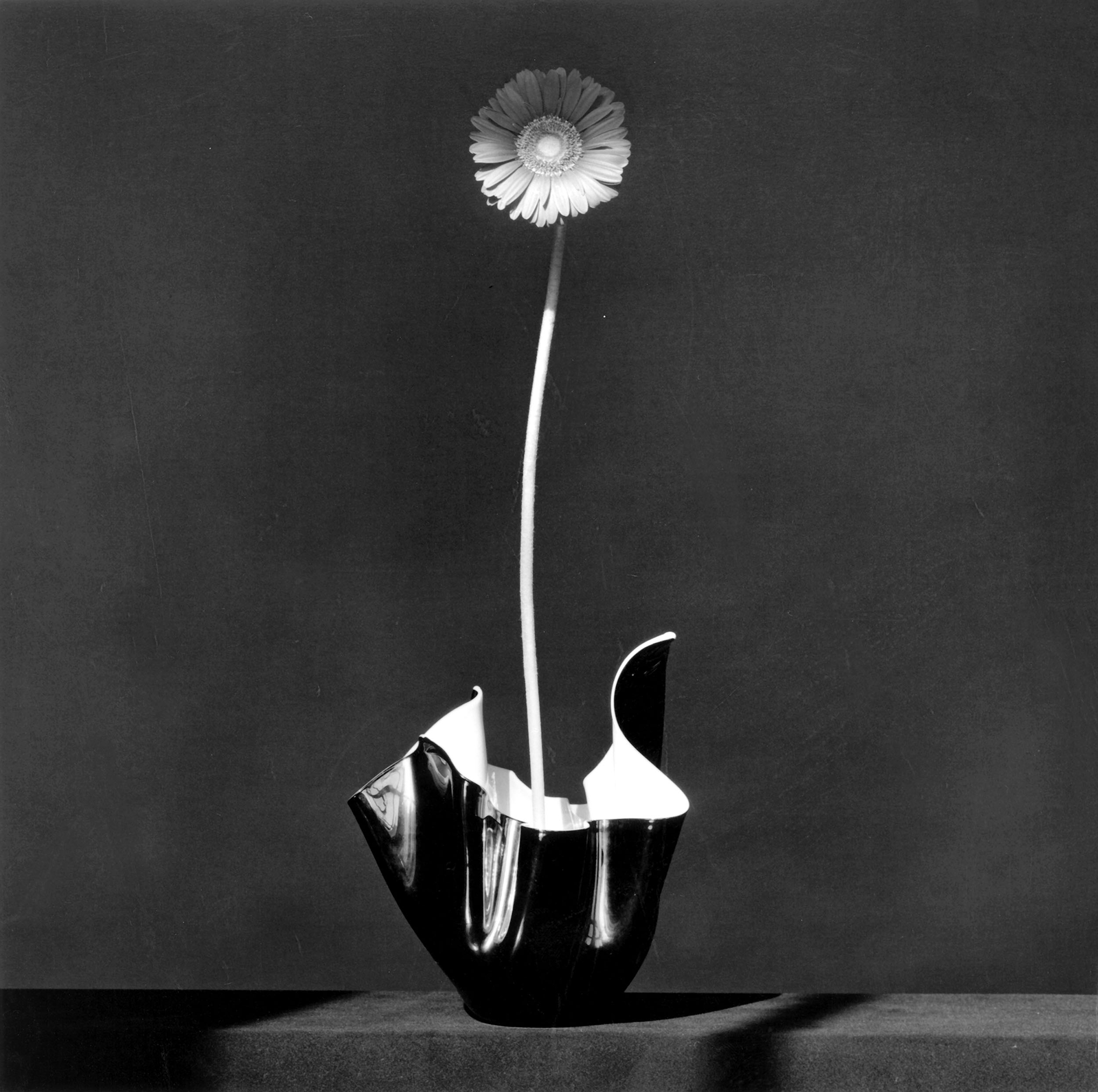
Robert Mapplethorpe
African Daisy, 1982
Silver gelatin print
50.8 x 40.6 cm
Courtesy and © Robert Mapplethorpe Foundation
A splash. Suspended animation. The Rokurokubi’s neck raises high, her elegant stem, her white long throat, her pearly skin shimmers as her body rebounds from the wet sculpted mirror. Silver in suspense, grown from the night. She passes Alan Lynes by, two ghosts at home in their haunt, old friends who understand the poise of a gaze, eyeslashes aflutter, half shaded, in desire.
Roland Barthes once echoed Franz Kafka, “We photograph things in order to drive them out of our minds. My stories are a way of shutting my eyes.” (Barthes, 53) What drove the African Daisy to the sky, surrounded by shadows of the night? What does she hope to see as she floats above the sleeping bodies of dreamers, lost wanderers?
Yet the photographs are watching us as we sleep. They cannot drive anything out of their minds, for they are held hostage, arrested in their stillness, as the light wears off the ink of their skin, lightening not darkening the pores of the print. They age as we age.
“In this glum desert, suddenly a specific photograph reaches me; it animates me, and I animate it. So that is how I must name the attraction which makes it exist: an animation. The photograph itself is in no way animate (I do not believe in “lifelike” photographs), but it animates me: this is what creates every adventure.” (Barthes, 20)
Alan Lynes and the African Daisy are on an adventure, they take flight.

Robert Mapplethorpe
Flower, 1980
Silver gelatin print
50.8 x 40.6 cm
Courtesy and © Robert Mapplethorpe Foundation
I am animated. The small circular pore, the perfect dent, the inconspicuous nipple almost out of frame, floating in nothing but an overblown, overexposed whiteness. This nipple of an inanimate furniture shudders me like the shadow play on the wall. I suppose this is what Roland Barthes notates as the punctum: “it is what I add to the photograph and what is nonetheless already there”.
The playful bush, sparse yet distinct, runs across the chest of the image. The tilt of the neck of flowers, the touch of bristle on stem, the lean. The shapely, tubular pants contain the flourish of stoic blooms. The dance of lines in the far corner. The resolute nipple of a cabinet.
“Philosophy is an art of touching, just as sex is an art of intelligence.” (Dufourmantelle, 9)
“… but none emerges unaffected from a confrontation with desire.” (Dufourmantelle, 6)
When desire plays on the surface of images, and teases us with charm, we long to touch these imperfections, from smooth to rough to particular. French psychoanalyst Anne Dufourmantelle reminds us that philosophy and sex are both acts, and both are obsessions
“There is no true thought that is not obsessional, that does not turn endlessly around the same question, that does not return again and again to the modalities of an unformulated question. An obsession that operates in the shade, shaping every life, every thought, every work, because what is ultimately at stake is the same desire. Sex, love, philosophy.”
“For it is not indifference which erases the weight of an image… but love, extreme love.” (Barthes, 12) A love that is arrested in its rupture, for the image is still, still waiting.
“When I say ‘I will be true to you’ I am drawing a quiet space beyond the reach of other desires. No-one can legislate love; it cannot be given orders or cajoled into service. Love belongs to itself, deaf to pleading and unmoved by violence. Love is not something you can negotiate. Love is the one thing stronger than desire and the only proper reason to resist temptation.” (Winterson, 78)
I’d like to think that Mapplethorpe fell in love, he fell in love with Alan Lynes and the African Daisy. He fell in love with the cabinet. In his love, he stole an image from the ones he loved, and made them ghosts who haunt his corridors long after he is gone. It is a kind of immortality, perhaps, of saving the moments too quickly gone.

Robert Mapplethorpe
NYC Contemporary Ballet, 1980
Silver gelatin print
35.4 x 35.1 cm
Courtesy and © Robert Mapplethorpe Foundation
“In front of the lens, I am at the same time: the one I think I am, the one I want others to think I am, the one the photographer thinks I am, and the one he makes use of to exhibit his art.” (Barthes, 13)
Who do we want to be in front of a lens, to be remembered as an image? What poise, what posture, how do we want to be captured? Power, repose, force, limp, dominant, submissive.
Velvet Underground “Venus in Furs”
Venus in Furs is written by Leopold von Sacher-Masoch, from his name came the term masochism, defining it as “sexual gratification from one’s own humiliation and pain.” He comes from Lemberg, Galicia, (today known as Lviv, Ukraine). This book was first published in 1870. Von Sacher-Masoch was obsessed with the subject of domination and submission, himself entering a contract to be the slave of his mistress Fanny Pistor, inspiring the writing of this text. In the interplay of power-humiliation-desire, two characters enter into a contractual agreement of slavery and mistress, Severin von Kusiemski and Wanda von Dunajew.
‘What an idea!’ I cried. ‘You fill me with horror.’
‘Do you love me any the less?’
‘On the contrary.’
On the contrary. Where fear itself is the power, where within the restful flaccidity lies the potential for tension and drama, for the possibility of the next moment where the limp soft fingers arrest themselves into a ball of fight. Clench and release, the motors of passion pumping through performance. Perhaps, the photograph isn’t held hostage, but holding its breath, waiting for the rupture of release, a forgetting that comes without reason. An exorcism. Or are we held hostage in our awe for the image? Who will be forgotten first? For is it not, that forgetting cannot be controlled, intended, called to presence? Forgetting happens to us.
How would one like to be remembered?
How would one like to be forgotten?
Robert Mapplethorpe
Orchid, 1986
Silver gelatin print
61 x 50.8 cm
Courtesy and © Robert Mapplethorpe Foundation
The withering tulip rests its tired neck on the erect stem. The ghosts are taking a break from staring back from a different realm in shared spaces: us, them, divided by sight. The long languid neck leaning towards the darkness. There is something sensual about the undulating leaves, different characters reaching out, touching the draperies gently. Flutter, aflutter. On standby.

Robert Mapplethorpe
Phillip, 1979
Silver gelatin print
50.8 x 40.6 cm
Courtesy and © Robert Mapplethorpe Foundation
The nude is a presence above all, a presence exposed to the gaze of others. A nude, any nude, always finds itself being looked at, even when I am the only one looking. The gaze, when it encounters the nudity of the body, attests to its presence. The naked body is present in the gaze. And its presence is indubitable: it is there.
But the presence of a body is also always fleeing the gaze that makes an image of it. When the body is made into an image, it leaves itself, exceeds itself. A body is never given as definitively present to itself or to others, even though it is also not pure absence. The vision of the naked body is exactly the experience of this presence that always flees into absence, into the impossibility of being an immobile given. My body is never given.
All true photography of the body is always at the same time the anticipation of the gaze and the projection of the subject outside of itself. (Nancy, 75)
Robert Mapplethorpe Robert Mapplethorpe
Tiger Lily, 1987
Silver gelatin print
61 x 50.8cm
Courtesy and © Robert Mapplethorpe Foundation
Tulips, 1979
Silver gelatin print
50.8 x 40.6 cm
Courtesy and © Robert Mapplethorpe Foundation
Bodies. The long neck, the solid trunk, the round hold, the translucent structures like corsets which bind, erect and prop into position. Like pillars and plinths, columns, towers and chimneys, it occupies space, it supports our heads to the sun. Yet it is the soft luminescence of the body, the sharp angles and deep curvature, the solidity which allows for a frivolous turn of the head, the scandalous pollen of the anther to fertilise the ovary, the self-production of fruit and seed. Powder puffs of sex falling on trembling petal while the body holds their floral chins up high. It drags up hydration and produces sap, it rots as it drinks, withering from bottom up, its roots long gone as it awaits for death.
We lift the glass to our lips, and taste blooms on our tongues. One must thank the resolute stem for standing still in order for the flavours of thought, beauty, and light to shine within the shadows of our mouth.
Robert Mapplethorpe
Tyrone, 1987
Silver gelatin print
61 x 50.8 cm
Courtesy and © Robert Mapplethorpe Foundation
And so we remain, eyes wide shut, staring yet not quite seeing the image before us. We consume with our eyes, with our mouths, with our noses. Yet, what can be known in the process? I confess: I don’t know what I am seeing.
Meanwhile, the photographs are listening to the thump of our hearts which has escaped the confines of our bodies. The beats echo through our organs and land out on the wooden floor, bouncing off lamps and long shadows, and the shimmers of glass and brass and steel. The photographs move us. It animates us. It puppets us into being.
The ghosts are watching.