Chromatic Identities
Appetite is proud to present Chromatic Identities, a group show exploring colour and its historical, experiential, and anthropological lineage. Colour is a fundamental human experience. The study of both material culture and visual culture is deeply shaped by the patterns of colour through history. From the geographies and routes of the spice trade, to the pigments and chemicals inherent to a land, the expressions of culture reveal themselves through the colours— hue, tint, tone and shade— that we find in food, textile, architecture, art, and everyday objects.
Bringing together works by Haegue Yang, Jason Martin, Rikrit Tiravanija, Ugo Rondinone, Ceal Floyer, Comp Syn, and Dawn Ng, we aim to build conversation around the cultural associations of colour— present, past, and future. Our interest in colour stands as both a historical and contemporary question, rooted in Nouri and Appetite’s practice of crossroads thinking.
Chromatic Identities is open to the public from Nov 3, 2020 — Feb 6, 2021.
Haegue Yang
Berlin- and Seoul-based contemporary artist Haegue Yang (b. 1971, Seoul) creates works that inhabit a broad range of materials and media, as well as engage the viewer’s senses beyond just the eye. Highly celebrated around the world, Yang is the recipient of the 2018 Wolfgang Hahn Prize as well as the 2018 Republic of Korea Culture and Arts Award. Her recent solo exhibitions include Handles, The Museum of Modern Art, New York (2019), When The Year 2000 Comes, Kukje Gallery, Seoul (2019), and Tracing Movements, South London Gallery, London (2019).
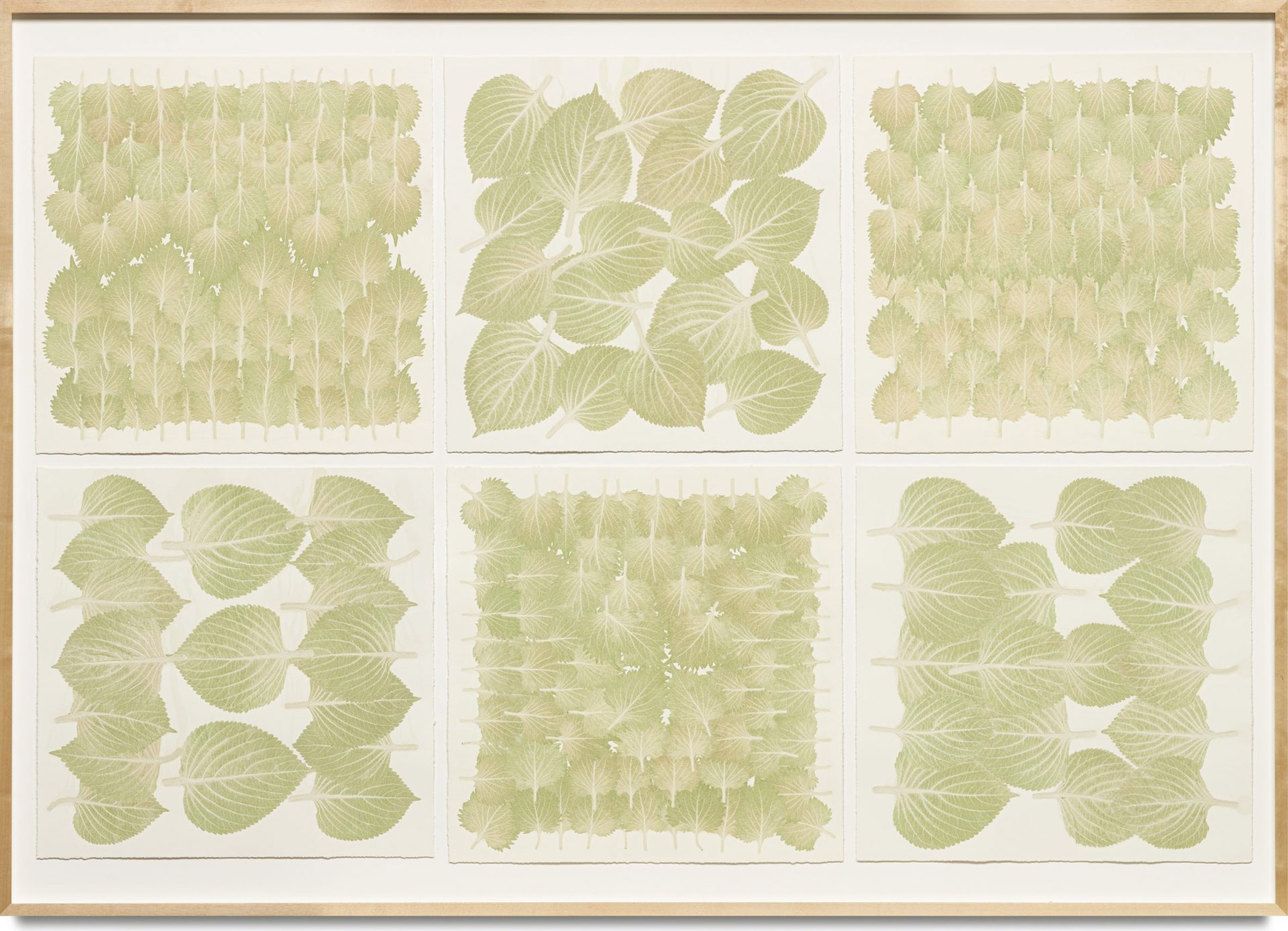
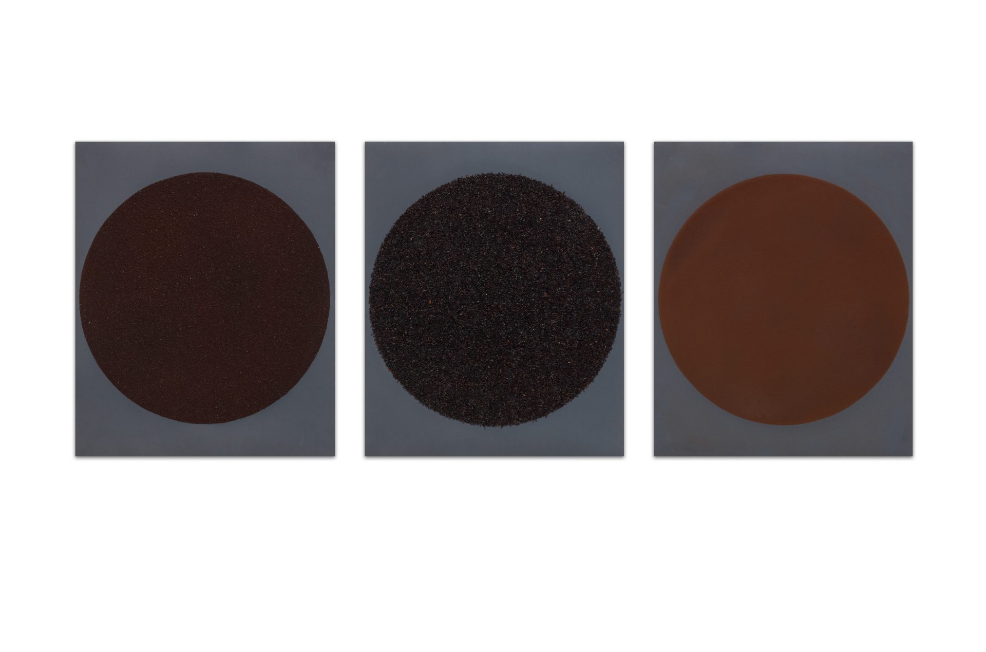
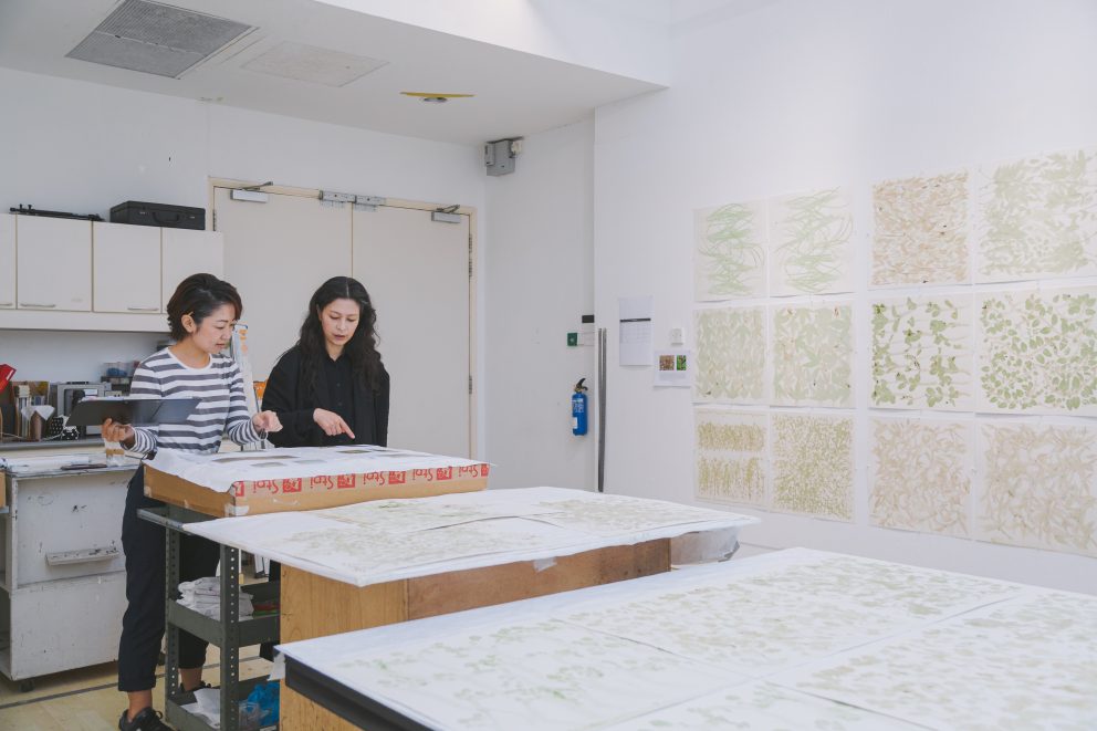
Yang’s pieces from the Honesty Printed on Modesty series were produced during her residency at STPI in 2012, one of which, Spice Moons (2013), was acquired by MOMA in 2014. Inspired by Singapore’s markets and history of multiculturalism, she employs fresh produce and spices from Little India and Chinatown as materials for the production of a broad array of prints. Because of its advantageous location on the Malaysian peninsula, Singapore has been directly connected to some of the oldest trade routes in the world—linking India, China, Indonesia, and Europe—from antiquity to the present. A key entrepôt within the global spice trade network, it has been a locus for centuries of exchange of traditions, information, cuisines, and ideas.
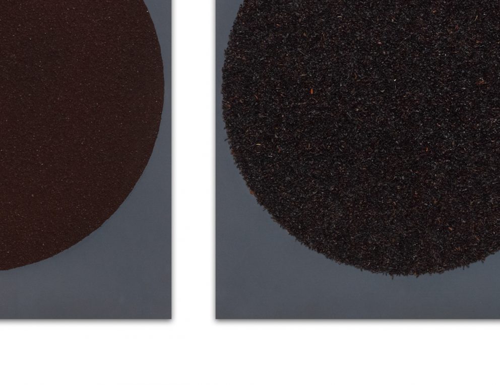
Triptych Moons draws together three commodities—coffee, tea, and cacao—with tremendously complex histories of trade, colonialism, and consumption into an earthy-toned, textured assemblage that evokes the humble botanical realities of these products. Through visual and titular reference, this work links the traditional spiritual and ceremonial aspects of these products with the cosmic symbolism of the moon.
Edibles Sextet explicitly brings to mind the natural materiality of its medium, with vibrant impressions of perilla leaves and shiso colourfully rendered in their own unprocessed juices. In an era where colour is readily available in all kinds of digital, industrial, and technological forms, what might encounters with organically-derived colour offer us?
The origins of these products lie in both in local markets as well as far-flung corners of the world. Their integration into pieces of art pays tribute to Singapore’s history as a hub of global connection, while also contending with the brutal colonial past inherent to the spice trade. Fervent cultivation, exchange, and consumption of spices and other goods around the world hinged on exploitation and subjugation of indigenous peoples, even into the modern era. How often do we think about the ways objects as domestic and intimate as the foods we eat connect us to intricate world histories?
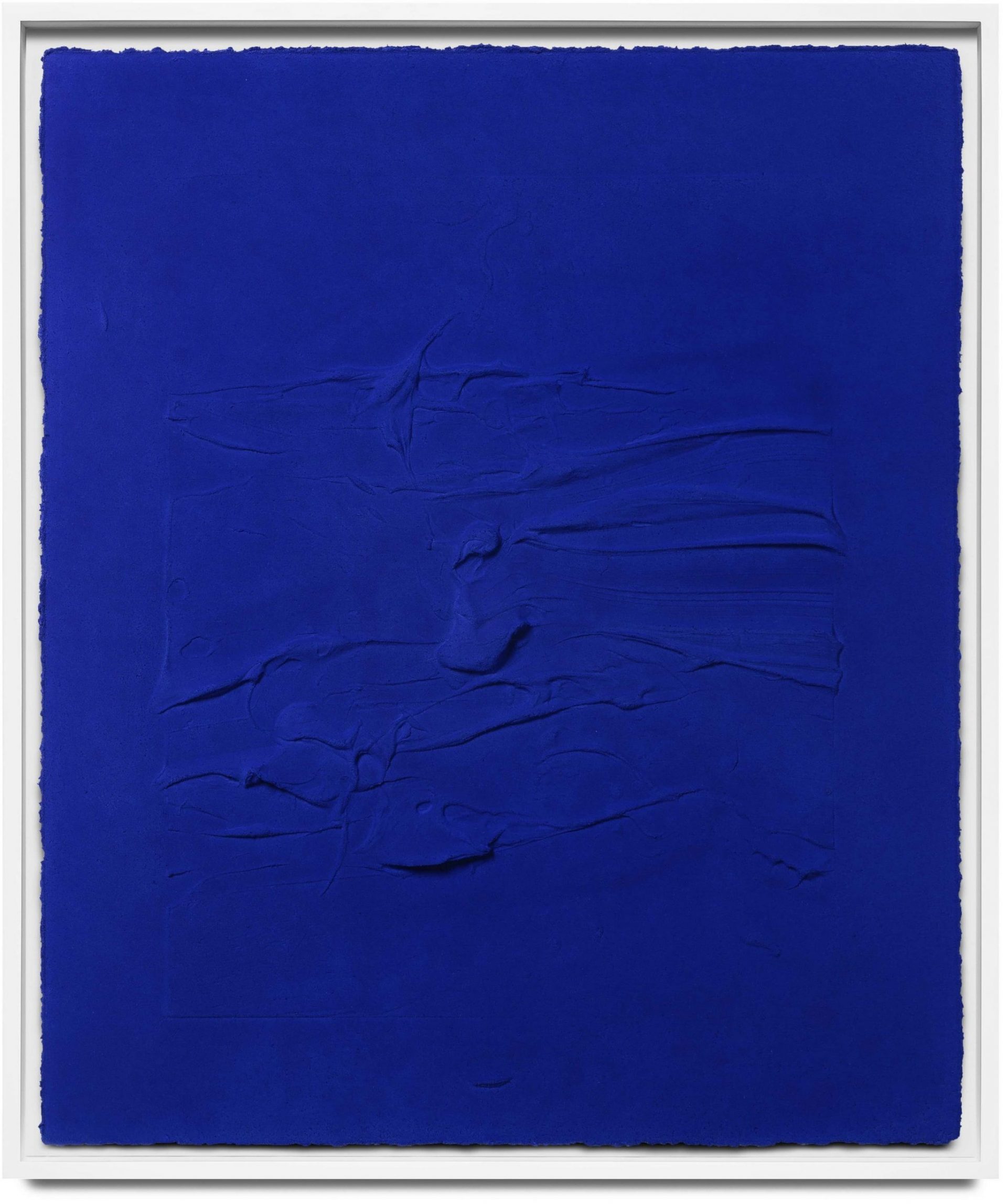
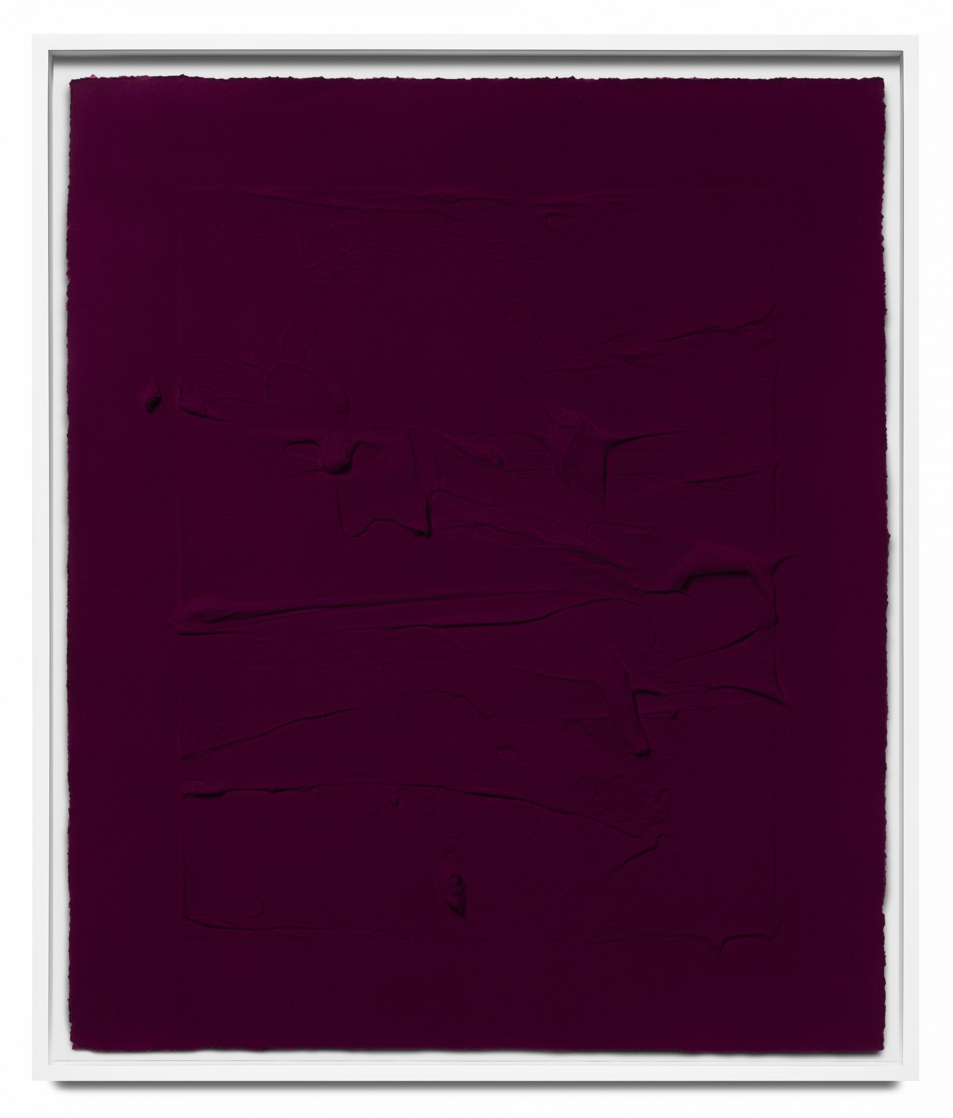
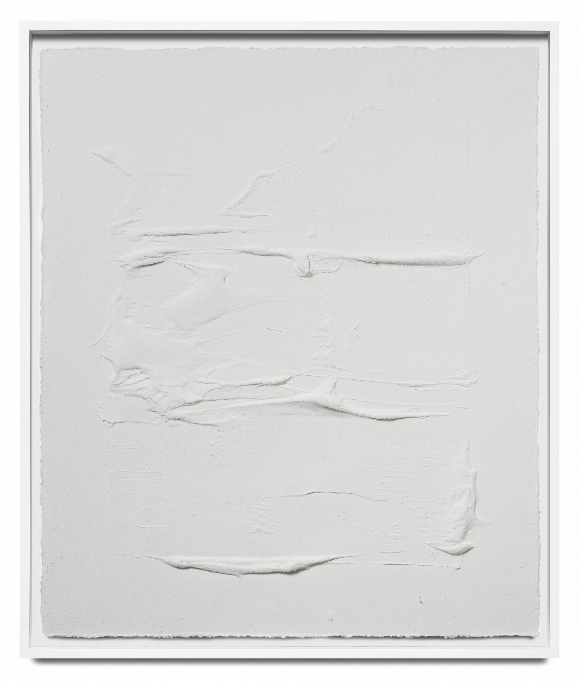
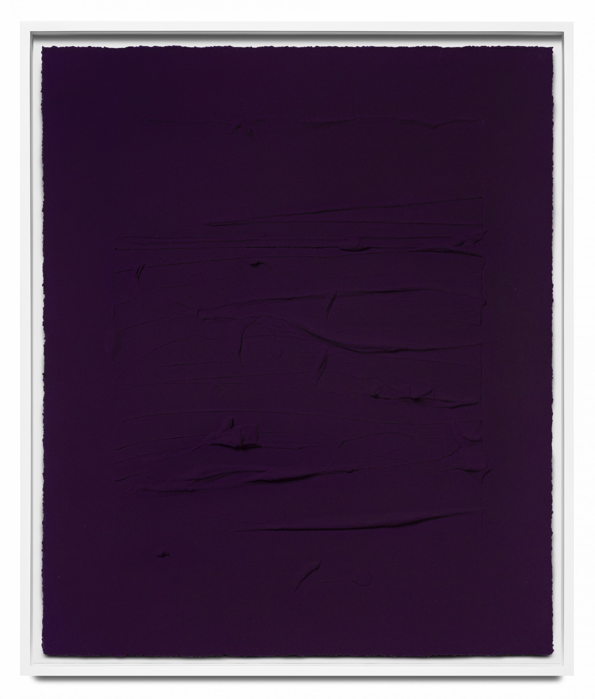
Jason Martin (b. 1970, Jersey, Channel Islands) paints sculptures and sculpts paint. The undulating surfaces of Martin’s canvases invite comparisons with the natural landscape; their vivid colours evoke the immersive realms of Colour Field painting, an Abstract Expressionist movement of the 1950s and 1960s characterized by large swaths of colour. Martin works with acrylic, oil paint, plaster, cast metal, paper, and pigment using a minimal yet expressive approach. Globs of paint or plaster, smeared and squeegeed across the canvas, capture the dynamism of his mark-making as well as the chromatic properties of the medium.
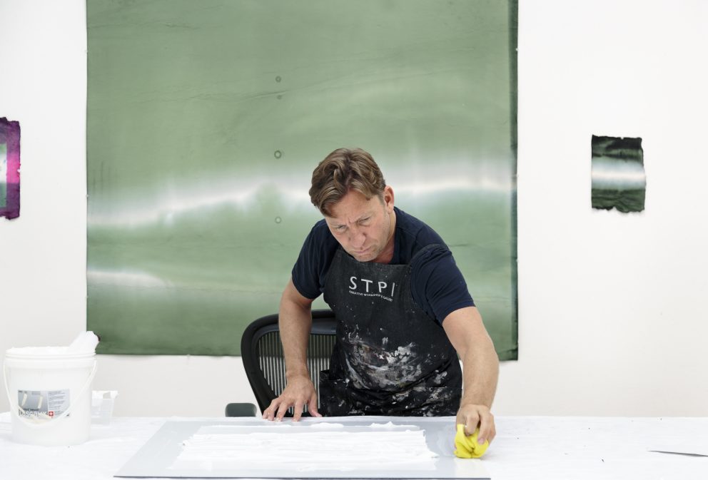
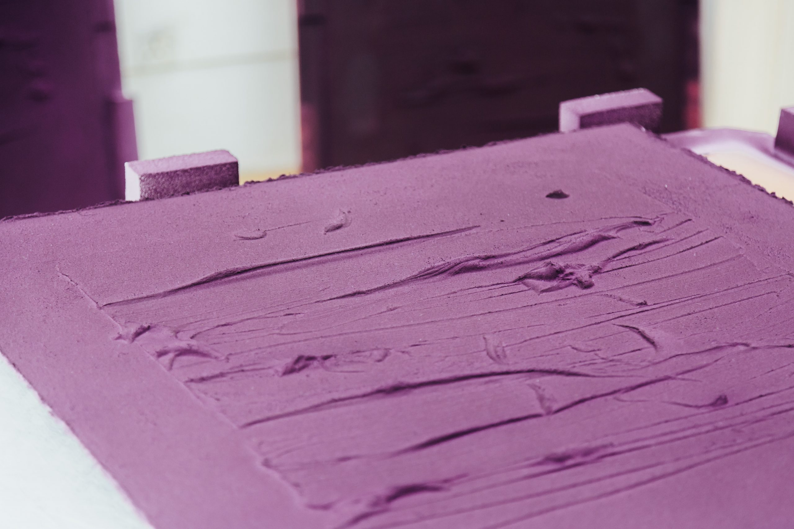
During his residency at the Singapore Tyler Print Institute, Martin utilized pure pigments and explored the medium of paper pulp and paper casting. The resulting exhibition, Meta Physical (23 March–4 May 2019) debuted works such as Oriental Blue III (2017), Ultramarine blue/ Quinacridone magenta IV (2017), Pure Magenta VI (2017), and Veritas white I (2017), all of which are titled according to the pigment he hand-sprayed on the paper cast. Martin’s monochromatic works not only invite viewers to immerse themselves in these velvety hues, but also to consider the histories of culture, trade, and industrialization imbued in these pigments and their names.
This Oriental Blue pigment (PB29) radiates a rich cobalt shade, though is not itself derived from cobalt. An inorganic pigment consisting of kaolin, soda ash, sulfides and coal, Oriental Blue has been used since the early 19th century as a substitute for the much more expensive Ultramarine blue pigment. The name perhaps alludes to blue’s significance in Chinese Tang Dynasty (618-907 C.E.) ceramics, specifically the blue-glazed pottery and porcelain that utilized cobalt ores imported from Persia. Europeans were infatuated by these “exotic,” opulent, and alluringly rare ceramics. The Western imitation of Eastern visual or material culture, called Orientalism, ultimately stereotyped these cultures though a colonialist gaze.
In the 1850s, British and French firms were racing to come up with vibrantly coloured commercial synthetic dyes. One of these was Pure Magenta, named in honour of the town near Milan where the French army was victorious over the Austrians in 1859. Initially very expensive, the pigment carried an elite status, for it was only accessible to the wealthy and the military. When industrial production increased output, pure magenta lost its luster, becoming quite commonplace.
White is actually achromatic, meaning it has no hue. White light can be broken up into its composite colours by passing it through a prism; similarly, white objects fully reflect and scatter all the visible wavelengths of light. Martin focuses on one of the many cultural connotations of white: “veritas,” meaning truth in Latin. This word is used in the mottos of universities, religious institutions, and governmental organizations. White may also chromatically symbolize light, goodness, innocence, purity, and cleanliness.
The artist sprays this paper cast with a mixture of two pigments, as indicated in the title. Ultramarine (meaning “beyond the sea”) was first manufactured in Europe using lapis lazuli imported from the mountains of Afghanistan, where it had already been used in Buddhist paintings. The brilliantly rich blue pigment was so sought after among artists in 15th century Europe that it was considered to be just as precious as gold. It wasn’t until 1826 that a French chemist invented synthetic ultramarine (called “French Ultramarine”).
Interestingly enough, magenta is not technically a colour. It is an extra-spectral colour, meaning that it is not found in the visible spectrum of light. Rather, it is physiologically and psychologically perceived as the mixture of red and blue light, effectively an invention of the mind. Quinacridone pigments were first produced in 1958 and are known for their exceptionally rich hues and weather fastness.
Rirkrit Tiravanija
Renowned Thai contemporary artist Rirkrit Tiravanija (b. 1961, Buenos Aires) has negotiated culture and language throughout his life. Born in Argentina to a diplomat father, Tiravanija moved frequently, being raised in Ethiopia, Thailand, and Canada before studying in Chicago and New York City. Currently, he works in New York, Berlin, and Chiang Mai and exhibits globally. He draws from his global identity to make works that cultivate deeply interpersonal experiences, while directly responding to shifts in social politics.
Tiravanija’s two-decade long practice ranges widely in both medium and message. His prints, sculpture, ceramics, and installations cross into various themes such as environmentalism, biography, politics, food, and performance. Perhaps best known for pioneering the movement of relational aesthetics, Tiravanija has developed an artistic practice that centers human interaction as its primary source of meaning. By creating conceptual installations, his works are platforms for discussion that demand your engagement.
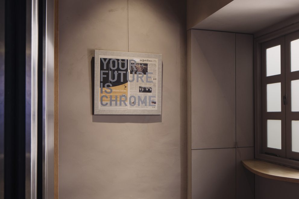
In the 1990s, Tiravanija reimagined artmaking and the use of the art space. In untitled (free/still) (1992, 1995, 2007, and 2011), the artist cooks and serves free curry to gallery visitors. In February 2020, Tiravanija worked with Chef Ivan Brehm at Restaurant Nouri to create a participatory cooking and eating experience, in which every guest was asked to bring and explain an ingredient of their choice. Tiravanija did what he does best: dissolve the boundaries between artist and audience, and force us to interrogate our traditional definitions of art practice.
Thailand saw major political unrest in the 2000s, and Tiravanija reacted to the 2010 military crackdown in Bangkok with his exhibition, Who’s afraid of red, yellow, and green (2010/2019). Protestors donned either red or yellow shirts, depending on their political stance, while the military wore green uniforms. Drawings of Thai protests surround the gallery visitors as they are served red, yellow, and green curries. Rirkrit confronts this chromatic and political divide in Thailand by inviting viewers to find a common ground through food.
During his residency at the Singapore Tyler Print Institute, Tiravanija experimented with new materials and pushed the dimensional boundaries of paper. In Time travelers Chronicle (Doubt) 2014-802,701 AD (24 May – 38 June 2014), the artist presents massive circular prints and chrome cones, encouraging the viewer to imagine travelling through time and space.
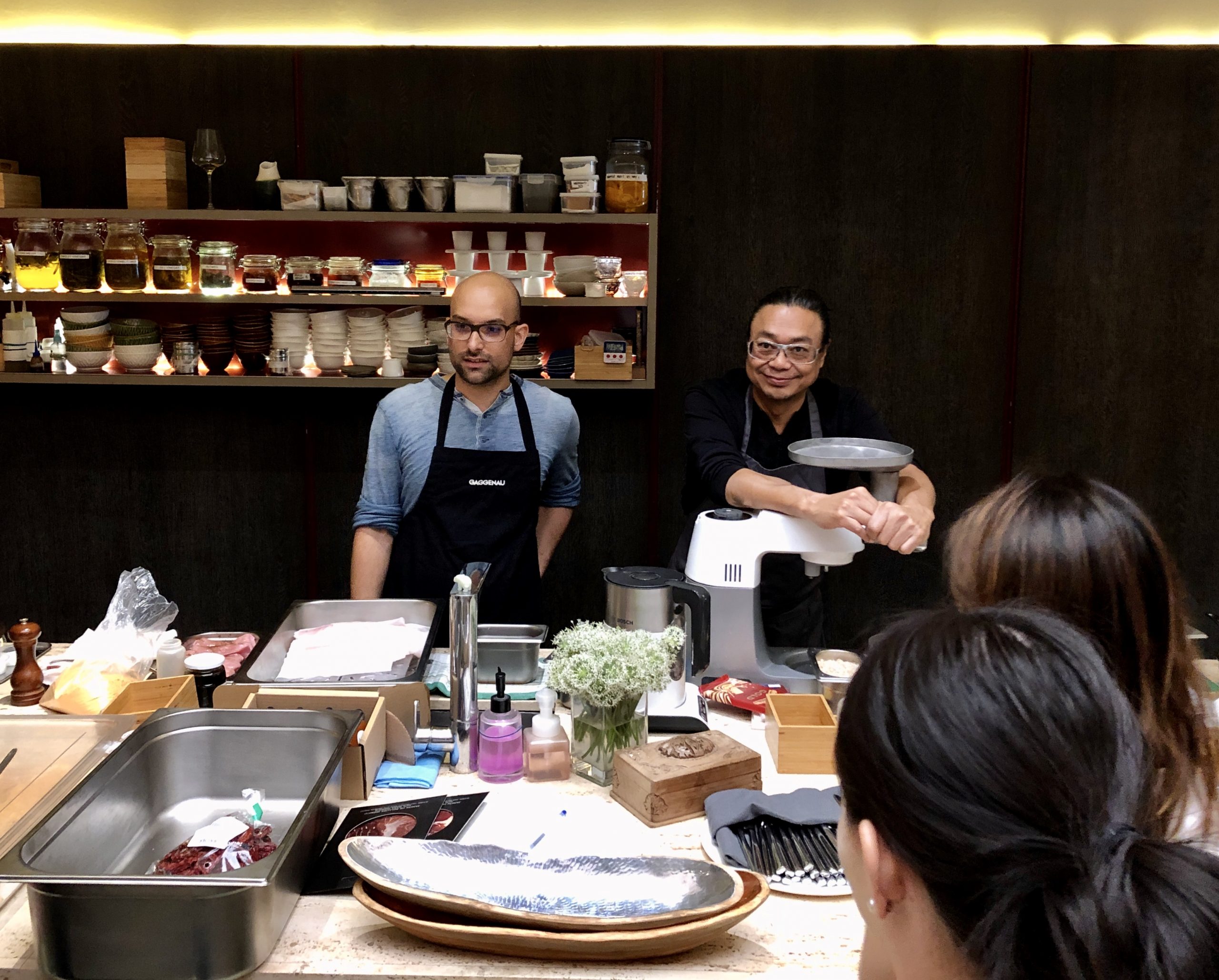
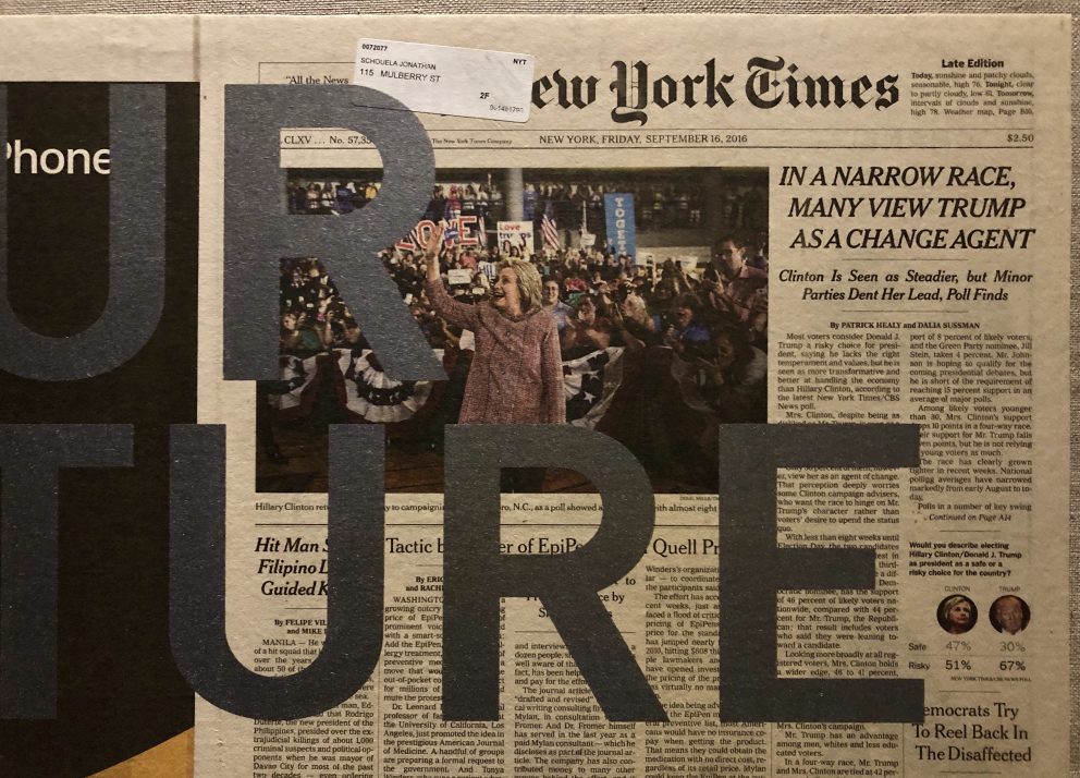
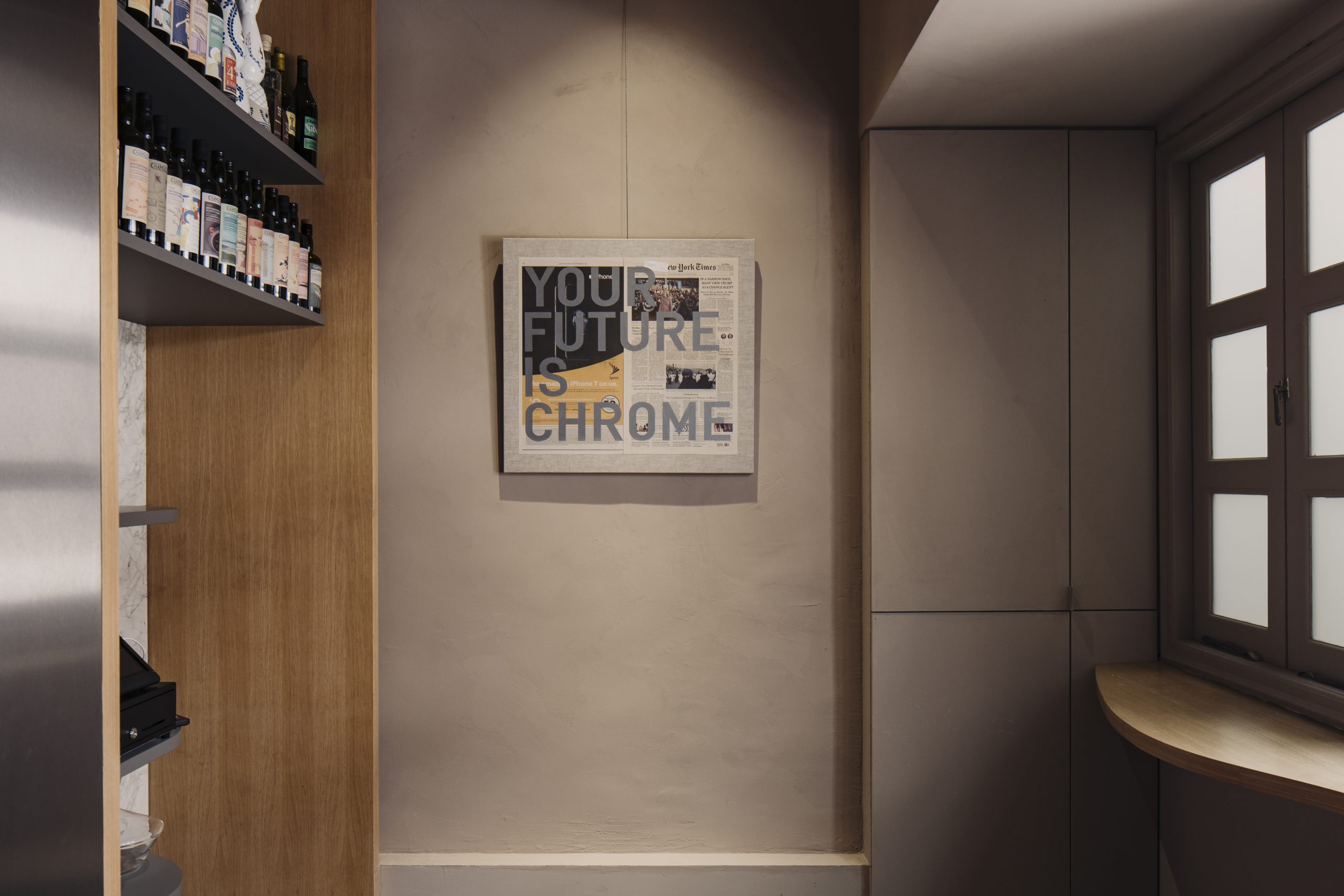
The artist prints another famous slogan of his, “Your future is chrome,” on collaged newspapers from 2016. This work, included in Chromatic Identities at Appetite, invites viewers to reflect on this turbulent moment in global politics as related to today’s world. The work recalls the uncertainty of the future during the 2016 United States Presidential election, with the newspaper headline reading: “In a narrow race, many view Trump as a change agent.” Chrome, textually superimposed over the article, relates to the iPhone advertisement on the left as well; with its gleaming, polished finish, chrome evokes notions of futurism, technological advancement, and digitization. Chrome (whose greek root, chroma, translates to “colour”) reflects all visible wavelengths and captures fluctuations in time and space. Tiravanija sees chrome as possessing liquid qualities that resist spatial-temporal limitations, which perhaps creates the sensation of a void.
Tiravanija explores new media in his most recent show, untitled 2020 (once upon a time) (after jasper johns) (9/5-10/10/20) at Galerie Chantal Crousel. The tombstone-like marble slab evokes a certain timelessness and monumentality, while tapestry is an ode to the artist’s mother, recently passed, and a means to continue her ideas in his work. Throughout his career, Tiravanija has framed his practice in terms of social engagement, while at the same time not disregarding the importance of personal experience.
Ugo Rondinone
Swiss-born multidisciplinary artist, Ugo Rondinone (b. 1964, Brunnen) works with a variety of media to transform the exhibition space into a world set on pause. Ranging from the stacked, brightly-colored boulders of Seven Magic Mountains to his unsettling Clown series of passive, hyper-realistic clown sculptures, Rondinone juxtaposes quiet bodies of work with dizzying colors to unwind man-made understandings of time, solitude, and stillness.
Ugo Rondinone creates artworks which signify but do not tell time, suspending the viewer in a state of ambiguity and perplexity. As one of his most well-known pieces, Seven Magic Mountains puts a colorful spin on the usual quietness that is common to most Land Art works. The Mountains combine an industrial artificiality with the silhouette of a geological formation hundreds of years old. Another series Sun depicts an array of tantric airbrushed paintings, each one a circular canvas filled with concentric circles. The series turns sculptural with a collection of gilded aluminum and bronze tree branches, tied together into gateway-like circles of varying sizes.
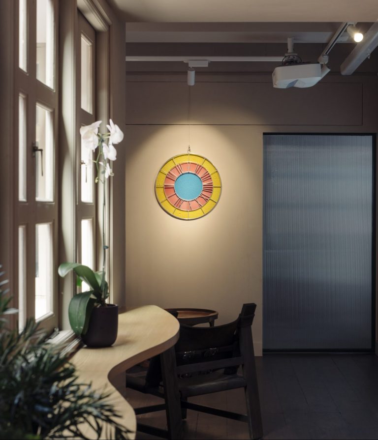
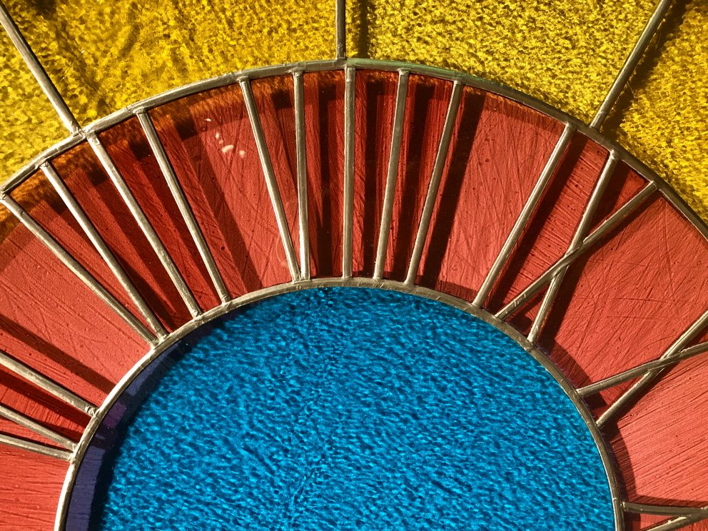
On the other hand, Clock is a collection of delicate stained-glass clocks, whose blank faces blur divisions between tradition and contemporary design. They move through ancient spaces of worship which have historically incorporated the craft of stained glass. Alone on a blank wall, the clock is a disorienting figure as it is almost– but not quite– readable. None of the clocks in the series have hands, and out of those, some are not even labeled with the Roman numerals. The blanks remain as mystical stained-glass windows, leaving the exhibition space and directly signifying a connection to the Spiritual.
From the glass beads of Mesopotamia to the stained-glass windows of Al-Andalus, the tradition of glass-making has survived countless religio-political shifts in order to arrive into the contemporary era as it is today: a beautiful example of the intermixing of geographical resources, belief systems, and political structures. Global glass-making technologies spread from artisan centers like those in Syria and Palestine through the Roman Empire and Umayyad Caliphate into Southern Europe, creating more trading and craft hubs for glass-makers in Italy and Spain.
Rondinone’s Yellow Pink Blue Clock (2016) directly points to this dynamic history by using stained-glass pieces as a medium, but the pastel palette of the glassware throws the object back into the present day. Today, there has been a revival in the glass-making world, alongside the increase of interest in crafts such as knitting, ceramics, and weaving. Contemporary designers and artists––Ugo Rondinone among them––have realized once again the ethereal quality of glass, recontextualizing this age-old craft while still honoring the meticulous craftsmanship of the medium’s history.
Within each of Ugo Rondinone’s projects, as well as behind his artistic practice as a whole, there is the central theme of the dynamics of duality. As an artist, Rondinone continually challenges himself to re-examine his surroundings so that his own values remain informed and open to change. We strive to do the same at Appetite, re-tracing and re-envisioning the spread of foods, modes of visuality, and cultural traditions.
Ceal Floyer
Pakistan-born, Britain-raised, Berlin-based conceptual artist Ceal Floyer (b. 1968, Karachi) is known for her deceptively minimalist pieces that span a wide range of media, including sculpture, sound art, projection, and installation. She received the 1997 Philip Morris Prize, the 2007 National Gallery Prize for Young Art, and was the 2009 winner of the prestigious Nam June Paik Art Center Prize. Her works are included in permanent collections at institutions such as Tate Modern and the Museum of Modern Art (MoMA), in addition to being represented by Lisson Gallery, Esther Schipper, and 303 Gallery.
Floyer’s subtle employment of the plasticity of language in her titles as well as in the material aspects of her work often invites a double-take from the viewer. Her practice is marked by a preference for everyday and found objects as both medium and subject matter; often, she procures her materials in the same area as the institution for which she is creating a piece. One notable example is her Monochrome Till Receipt series. Each iteration consists of a simple receipt from a local store fixed onto the exhibition space wall; upon closer examination, it details purchases of solely white or off-white items.
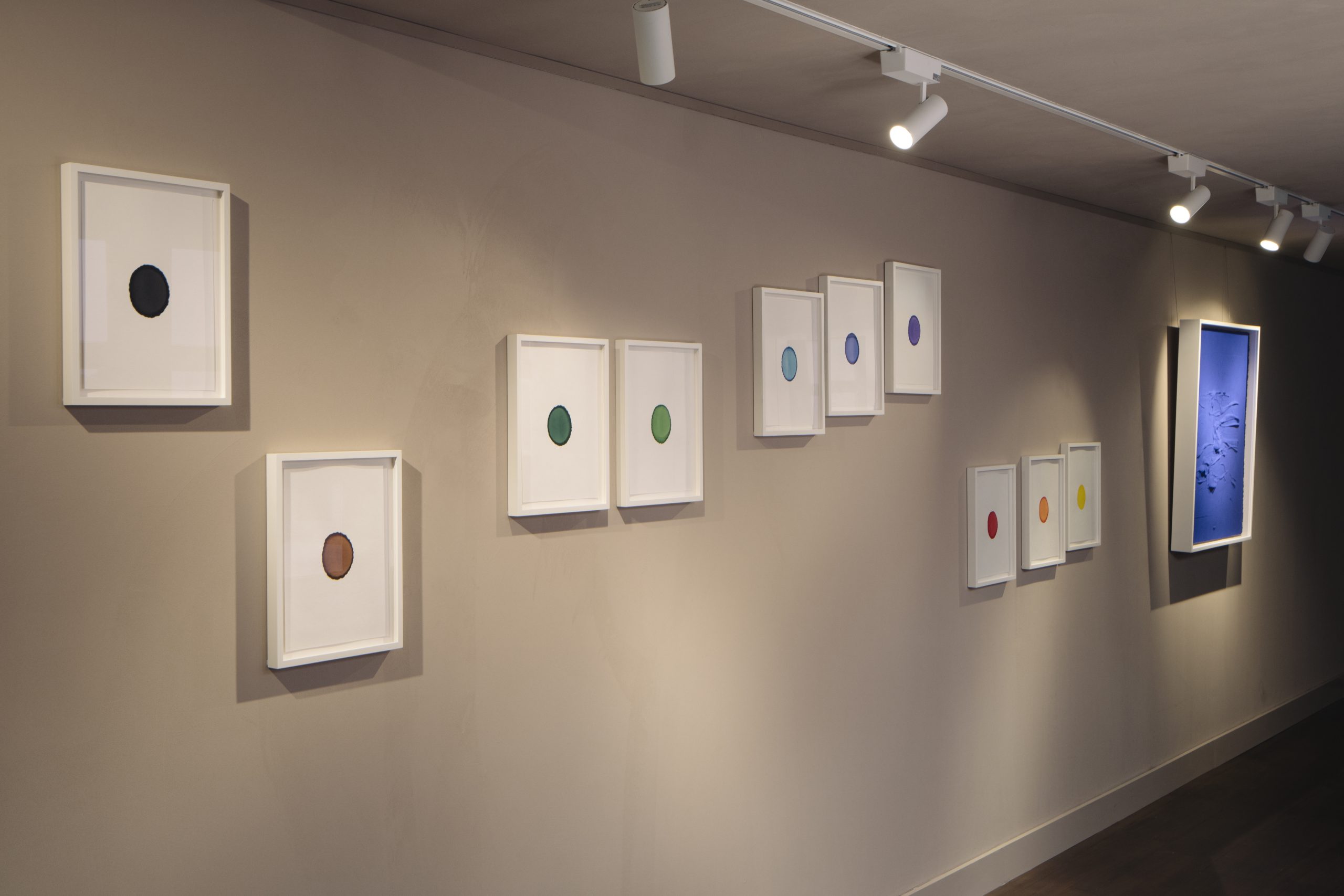
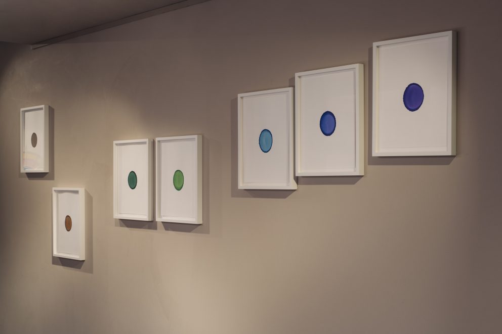
Her Ink on Paper series marks a shift from the rest of her body of work in terms of material and visual presentation. While the majority of her practice is defined by a visually simple, almost monochromatic sensibility, this body of work turns the spotlight on colour itself. Each iteration of this series consists of identical sheets of blotting paper, stained by suspending the end of a felt-tip pen over the page for hours until the inkwell empties itself onto the page via osmosis. The colours, number of sheets, and ordering of the sheets are determined by the colour, number, and arrangement of ordinary felt-tip pens in their packaging.
As with the rest of her work, Floyer’s Ink on Paper series encourages deep reading. At first glance, each spot of ink appears as a uniform and singular blotch. However, each sheet reveals imperfections along the edges and variations of shade and hue throughout. Though these pieces are made with mass-produced ink and paper within a set of constraints set by Floyer, variation and uniqueness still manage to bleed through. With the specific use of pigments generated through technological, chemical, and mechanical interventions, Ink on Paper epitomizes a material culture of hyperartificial, commodified colour.
Floyer’s characteristic simple arrangements of objects and engagement of visual semiotics results in a body of works that complicate and expand themselves upon closer exploration. Her preference for small manipulations in this series tests the limits of authorship by employing a long-established medium in an unconventional way: relying on the chance operations of physics to render the work, rather than her own physical, expressive artistic gesture. Disconnecting the hand of the artist from the piece this way makes room for a reevaluation of colour as an actor, rather than just a concept or qualifier applied to an object. In what other ways might colour directly intervene in our lives, rather than simply accentuate it?
Comp-Syn
Comp-Syn—short for Computational Synesthesia—is a creative team at the forefront of scientific and artistic interdisciplinarity. Formed at the Santa Fe Institute, their work ponders big questions around human cognition, drawing on expertise from aesthetics, computer science, linguistics and physics. Comp-Syn’s work ranges from formal scientific publications to exhibition artworks, taking a point of view that bridges an individual’s gaze with the expansive scale of technology. In two recent publications Comp-Syn finds that colour structures abstract language at category level, and that word concreteness can be measured through colour. Mark Chu is a founding member of Comp-Syn.
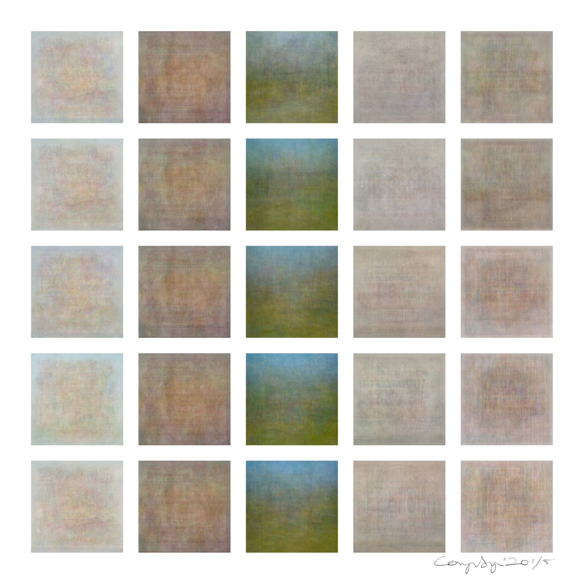
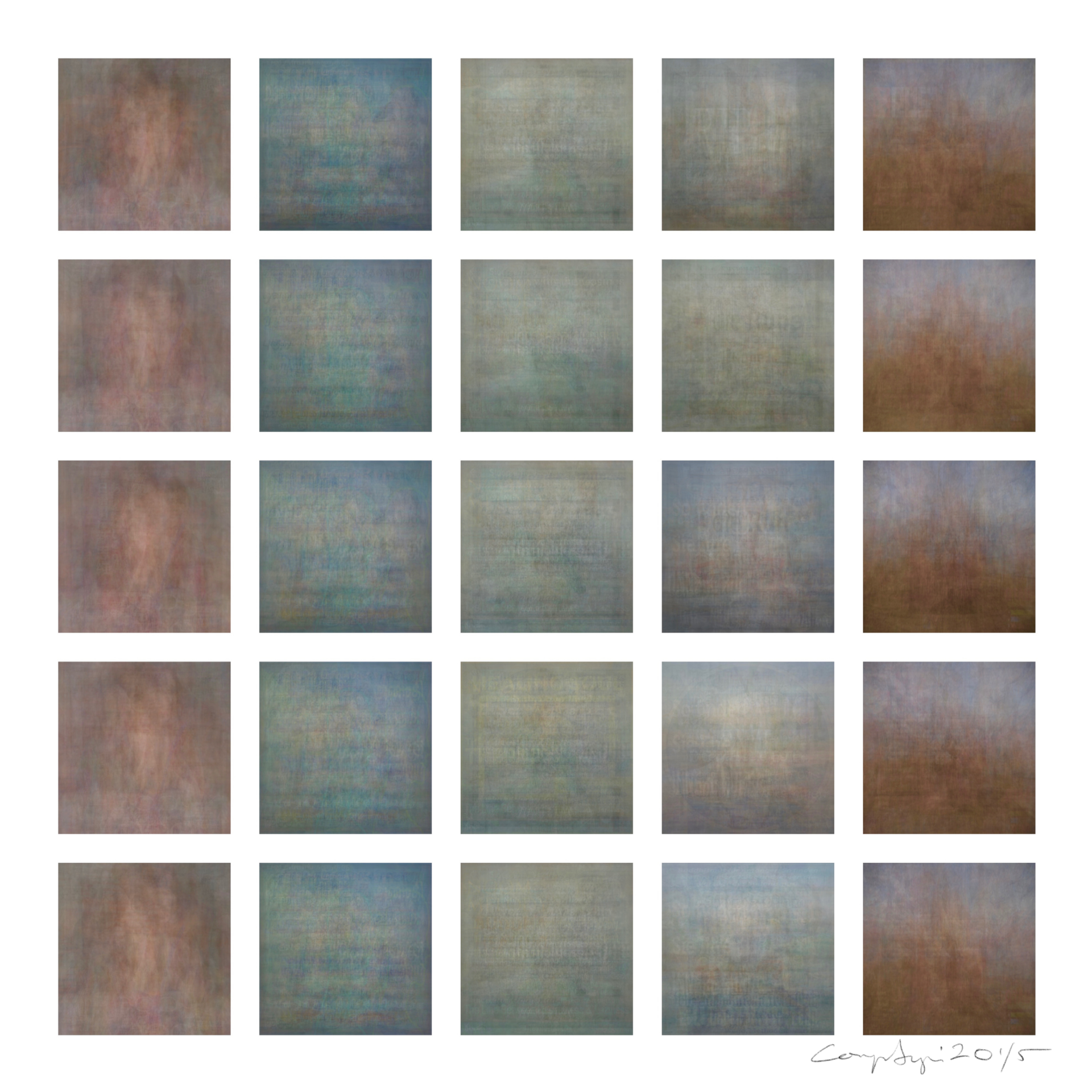
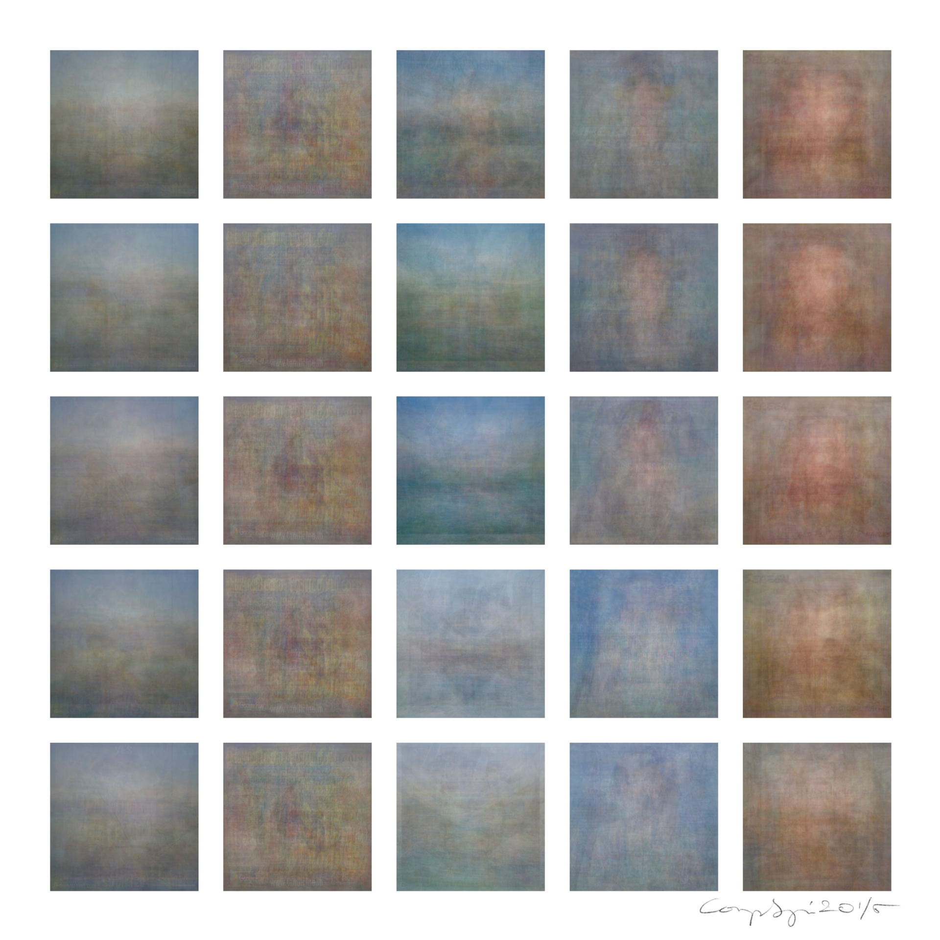
Each of the small squares in these works is a colourgram, made by averaging the colour information from mass internet image search results. In these three works, a central search term is used to generate colourgrams across five languages and places, with striking differences arising, especially in colour. Columns vary in language, and rows in IP location of search. In English, the word pleasant evokes impressionistic suggestions of fresh pasture under sky, yet other languages yield mineral tones and a weft texture made by traces of text. Depending on language, restfulness and serene oscillate between cool or warm tones. Such variance may be explained by structures internal to each language, how a language relates to its culture, and how cultures and language relate to each other, online and off. As an example, these colourgrams imply that across different cultures, serene varies in its connection to either landscapes or an embodied human facial representation, echoing connotations of the name Serena. Whatever the difference in a culture’s use of language, it seems that key to many expressions is colour.
“What is colour?”
Colour is not intrinsic to nature. It comes from a gamut of wavelengths, detected by sensitive photoreceptors in your eye, interpreted by your mind. Understandings of colour arise as ideas from different fields interact with each other and snowball in meaning—physics, anatomy, psychology, language. This snowballing effect is called emergence.
“Why measure colour?”
In nature and society, colour is useful. It changes your acts and thoughts. It makes you feel. Language is one way to organize colours. Words sort colours into labelled bins, some well-known, others specialized or local. Like chefs, artists rely on words as labels when choosing ingredients. But words—like coquelicot, imperial, or cerise, which all describe reds—can be hard to remember. Worse yet, there’s no system of naming. Numbers measure colour more precisely, in a familiar spatial system of labels, based on counting.
“What’s the best ruler?”
We need to imagine what and where we’re measuring, spatially—what colours are near others, their order, what shape best maps out all colours. History offers colour wheels but they don’t consider light and dark. They also don’t consider biases of eyes. Scientists from Dolby, Huawei and Chinese Universities came up with perceptually uniform colourspace to account for all this—a numeric map grounded in human sight.
Colour in Images
We can measure the colours in an image by dividing it into pixels. Instead of listing, we plot the numbers on graphs. Some artworks use colours near each other—this is called clustering, think John Brack. Others have more range—a wider distribution, think Georgia O’Keefe. Techy words come in handy as we’re bundling individual ideas into ideas that hold many little ideas together—doing structural analysis. We can precisely compare different artworks and artists. “How does Brack’s palette differ to O’Keefe’s?” Now we’re measuring cultural and stylistic diversity and norms.
The Colour of Words
One norm we wanted to research was if and how colour connects to words. “Why are Valentine’s notes pink?” We measured colour in internet search images of emotion words and found that emotion words clustered around either red or blue. We measured other categories—music genres and academic disciplines—finding similar results. This told us that across society, colour organizes language in somewhat prescribed ways, as if Marie Condo had long ago decided that all categories of abstract ideas should be colour-coded. Our team always kind of felt this, but now an explainable proof expanded our instincts.
Colourgrams
The way we measured the colour of a word was by taking banks of image search result, per word, and averaging the colour across all those images. In doing this, we created colourgrams, an image that shows the average of many images. Unique and beautiful, colourgrams gave us a new way of seeing that considers multiple points of view and times at once. It made us question whether notions like background and subject made sense at all. We discovered two amazing things: the internet’s depiction of any word, and from that, it’s colour. “What’s the colour of surprise, victim, technology…”
We also found that word types impact colour: pleased, pleasant, pleasure—the internet knows grammar! Because the internet archives itself, we made colourgrams from the past, finding that the colour of words evolved over time. This then proved resonant during dramatic world news cycles—our colourgrams showed biases in real-time.
Cultural differences
The internet is often local, so we made colourgrams from different IP addresses, in multiple languages. “Is green the colour of envy everywhere?” With the same word, colourgrams changed across locations and languages, showing not only that colour is a property of many languages, but that colour can measure cultural differences. We’re continually trying to ask the internet better questions, using computers in niftier ways, and in only a year we’ve opened our eyes to an amazing global sensory diversity. Our team includes physicists, artists, coding scientists and linguists from four continents. Only in using all our different backgrounds can we see as much as we do.
Dawn Ng
If you’ve ever seen a colossal inflatable rabbit peering at you around Singapore — perhaps at the Queensway Bowl or the Singapore Art Museum — you have definitely met Walter. More importantly, you have encountered the work of Singaporean artist Dawn Ng (b. 1982, Singapore).
A Singaporean by birth, with sojourns in Washington DC, London, Paris, and New York, Ng’s practice is whimsical and earnest, often revolving around notions of home, nostalgia, and the environment. Ng is represented by Australian Gallery Sullivan+Strumpf.
Walter (2011) is just one of Ng’s many acclaimed works. Her installation at Art Basel Hong Kong 2013, titled Sixteen, featured 16 colorful wooden chests labeled with plaques about Singaporean culture. Ng’s work has also been featured in the 2015 Art Paris Art Fair and the 2017 Jeju Biennale, and she has been commissioned by distinguished companies such as Facebook and Hermès to create site-specific installations. In her recent piece Merry Go Round (2020), the artist took inspiration from an abandoned ship-repair factory in Singapore to create a 20-metre circle of tall, L-shaped mirrors.
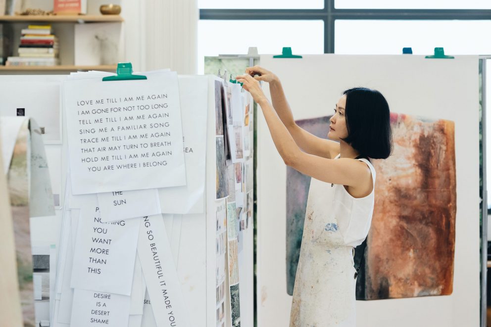
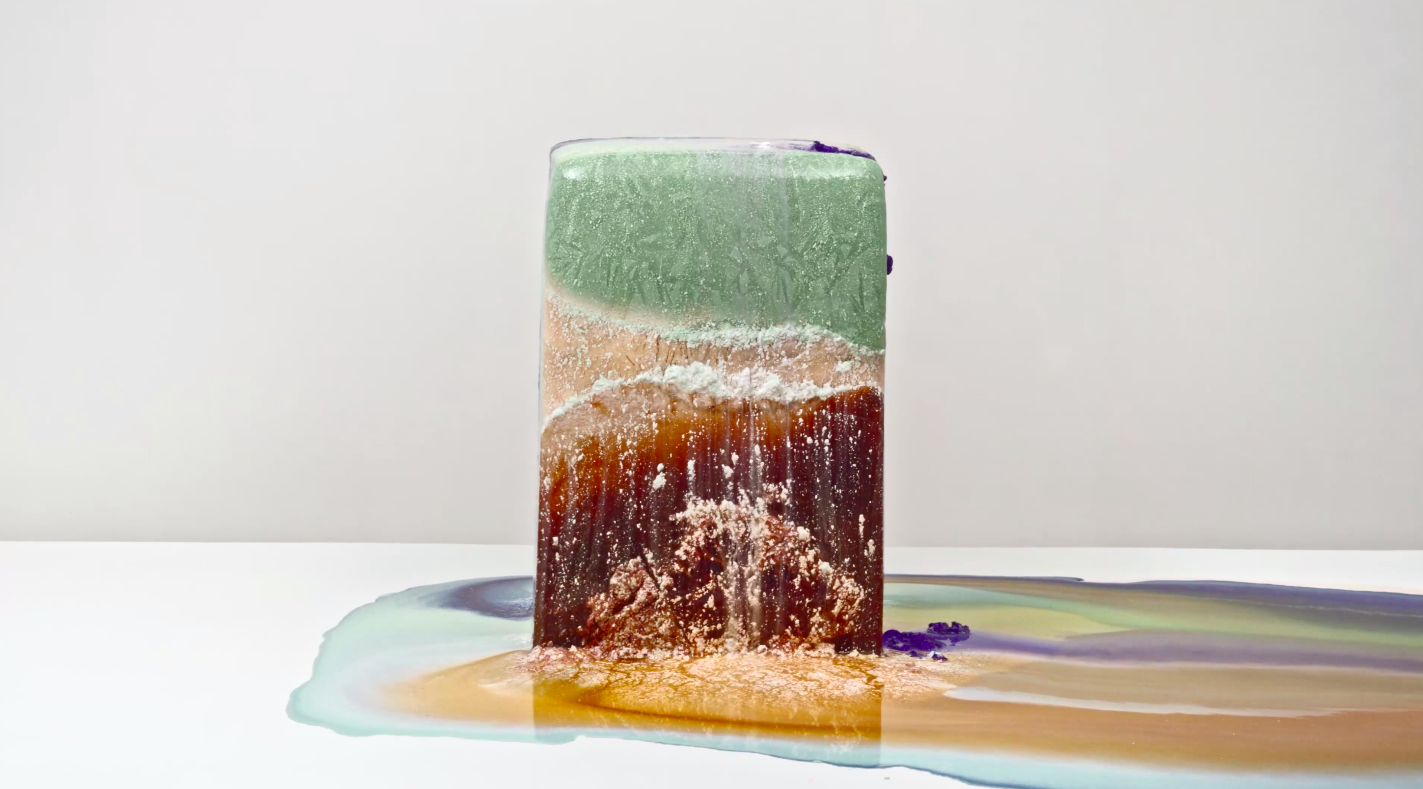
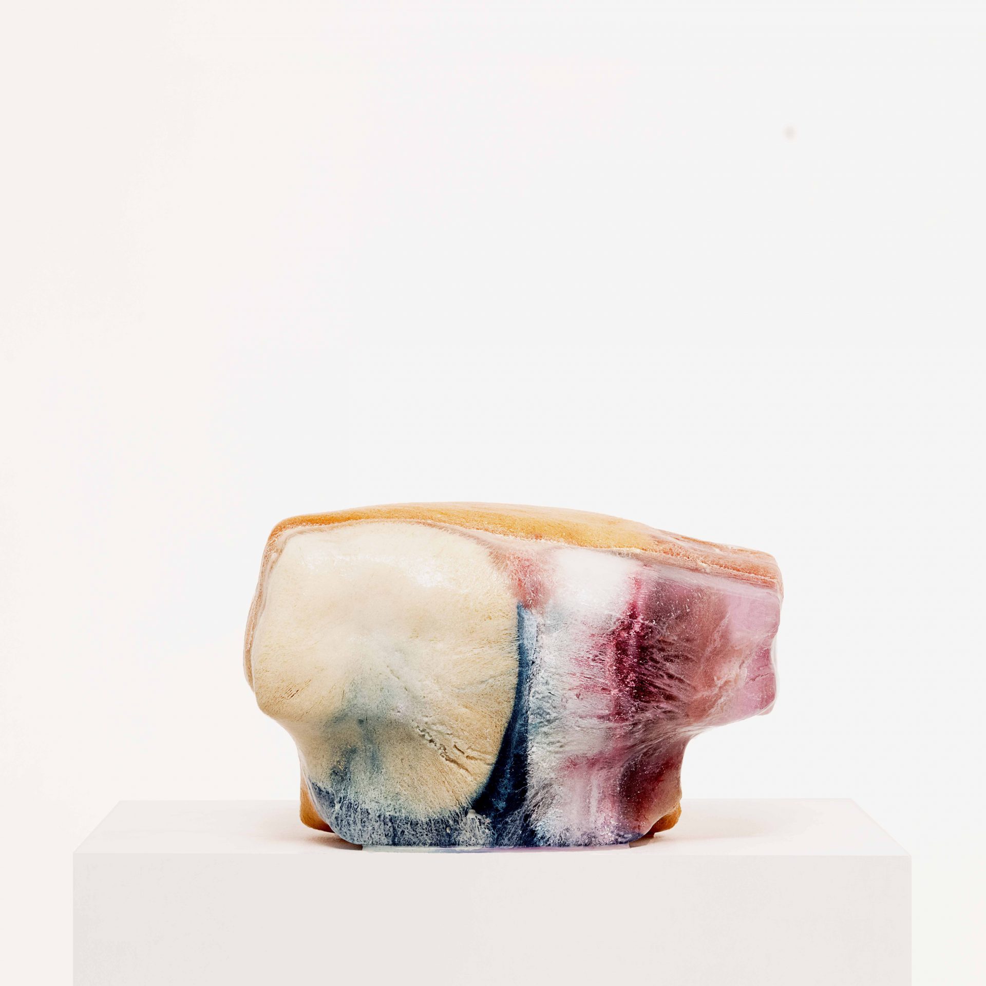
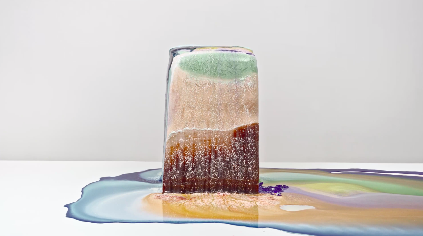
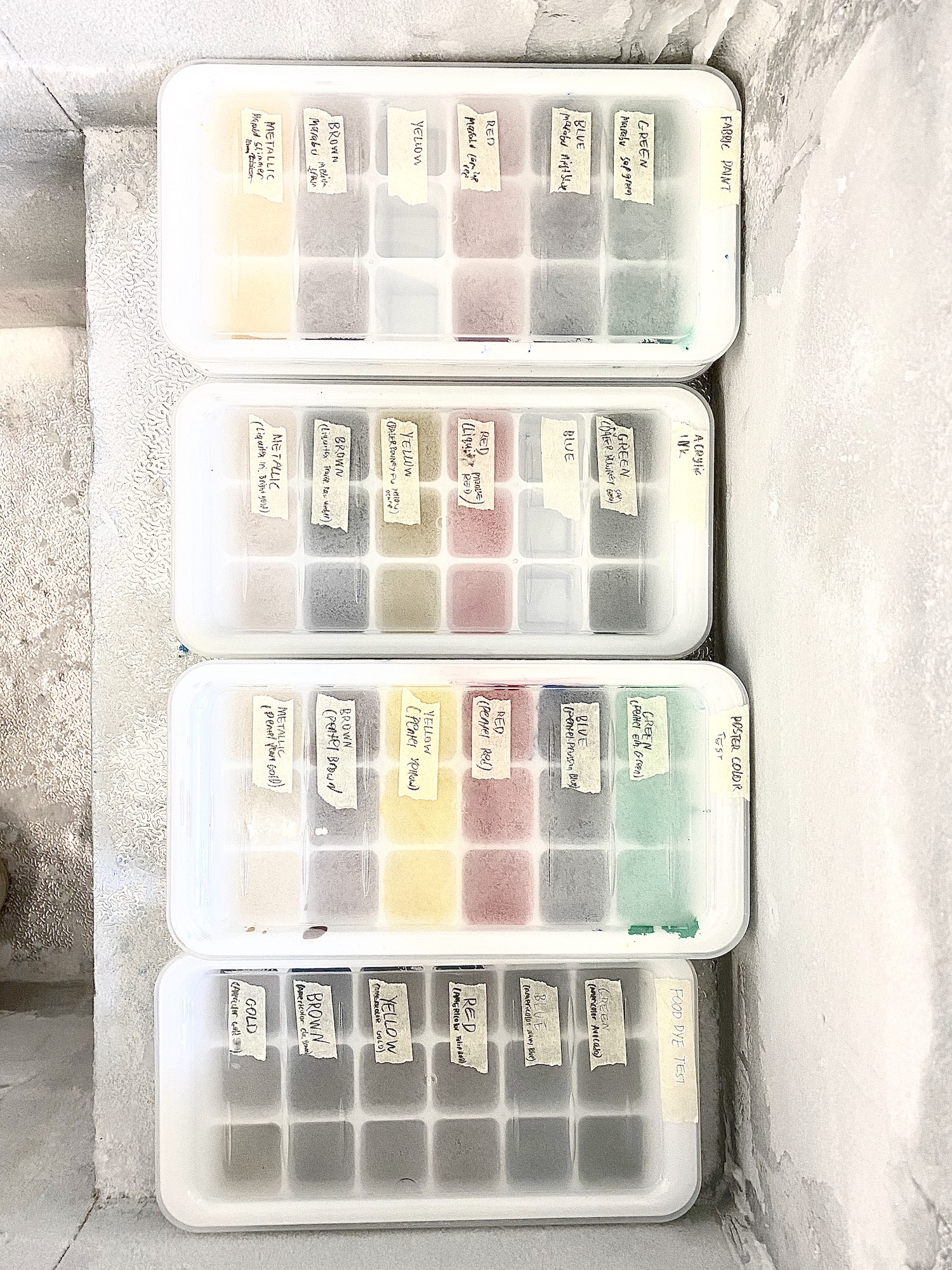
Ng’s latest body of work, Into Air, explores a new medium for the artist: frozen blocks of vibrant pigment. Over the course of three years, Ng has documented these colorful ice-cubes as they melt, mix, and transform. In her 4K video series, Time Lost Falling in Love, Ng seeks to challenge the numerical and unvarying way in which we measure time— not with numbers but rather the progression of earthy greens and browns into vibrant blues and magentas.
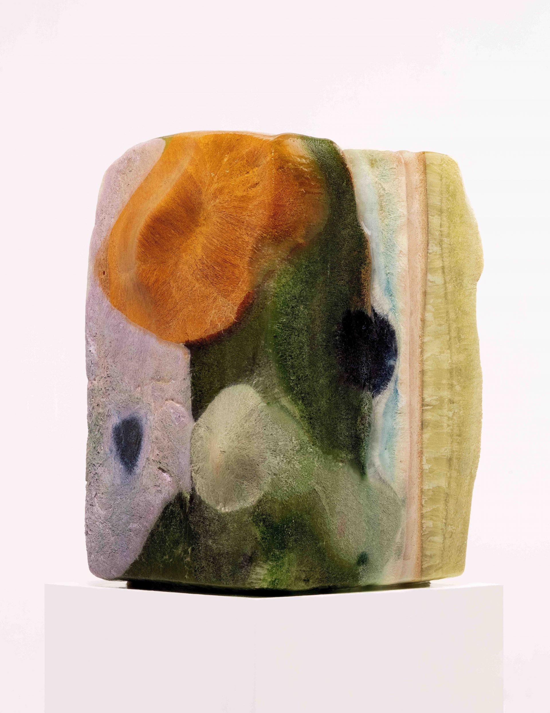
Clocks is an extension of the video series. These monumental photographs reimagine time-telling in a novel and aesthetically-driven form. Walk with me Suzy Lee through the Park and by the Tree (2020), for example, depicts an ice-block composed of bright orange, lavender, forest green, and pastel stripes. As with her video work, Ng reveals the unpredictability, elasticity, and fleeting nature of time.
Ng’s sensibility is both emotional and scientific. Pigments are selected after thorough experimentation and documentation of melting patterns. They invite and arrest the viewer, and quietly ask you to be inquisitive again. How do her pieces, which exude playfulness and light, touch on something beyond abstraction and aesthetics?
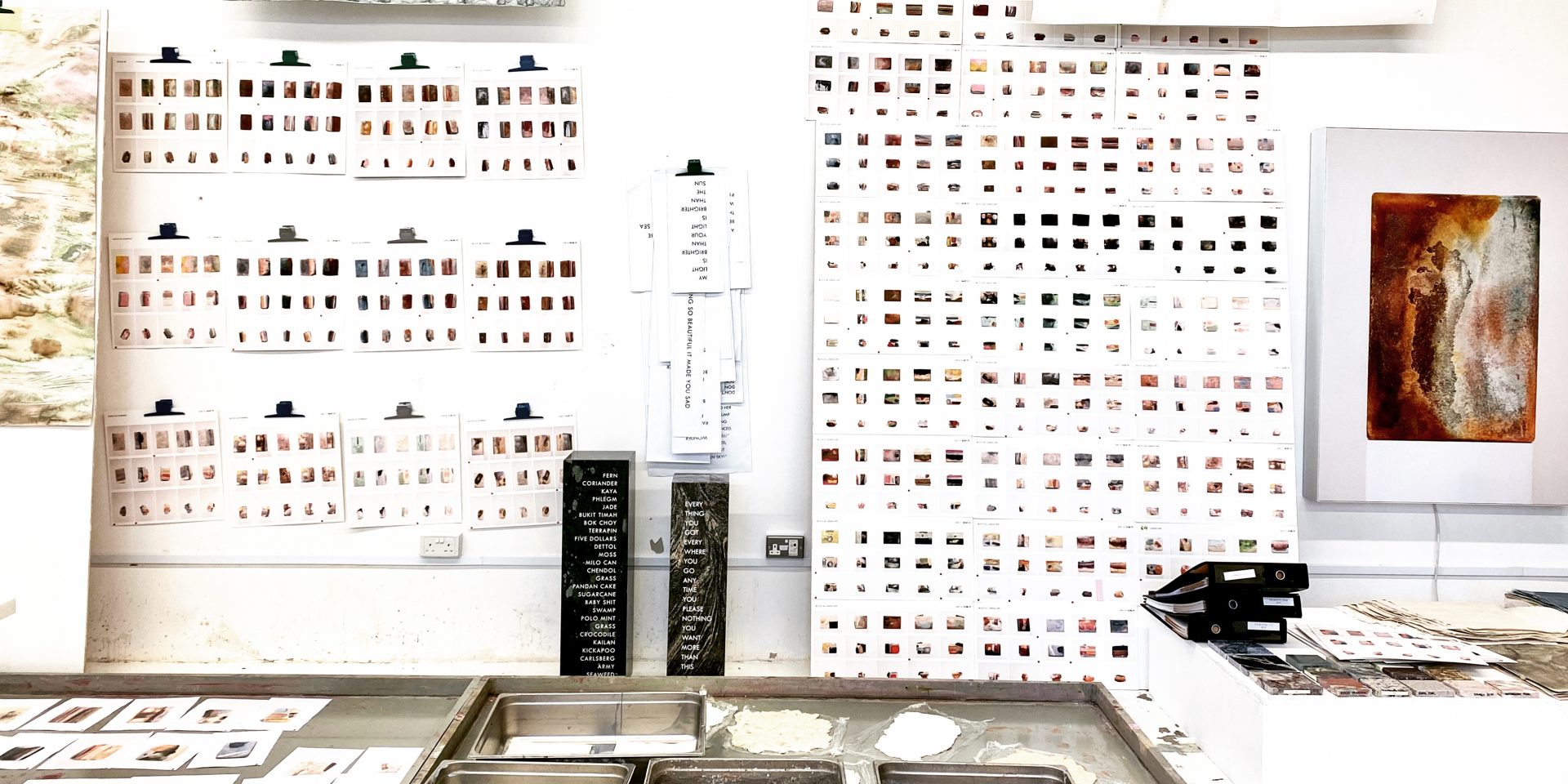
A shout out to our research team:
Kathryn Miyawaki
Sabrina Cunningham
Mei Ge
Maddie Rubin-Charlesworth
And a very special thank you to:
STPI Creative Workshop and Gallery
Sullivan+Strumpf Gallery
National Arts Council (NAC)
At the same time, check out Offline Colour by our friends over at Art Porters Gallery.

